In Memoriam: Anagha Bhat
→
June 2, 2026 |
Reading time: 3 minutes | Permalink
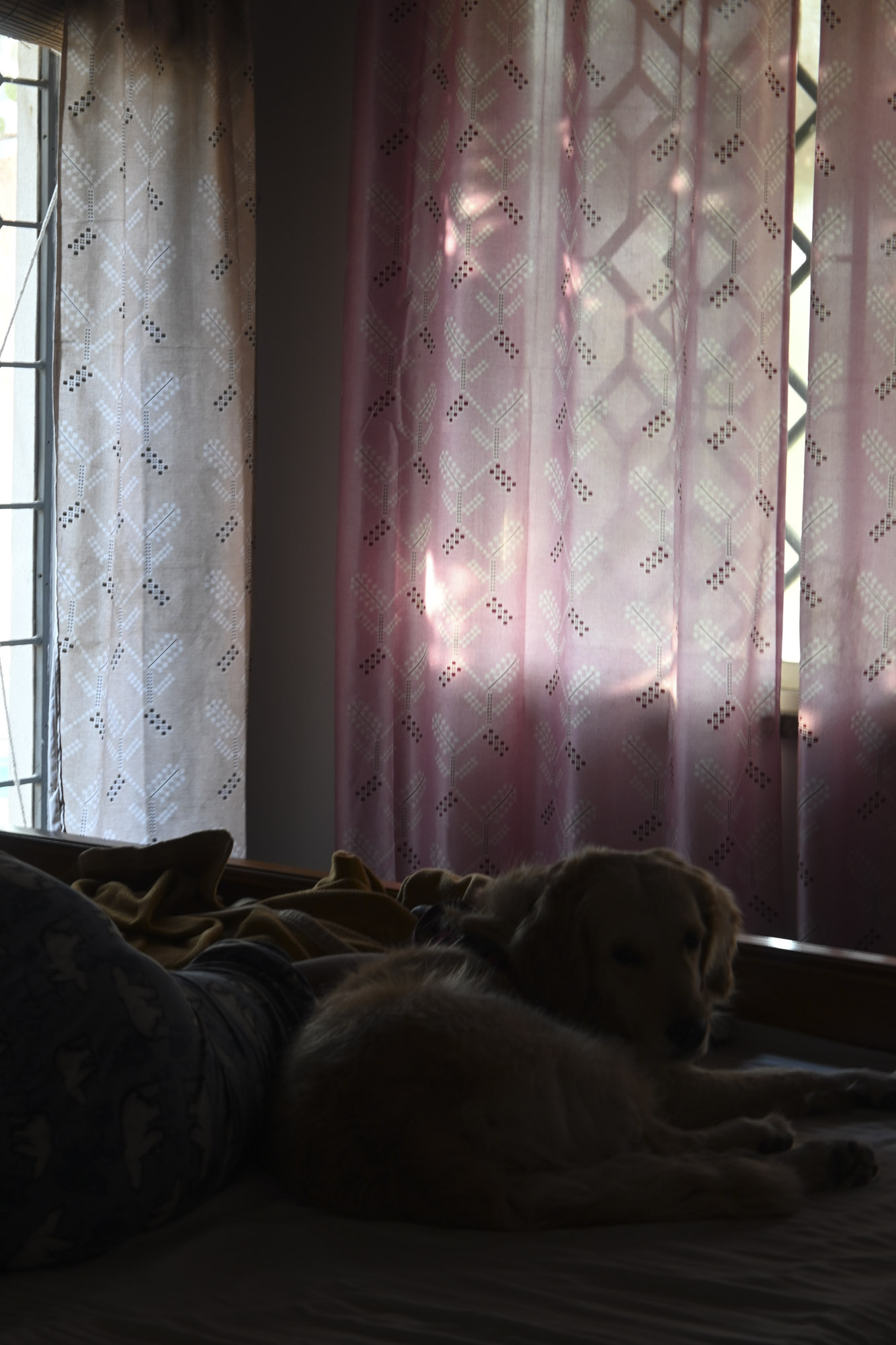
I met Anagha in August 2018 at NID Vijayawada.
She was in second year then, part of the group that always showed up way before time, present in all ways and eager to return to the studio the next day. This was my first time teaching and I couldn’t have asked for a better set of students to start that journey with.
In the four (and then another four) weeks that followed, I would get to know her brilliance and undying need for perfection well enough. She was reserved but not quiet. She was relentless in her pursuit to excellent work yet thoroughly grounded when it was done to her own high standards. She disagreed respectfully and was always up for conversations about the disagreements.
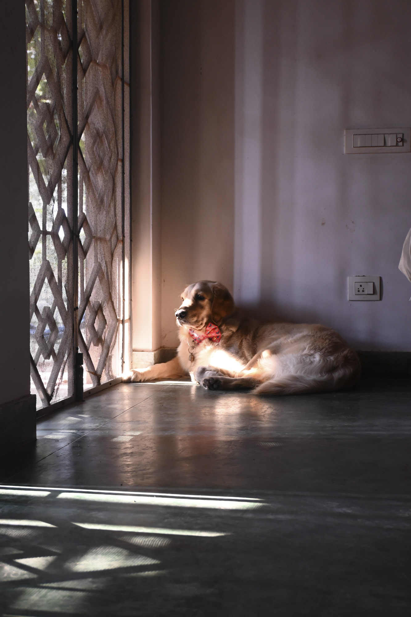
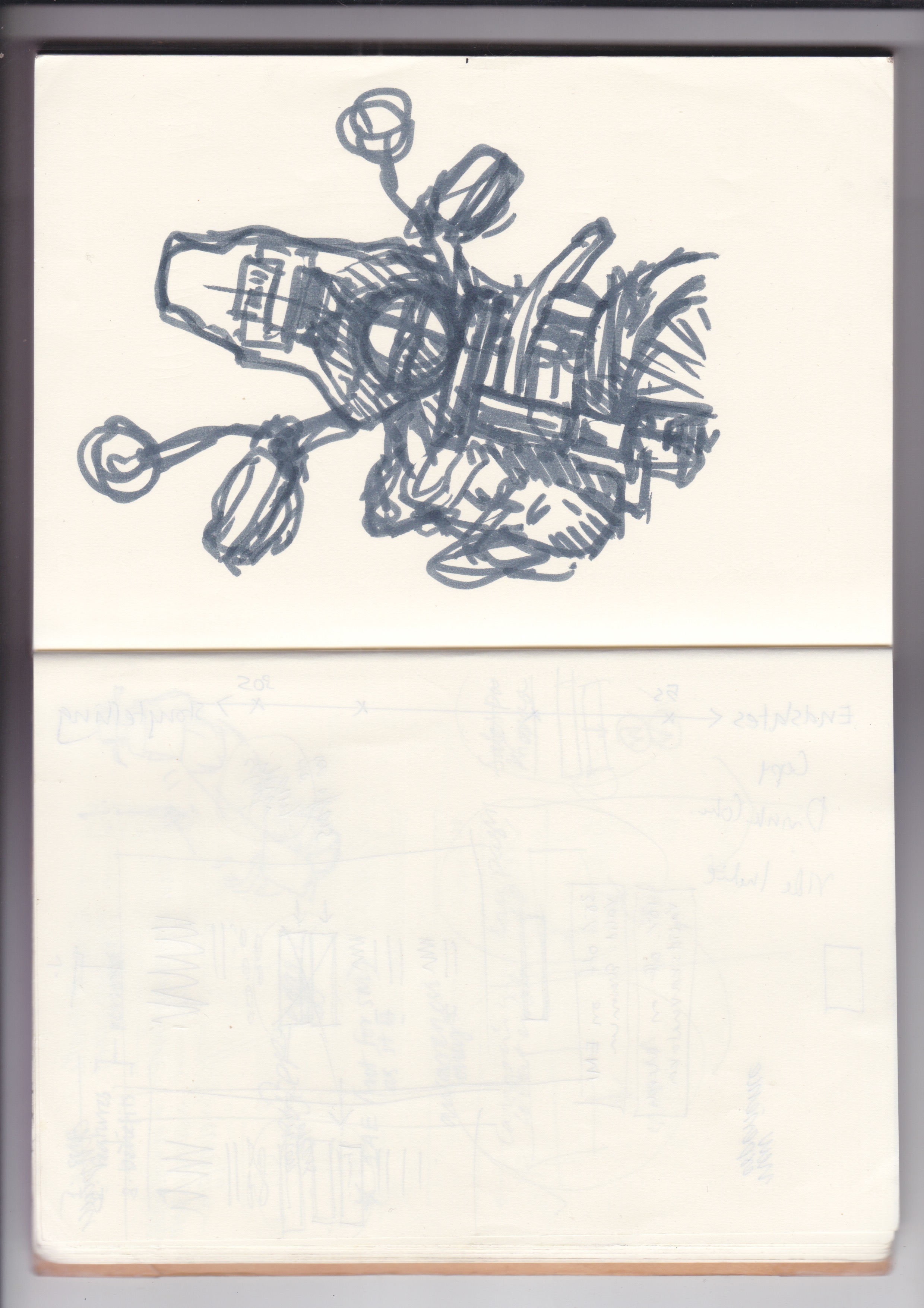
The image I remembered in full-resolution when I heard the news is of her—eyes framed in squarish black acrylic spectacles—and SJ standing in the corridor with ScotchBrite pads, taking a break from drawing large calligraphic letters on the floor to take stock of the fading strokes. She chose letters on wrought iron gates in Mangalagiri as a staring point to one of her type design exercises and had an absolute blast of a trip through the many small decisions to making a whole set of letters. For her movie poster for Ulidavaru Kandanthe, she tirelessly pasted together moire-patterned eyes from many newspaper-people to leave a gun-shaped hole at the centre. It was something that could have been short-cut to half the time if done wholly digitally but she chose the route that meant the most. This would become a running theme in her work.
Anagha passed away on 2nd of May in an accident somewhere between Bengaluru and Mysuru. I saw SS’s text the next day and could not respond for a while. R remembered Anagha as the person who had really nice work to show her GP jury (R was the external examiner for her final jury at AP). When you faced with a loss like this—unexpected, of someone much younger and so full of the stuff that puts the balance in ‘life-work,’ there is not much that rationalising and positive-thinking can do to help.
Then R and I met Anagha’s mother and younger brother two days later at their home in a quiet lane in the South of Bengaluru. It was near-impossible not to tear up in the presence of her mom. She did the humanly impossible job of keeping her composure, with the aged grace of someone who is worldly and wise. She spoke of a daughter who wanted to do the best with everything she wanted to. And she wanted to make and write a lot of things. She’d set her room up surrounding herself with work and books. They had been going to concerts and dance programs in Bengaluru since she quit her job three months ago. She was writing an article on her grandmother for Luru. She spoke of a daughter who was an ‘old soul’ and I couldn’t agree more.
She was an exemplary student. The kind that made better teachers out of rookies who were fuelled mostly by enthusiasm and a bit of anxiety. I believe she was—later—a great colleague and a great addition to the teams she worked with.
‘Rest’ is the thing that she hated the most, perhaps. We hope she finds peace.
Six!
→
May 7, 2026 |
Reading time: ~1 minute | Permalink
Six years married to my best-est friend.
R makes me a less terrible and much happier person every day. And puts up with my many missteps. I love coming home to her and P&C. Two weeks ago, we made and sold some food (jam and ela-adas) at the society market. It was all so nice! I am looking forward to many more years of being-working together.
(This photo is from 2023; Rajesh-ettan took this at B&R’s wedding reception.)
Lots of love and gratitude.
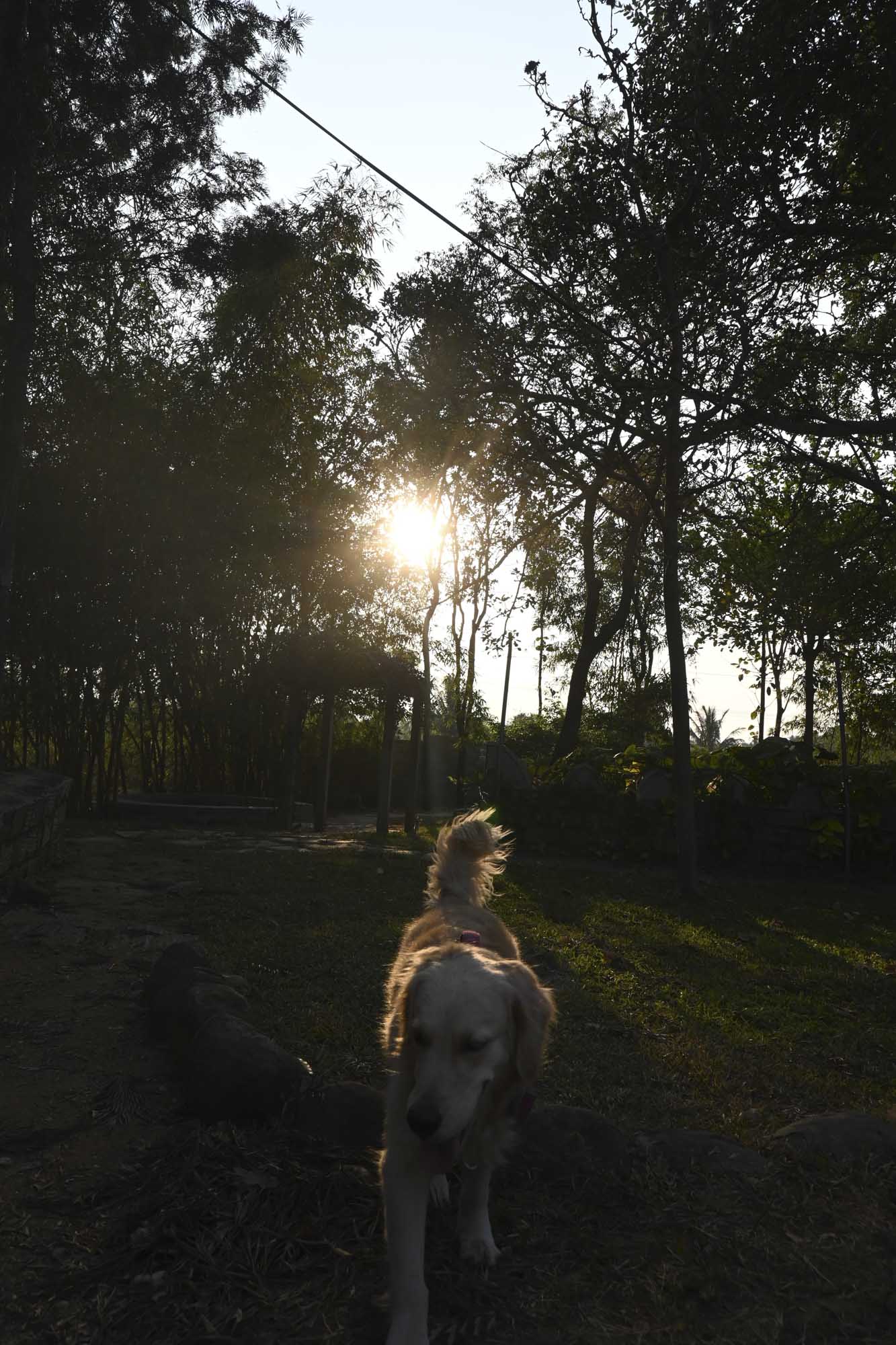
Shoolagiri in March
→
March 29, 2026 |
Reading time: 2 minutes | Permalink
Two hours through fields of flowers and fruits and vegetables and people. Then silence and dust and the girls running around happily bathed in the sunsets.

Zen and the Zen of Motorcycle Something
→
February 27, 2026 |
Reading time: 6 minutes | Permalink
It’s been a while since that last semisuccessful attempt at wordplay in the post title. I say ‘semi’ only because I am a prime-ish example of how humility works etcetera and not because it was halfbaked-slash-unoriginal in a semifulfilling way. Anyway.
In other news, post much trepidation (brand-appropriate), hesitation (just appropriate), and calculation (GST-appropriate), we brought home a Himalayan (the 450 in Kaza Brown) the day before Onam last year.
I was a fan of the 411 from the day it launched and had been drooling over first-second-third-hand market listings ever since. Post turning 36, watching reviews back to back wasn’t doing anything to calm down the good-old early midlife crisis. I decided to go take a test ride. R was more than fully supportive of the thing and did a stellar job of keeping her concerns from showing.
The bike was heavy and I am not as old as I was when I first rode all the 500s in Gurgaon. I could feel the weight before the first test ride but not during. That supershort ride—through horrible Whitefield-Bengaluru traffic—sold whatever was left to be sold, and got me into the typical longwinded waiting game that is the backbone of an RE-buying experience.
I took one more longer test ride loop midway through the long wait just to be sure that the first impression wasn’t just wishful thinking etcetera. This time I chose a less trafficky day and the loops-around-town were lovely. The test-ride bike wasn’t in the best of shapes yet the engine-gearbox-suspension trio worked like butter over abrupt slowdowns and huge-ish speedbumps.
I am an equally huge fan of the older Himalayan hillrange wordmark and absolutely hate the abomination that sits atop the new 450’s tank. I asked D for the old vector file so Welpac could help me deal with the daily pain of having to look at the crossbarless capital As messing up that nice offwhite volume. That conversation helped in other ways too; D’s call to the higher ups at RE helped cut my wait time really really short. The ASM was nice enough to call multiple times to make sure the delivery happened sooner and the dealer was a little surprised it did. I kind of embarrassed R with my PDI/PDF shenanigans (thanks to TBHP) but all was well.
RE has managed to build the machine well. I am not used to their bikes having this level of finish or refinement and that is a welcome change. The Himalayan sits happily at 4–5K RPM and makes a lovely drone on revs. (This is new, coming from the low-rev-loving vibey C350.) Almost all the weight sits on top but that makes itself felt only in parking lots and awkwardly slopey traffic stops. (Of which Bengaluru has many fine examples to throw at you.) I managed to drop it once on the way to JCRoad over a pothole-at-a-90-degree-turn as the ground gave way and I had to slop for the turn. I’ve set the stock seat height to its lower setting. With that and the front footpegs folding out of the way when walking the bike through slowmoving traffic, there isn’t as much tiptoeing as I thought there would be. I watch out for potholes and low kerbs now.
Post the first service, went on a ride on the OMR–KGF stretches touching 100 and all was well. Except for all the wind hitting the helmet and all of that getting a little noisy. I’ve since upped the windshield to the touring version but haven’t tried hitting a hundred. I don’t think I am a fast rider anyway. I do look forward to some tricky uphill-downhill geography though. It will be lovely to ride to Wayanad on the twisty estate roads.
I’m keeping it a single-seater till R is fully A-OK with riding pillion. (And generally otherwise.) It is a bit tricky to refuse pillion-ride requests but I’d have it no other way. There are two Rynox Stacker (10L) bags on the tank rails and the straps for a third 30L one on the back seat, permanently. I love front-mounted panniers in general; on the bicycle there are two Ortliebs on the front forks when I am carrying cargo. I think I’ll eventually get the OEM pannier stays and switch the Ortliebs over to the 450, though.
The volumes are clean in a different way (than the 411, which I loved for how unassuming the shapes were). The little details (though not as refined as some of the other everyday machines) are lovely. The Kaza Brown colourway has the nicest stickerwork of the lot (also because there isn’t a lot of it). I’ve grown to prefer as little visible branding on the products-slash-tools I use, even as I admire boldly plastered well-designed logos on everything else, from packaging to stationery to T-shirts. Even the LCD instrument cluster does a good-ish job in presenting the information needed clearly. I think this is one of the most usable—and therefore, best—LCD layouts out there on two-wheelers today. In the analog speedo mode. In the analog speedo mode the layout takes the best parts of actual-analog clusters and complements that with really straightforward typography and colours. I wish they’d picked a monospaced face for numbers though. (It irritates me to no end when the numbers jump around as they update. On the Indie’s instrument cluster, we stick to all monospace mainly thanks to that being segmented LCD but the decision wouldn’t have changed even if it were a TFT. Lots more on that soon.) I’m ordering an AOOCCI or something for GPS soon; the navigation integration via the RE App is a gimmick at best and the lag catches up with you when in unfamiliar parts of the city.
The bike makes me want to ride more, and admire it whenever I am off it. R knows I intentionally forget grocery-list-items so I can go for another short ride. It makes me feel younger and happier on even the commutes through office-going pedestrian traffic. There are days when the Tabebuias are falling onto the windshield and sometimes hanging on to the tank-rail bags. Those days I reach the studio with a smile in my head and happy to take on some new marketing bullshit.
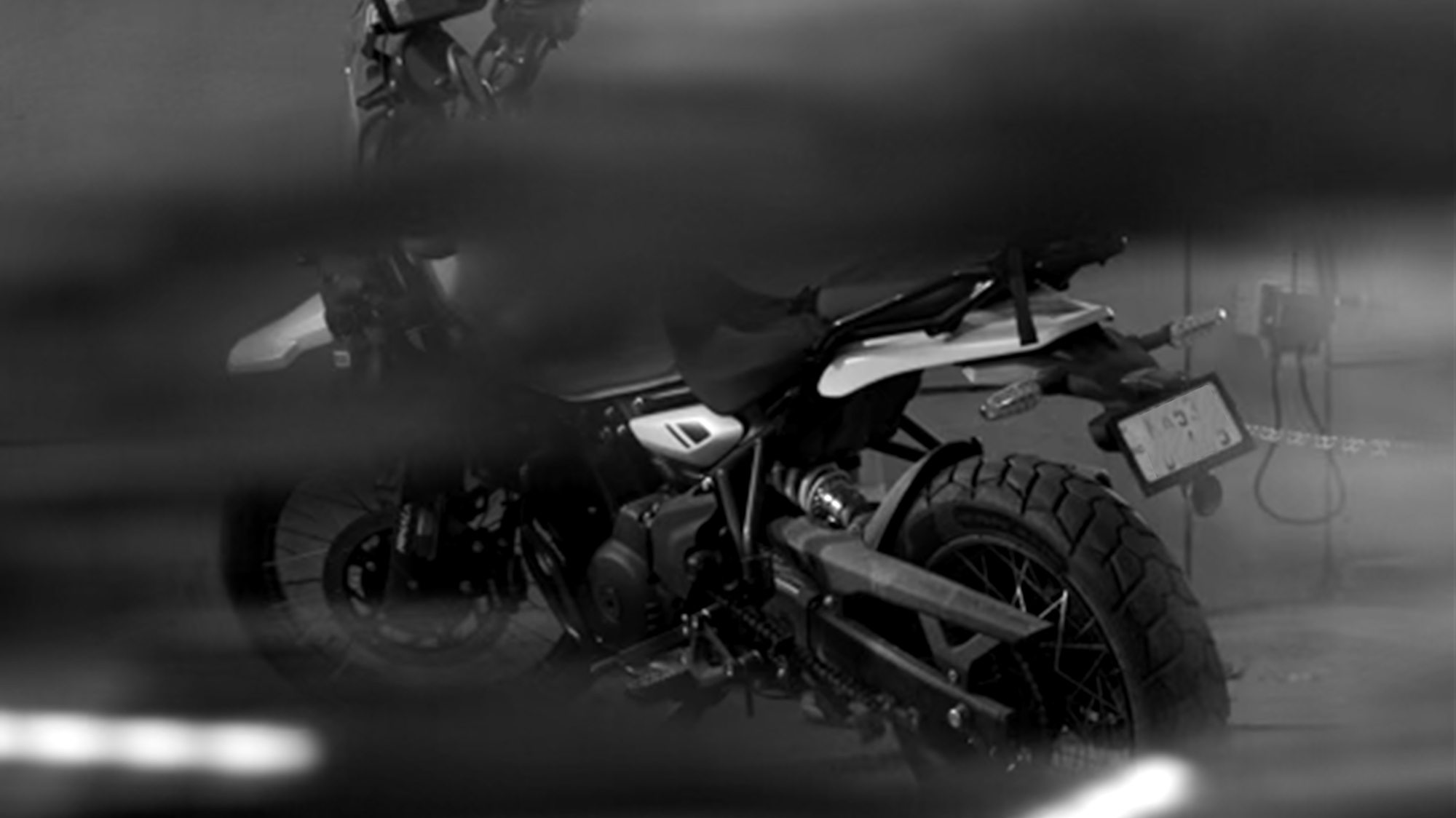
V took this photo in the River parking lot. He has—appropriate for a product designer—a good eye for composition and good taste in vehicles. (Committed to a cafe-racer-ed Husqy even in Bengaluru’s moving parking lots.) We’ll soon go for a ride together I hope.
The Space Between Letters
→
August 19, 2025 |
Reading time: ~1 minute | Permalink
Got this split keyboard a few weeks ago. Haven’t been able to use it well enough to reach a good enough WPM. But I am typing this post on it to keep the spirit well connected. This is a completely new and different way to access letters, and that slows one down a fair bit. (As intended.)
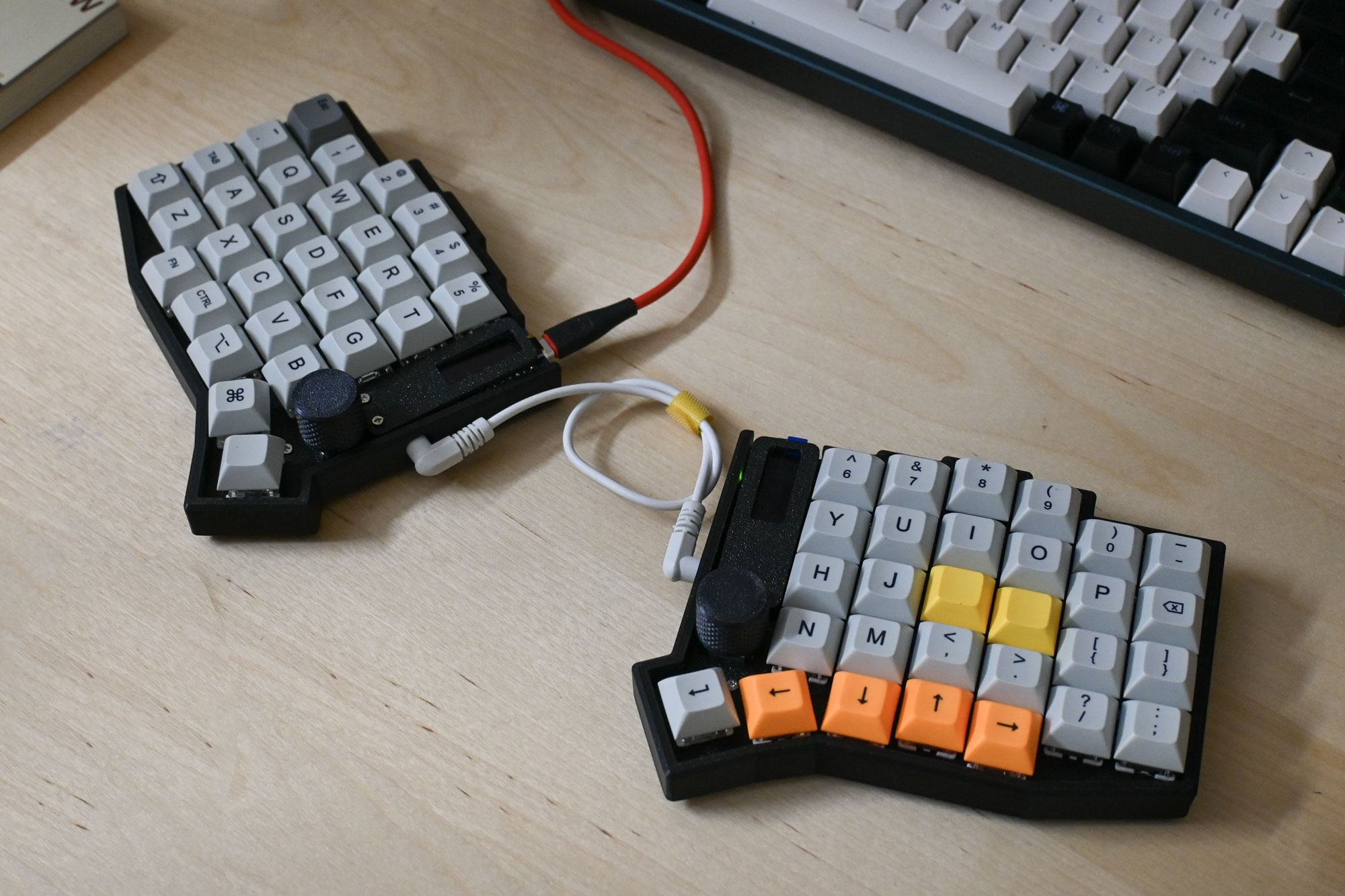
It is a Sofle V2 that M from the IMKB Discord built. There are blue Gaterons under the Orthilinear keycaps from Meckeys. The TRRS cable is the weakest link in this daisychain. Looking forward to getting a custom one soon. The rotary encoders work as brightness and volume knobs at the moment.
Last week R had a muscle spasm and it was really bad. She couldn’t move at all for three days. We took an (ill-decided) ambulance to the diagnostics center and that ride was all kinds of horrible. She’s back to walking—with some pain sometimes, but walking—thanks to physio and pain meds. The whole ordeal made us appreciate the good parts of life and realise again how bad most of life is for most people. More on all this later.
Stroke Weight
→
July 18, 2025 |
Reading time: ~1 minute | Permalink
Three/four dimensional samples from questionable sources. It is always nice to see things from the screen occupy space outside, even when the Pantone is a weathered memory of whatever it must be.
Shot with the lenscaplens. No Photoshop was harmed except for saving as a progressive jpeg at 2000px. I love the rainy-day-slash-old-film aesthetic on it.
It was 2009 and I was a wet-behind-the-wacom-ears intern at Co. Every now and then Mr. D would show us the ropes of form correction (or something similarly fundamental) with intent. In my memory, the ritual always starts with staring at the black and white form on Illustrator, stylus in hand, in silence. Then the slightest, deliberate movement of one or two of the many handles. Then a calculated pause. Then another handle moves an imperceptible bit. Then another. Then a short pause for a printout and the thing would restart, sometimes with a pencil on copier paper.
We would watch from the sidelines and from behind his chair, expecting hurried movements and complicated shortcuts. None arrive. The stylus-in-hand-deeply-lost-in-the-black-and-white-ness-of-it-all would go on for far longer than we think it would. Then another shift in the curves.
For someone obsessed with the efficiency of shortcuts and execution at the speed that the good-old franken-laptop allowed, this was a difficult circus to watch. I knew, by then, that Mr. D understood the software in ways I could only hope for then—and even now, and that he could play it like an instrument to a crescendo at the drop of a dropcap. So this ‘inefficiency’ was strange to witness. Why would someone so well-versed in the tool want to waste so much time ‘not’ doing anything, I would ask. In time—over weeks—I saw how quality of movement trumped quantity and speed in ways more than one. How ‘efficiency’ was a byproduct at best and not the meat of the journey. Each one of the slow-small movements was a step decidedly closer to what the form was trying to tell us. The silences were spent listening to the it. The small movements were a filtered, economised lot. There were no missteps or wasted moves. It was years later at Kala Ghoda, watching Sudha Chandran and crew dance (watching the larger-than-life shadows cast on the stage more than the three-dimensional dancers) that I connected this slowness to a level of dance that revelled in refinement and a quieter kind of efficiency. There were no missteps—no flourishes undeserved, no glances unnecessary. The moving shadows were an exercise in precision and grace.
Day before, on H’s recommendation, we watched an episode of Chef’s Table and sat speechless post. There is a scene where a mother and two daughters are making pasta (corkscrew trofie) by hand. Same feeling. Same graceful watching and learning and ’doing’ nothing unnecessary.
Over the years, thanks to how we (KL11) work, I have pendulum-ed between all-out efficiency and snail’s-paced-deliberation. Investing time and effort in systems (hardware and software) that trivialise repeat-tasks brings me a lot of joy on some days. I’m moved by purpose-made workspaces (physical and digital) to a point where sometimes it feels performative in an old-fashioned theatre-sense. (The kind that would make you say ‘overacting’ under your breath. Not the kind that inspires awe.)
I have a ‘Form-Correction’ playlist—some Tycho, some Paul Simon, some Malayalam Rap, and some white noise—that loops. Last week, trying to layout a set of slides for a hiring exercise, I realised how automated and far from the silent-staring ‘dance’ of it all I have come on this swing of the pendulum. (R bailed me out of that stuck-ness with simple, pointed reminders as to what she expected from KL11, and no-mercy criticism of the stuff that I was casually iterating.)
As—over the years—software starts to feel like the hardware it apparently replaced, one starts missing the accidents and slowness of progress that the hardware allowed even without you trying to be all WaldenPond deliberate. I miss homebound tracing paper sketchbooks the most. They balanced speed and deliberation in a way that ‘efficient’ use of software tends not to. This is not a call to go back to the ‘good old’ lead on papyrus days. What I am really interested in is slowing myself down with difficult hardware input. In making it harder to manipulate forms on a computer so the act takes longer. In putting myself on unfamiliar-usteady terrain to slow down and look. In forcing myself to weigh each potential choice against ten others like a chess player contemplating a move. In doing less and thinking more.
Guideline-aided-graphic-design isn’t working for me as well as it used to. There is a sense of joy in making predictable work that works but there is none of that standing-on-the-sidelines-watching-MrD-manipulate-beziers sense of adventure in it. I am going to try to be inside the head of that twenty-year-old self again. At least once in a while. At least once or twice a week.
Much navel. Much gazing. Back to checking what that AstuteGraphics license is up to.
Input and KadalaCurry We Believe
→
April 29, 2025 |
Reading time: 3 minutes | Permalink
The Orbit makes mouse-movements fun. Makes me want to download IOGraph again.
There is a near-divination-like quality to how the forefinger-middlefinger-trackball operates. I pretend (in my head, I’m not that confident yet to be seen as an odd character at the business-casuals-weekly-standups-type workplace setting) to be dealing with bezier-spirits and calling on them to help deal with filled-to-the-brim layouts and unwieldy InDesign files and curves that change direction without telling you.
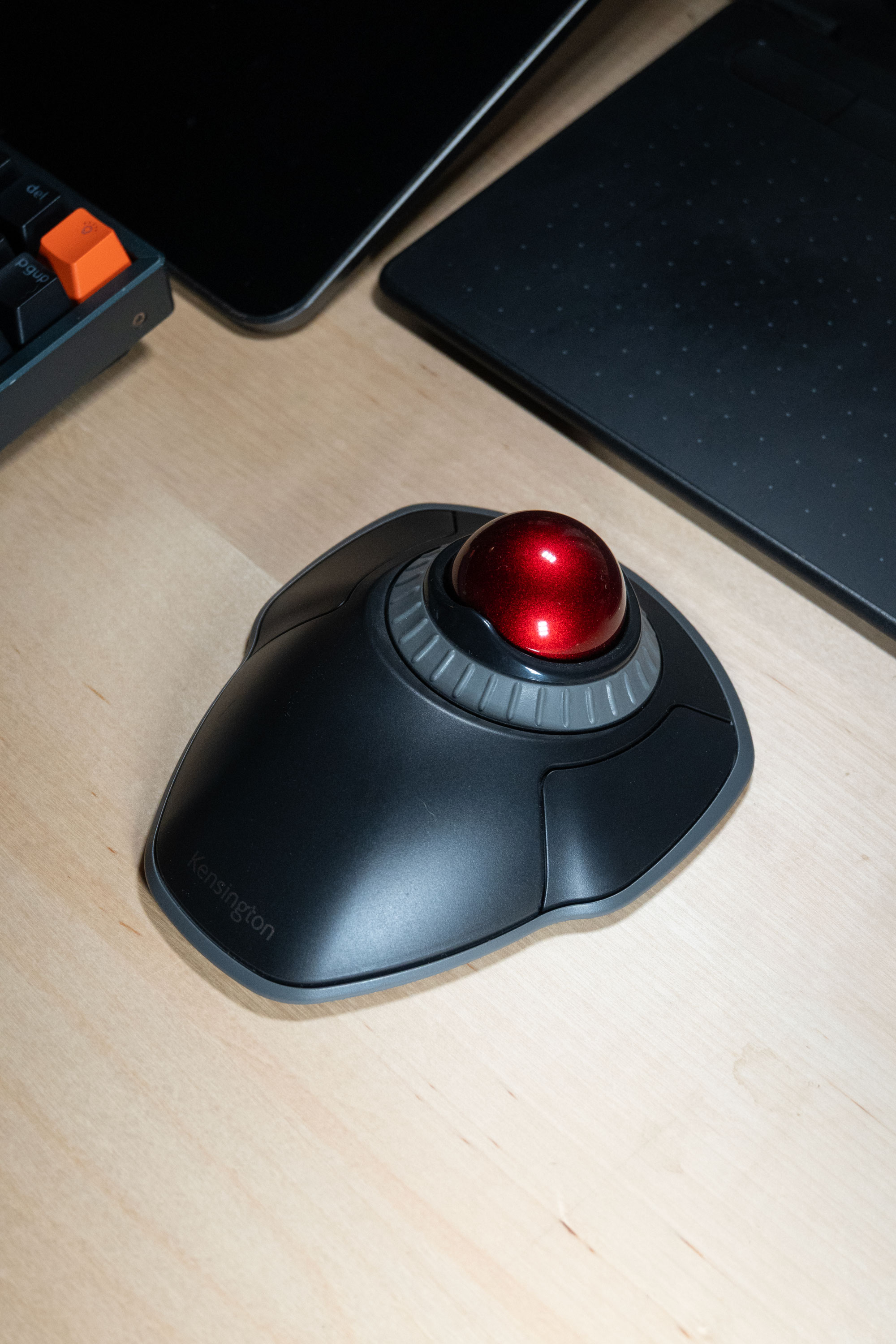
I bought this on a whim, having decided to experiment with input devices. My tool-use had gotten boring towards the end of last year. Now every trip to the menu bar feels like a mini-adventure.
It is not as accurate as the Logi Lift. Or perhaps I am not as accurate with it as I am with the Lift, yet. It is predictably inaccurate, though.
I have come to appreciate predictable inaccuracy after living with the Huion-with-its-own-mind for almost a year. The inherent newness of the trackball-led mousing is the only reason this device ‘feels’ inaccurate—is what I think. And that is something one can learn to deal with. It is like knowing how a certain hardware component has its quirks (predictable quirks, even if temperamental) on a device (or a tool or a vehicle) that you use everyday. (Podimol has a heavy clutch that needs a gentle pulling-out every 3/4 presses. That has now become muscle-memory and works well. The front brakes on my FourCorners sqeal once evry two/three rides and needs me to keep the lever half-pressed—like I am autofocusing them—for half-a minute so they stop.) The Orbit needs lasersharp focus working with bezier curves and text editing or anything that involves x-and-y-axes movements at the same time. The general accuracy one needs to work with for such tasks naturally maps to moving the trackball. It is nice how that trains your hand to be sensitive to small movements, too. Unlike the Huion, the Orbit doesn’t randomly ‘jump’ pixels at will especially when you are hyperfocused and making precise small movements. The clicks are not tied to the cursor movement, so the little jerks-on-click are no longer a thing.
The tablet feels actively hostile while the trackball feels like a challenge one needs to (and can) step up to.
The best use-case for the Orbit (or any trackball device, apparently) is with multiple displays and a less-than-ideal desk setup. The mouse doesn’t need to move around for the cursor to move, leaving a lot of area on the desk free for junk-accumulation and ‘research.’ Or just junk accumulation called research. The Orbit covers a lot of screen real estate with simple short flicks of the trackball and scrolls independently with the the scroll wheel. (The scroll wheel isn’t as fancy as the ones on an MXMaster or even the lift—no free-flow-scroll, no ‘weight’ to the scroll for it to ‘feel’ like quality—but works reasonably well with finer control than a typical vertical wheel.)
What I miss are the customisable buttons. Unlike the Lift or the tablets, there are no ‘extra’ buttons to help with ‘reverse/forward’ or ‘sideways-scroll’ or ‘snap-to-grid on/off’ on the Orbit. There is a two-button combo one can activate via the KensingtonWorks software, but that means leaving yet another input-tracker running in the background all the time.
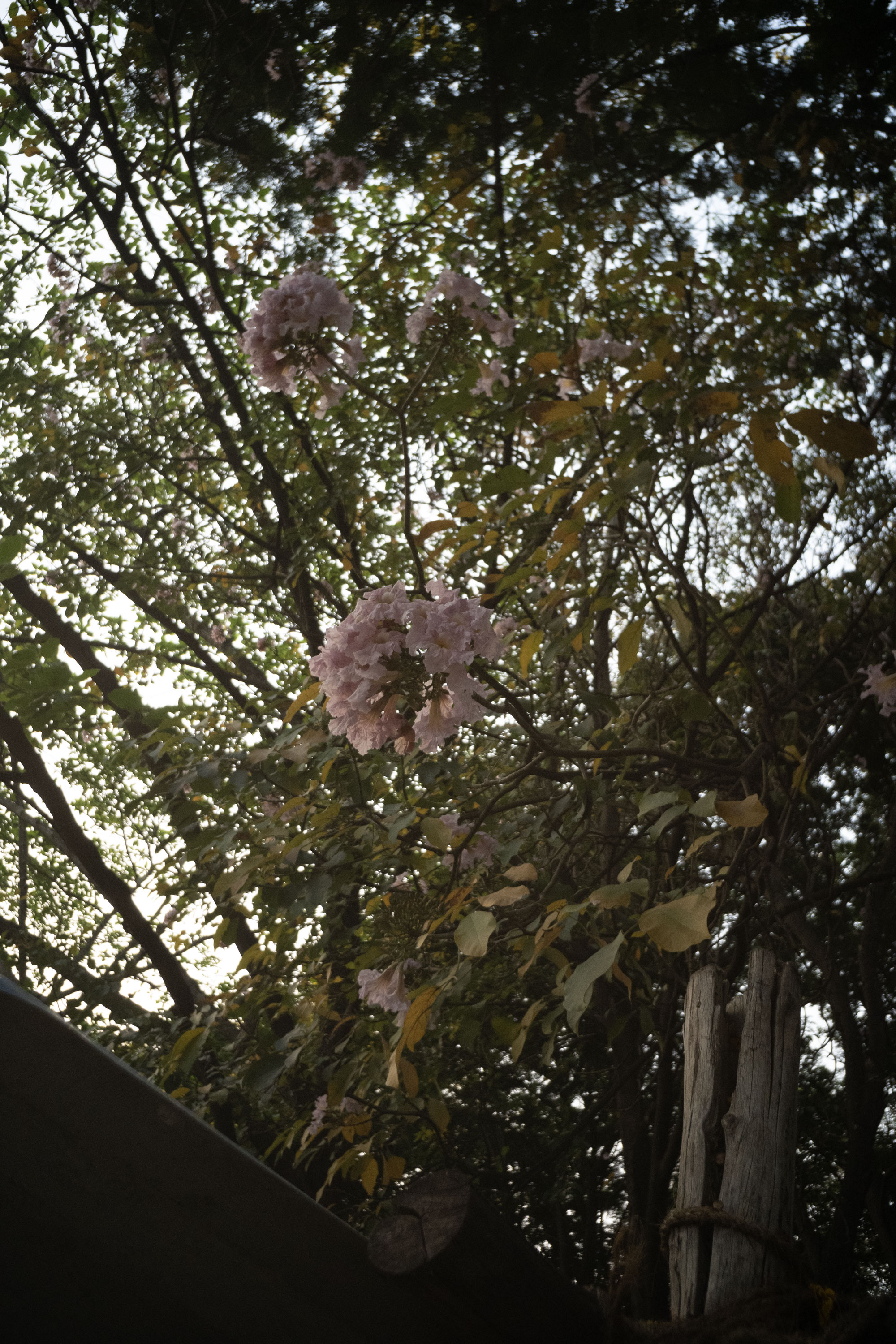
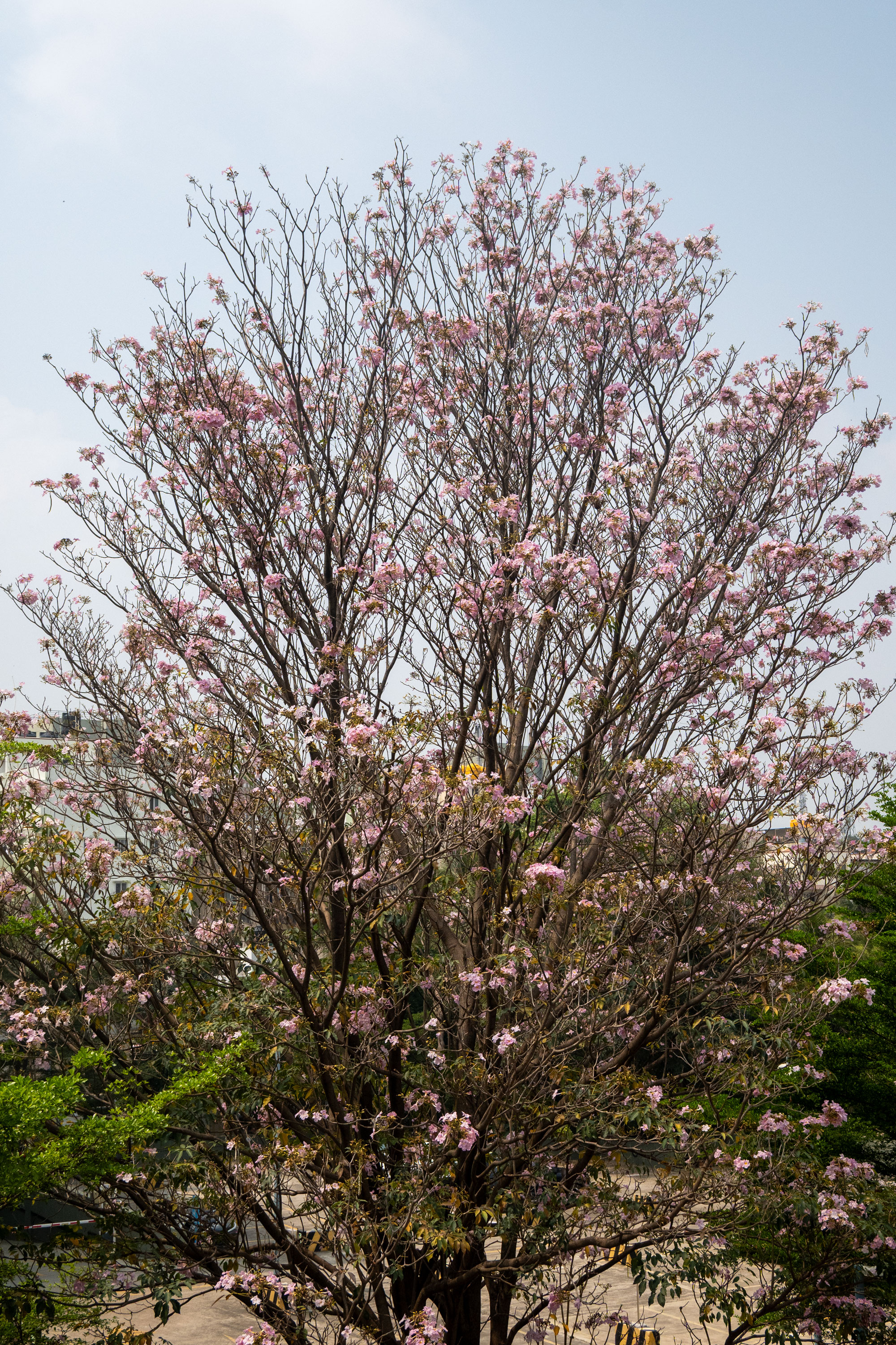
Tabebuias, 20250401
→
April 23, 2025 |
Reading time: 2 minutes | Permalink
This is from the smokingbalconey at River HQ, looking out into the SAP parking lot. I’d hang out in the passive-smoke cloud to look at this beauty allover March. Almost all pink flowers have fallen leaving the violet ones in the air. (The image will take longer than usual to load because I haven’t compressed the living daylight out of the colours. Joke, laughs at own, etcetera.)
Shot this one with the kit 16–50 mm (with an effing hyphen on the lens) and ‘Auto’ corrected in Camera Raw.
I am riding way more than I did in ’24. Commuting almost religiously by bike, thanks in no parts to certain rings that need closure. (More on that later. I wasn’t too wrong to wait till Series 10; I was wrong to not look into the ecosystem benefits earlier.) In trying to pack light (or none at all) I am relying more than ever on cloud storage and subscription fees. Interesting how lightening some loads always end up adding some somewhere else. I am stopping less often yet smelling more roses on the way. In true JustRide spirit, packing a raincoat instead of excuses. The mudguards are back on, with some less-than-aesthetic fasteners this time. Feels nice that I don’t seem to care anymore. Signs of wisdom—or just age.
The Brookefield roads are potholy but not with a set-dosa sort of frequency. The traffic is bearable enough (way better than the private bus hell that is Kozhikode) and geography is apologetic enough not to leave me a sweaty mess at 8 AM 9AM 10AM.
We got some Chandigarh-adjacent chairs almost too late and have lovelier longer conversations over food. Next time we do this, the first investments in a new place will be comfortable chairs and dinnerware. The cost to benefit ratio needs no second thoughts.
Tabebuias, 20250330
→
March 30, 2025 |
Reading time: ~1 minute | Permalink
Tabebuias above a semi-legal tea shop in Brookefield. The season is winding down. Straight off the 7Artisans 18mm f6.3 lens. Focusing on this is an exercise of its own. The images have that ‘almost conspicouosly inconspicuous’ quality that I really like. It is like a self-aware ‘meh.’
The sunset is behind me, reflected off Glass panels on the Capgemini building. I’ll shoot a better/prettier picture on Tuesday, from the smokingbalcony on HQ second floor. The SAP parking lot has a beautiful specimen.