Stroke Weight
→
July 18, 2025 |
Reading time: ~1 minute | Permalink
Three/four dimensional samples from questionable sources. It is always nice to see things from the screen occupy space outside, even when the Pantone is a weathered memory of whatever it must be.
Shot with the lenscaplens. No Photoshop was harmed except for saving as a progressive jpeg at 2000px. I love the rainy-day-slash-old-film aesthetic on it.
It was 2009 and I was a wet-behind-the-wacom-ears intern at Co. Every now and then Mr. D would show us the ropes of form correction (or something similarly fundamental) with intent. In my memory, the ritual always starts with staring at the black and white form on Illustrator, stylus in hand, in silence. Then the slightest, deliberate movement of one or two of the many handles. Then a calculated pause. Then another handle moves an imperceptible bit. Then another. Then a short pause for a printout and the thing would restart, sometimes with a pencil on copier paper.
We would watch from the sidelines and from behind his chair, expecting hurried movements and complicated shortcuts. None arrive. The stylus-in-hand-deeply-lost-in-the-black-and-white-ness-of-it-all would go on for far longer than we think it would. Then another shift in the curves.
For someone obsessed with the efficiency of shortcuts and execution at the speed that the good-old franken-laptop allowed, this was a difficult circus to watch. I knew, by then, that Mr. D understood the software in ways I could only hope for then—and even now, and that he could play it like an instrument to a crescendo at the drop of a dropcap. So this ‘inefficiency’ was strange to witness. Why would someone so well-versed in the tool want to waste so much time ‘not’ doing anything, I would ask. In time—over weeks—I saw how quality of movement trumped quantity and speed in ways more than one. How ‘efficiency’ was a byproduct at best and not the meat of the journey. Each one of the slow-small movements was a step decidedly closer to what the form was trying to tell us. The silences were spent listening to the it. The small movements were a filtered, economised lot. There were no missteps or wasted moves. It was years later at Kala Ghoda, watching Sudha Chandran and crew dance (watching the larger-than-life shadows cast on the stage more than the three-dimensional dancers) that I connected this slowness to a level of dance that revelled in refinement and a quieter kind of efficiency. There were no missteps—no flourishes undeserved, no glances unnecessary. The moving shadows were an exercise in precision and grace.
Day before, on H’s recommendation, we watched an episode of Chef’s Table and sat speechless post. There is a scene where a mother and two daughters are making pasta (corkscrew trofie) by hand. Same feeling. Same graceful watching and learning and ’doing’ nothing unnecessary.
Over the years, thanks to how we (KL11) work, I have pendulum-ed between all-out efficiency and snail’s-paced-deliberation. Investing time and effort in systems (hardware and software) that trivialise repeat-tasks brings me a lot of joy on some days. I’m moved by purpose-made workspaces (physical and digital) to a point where sometimes it feels performative in an old-fashioned theatre-sense. (The kind that would make you say ‘overacting’ under your breath. Not the kind that inspires awe.)
I have a ‘Form-Correction’ playlist—some Tycho, some Paul Simon, some Malayalam Rap, and some white noise—that loops. Last week, trying to layout a set of slides for a hiring exercise, I realised how automated and far from the silent-staring ‘dance’ of it all I have come on this swing of the pendulum. (R bailed me out of that stuck-ness with simple, pointed reminders as to what she expected from KL11, and no-mercy criticism of the stuff that I was casually iterating.)
As—over the years—software starts to feel like the hardware it apparently replaced, one starts missing the accidents and slowness of progress that the hardware allowed even without you trying to be all WaldenPond deliberate. I miss homebound tracing paper sketchbooks the most. They balanced speed and deliberation in a way that ‘efficient’ use of software tends not to. This is not a call to go back to the ‘good old’ lead on papyrus days. What I am really interested in is slowing myself down with difficult hardware input. In making it harder to manipulate forms on a computer so the act takes longer. In putting myself on unfamiliar-usteady terrain to slow down and look. In forcing myself to weigh each potential choice against ten others like a chess player contemplating a move. In doing less and thinking more.
Guideline-aided-graphic-design isn’t working for me as well as it used to. There is a sense of joy in making predictable work that works but there is none of that standing-on-the-sidelines-watching-MrD-manipulate-beziers sense of adventure in it. I am going to try to be inside the head of that twenty-year-old self again. At least once in a while. At least once or twice a week.
Much navel. Much gazing. Back to checking what that AstuteGraphics license is up to.
Gradient Retriever
→
July 24, 2024 |
Reading time: 3 minutes | Permalink
Made this ‘illustration’ [1] for Aruma’s second-floor grooming station windows+doors. The white bits (that spray-bottle, the standing dog’s legs, all white parts of gradients, speech bubbles, general bubbles, etcetera) are transparent and the other bits are translucent (frosty) for eager pet-parents to take peeks at their (our) kids getting their spa on. There is a photo of yourstruly bent over and eyeing a young Chellam somewhere on R’s phone.
My opinion is greatly biased and they’re the first (and sometimes only) place I trust with Chellam (and before her, with Kalyani). Chelgato had an uncharacteristic seizure (tests couldn’t say anything beyond ‘normal’) a couple of weeks ago and we are a bit worried. She’s been her usual complicated happy self since—is the report from home.
Said illustration. The grey bits are grey ACP walls.

And this below is on the ground floor windows. The left side houses a pet-supply store section so sunlight wasn’t welcome. Then, everyone got bigger heads. The right side is a waiting lounge and there is a decent amount of exposed glass there. I shamelessly repurposed stuff. This was ‘work-for-a-friend’ so no green pieces of paper changed hands. There was a huge bucket of fancy shampoo involved though. (We’re sorted for another two years I guess.)
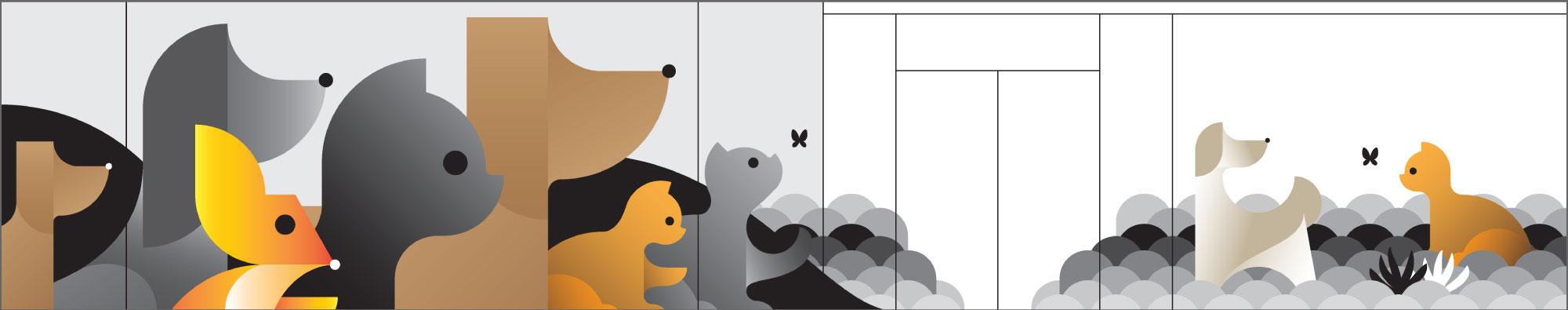
These are all—obviously—based on simple geometric shapes and an unhealthy amount of gradientry. If one clicked on that link in the first paragraph, one would also see that the symbol—unoriginal, but drawn ‘well’ by yourstruly—drove most of those decisions and not laziness. One can argue laziness drove some of the decisions when it came to the symbol, but that is somebody else’s beef. What I really loved doing was giving some of these playful poses, and—R says—obviously, drawing those wavy lines for the showerhead and hair dryer. There is a lot of copypasta that is too late to apologise for.
1: I say ‘illustration’ and ‘well’ in quotes not because I am not good at them. Make whatever of that statement, etcetera. That ‘well’ is also what I tell myself; to sleep fairly well without all the waking up worrying that I most certainly did eff something up somewhere. Just saw these files looking for door-stickers to River Stores (that now get updated, longer working hours like the rest of the country; hello, union budget!), and now my filing system needs some spring cleaning. See? I have bigger problems of ‘being good at’ to deal with. Recently, Ma at the HQ gave much wisdom in simple terms: no fire, nobody is hurt, Ar is not in jail, we’re good. That was such good life advise that I’m going to ignore and panic instead.
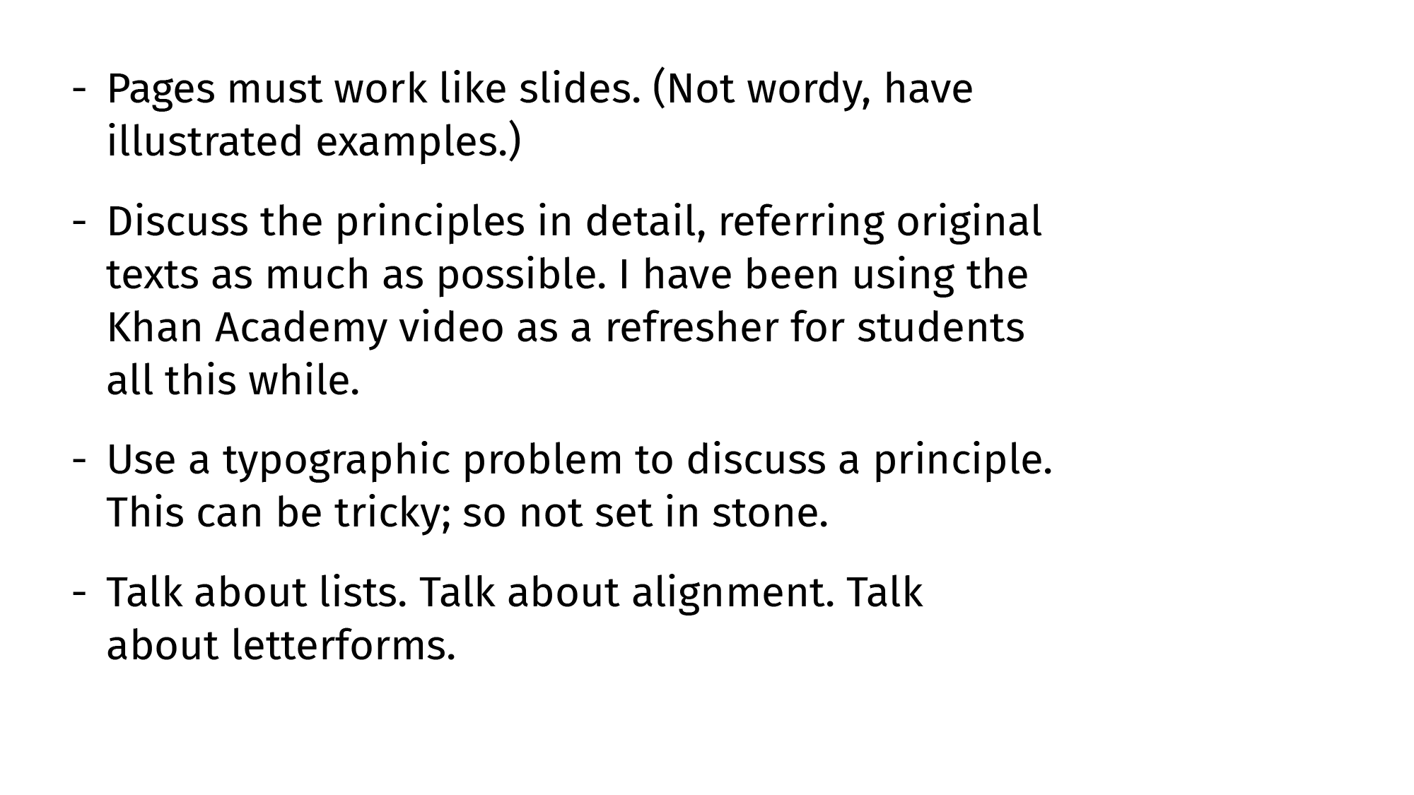
On Lists
→
July 11, 2024 |
Reading time: 8 minutes | Permalink
The List is a Paragraph That Stood in Front of a Mirror
Lists are one of my favourite things to typeset. I love how they are a near-perfect stage set for all the fundamental form- and type-related gymnastics in service of clarity and brevity. They are also so easy to mess up with the tiniest amount of extra paragraph indents or the wrong choice of bullets. The ‘risk’ thus involved is quite rewarding. I’ve also come to judge people (design people, not general people so much) by the lists they design. I find it easier to tell if someone is an excellent graphic designer looking at the way ‘bullets’ in their lists are indented, than by looking at tastefully rendered simulations of loremipsummed app screens.[1] Yes, I am fun at parties I don’t attend. Moving on.
What Lists Do
At the text level, the list strips away fluff even from otherwise well-sculpted paragraphs to surface all the crispy little chunks of stackable information. The list breaks walls of text into more ‘porous’ walls of text. Typeset well, the list pauses and takes stock of whatever has been, and whatever will be. Typeset carelessly, the list breaks the text’s flow into random islands where meaning keeps facepainted volleyballs for company. [2]
I Detest Bullets
Broken down to fundamental shapes that form them, ‘bulleted’ lists are an exercise in Gestalt theory. The directionlessness of bullets and our years of connecting dots to make meaning out of them are a match made in typographic hell. All the ‘dots’ form a line and the listed stuff floats away (sometimes together) looking like badly spaced (and punctuated) paragraphs.
Default Lists and Disconnect
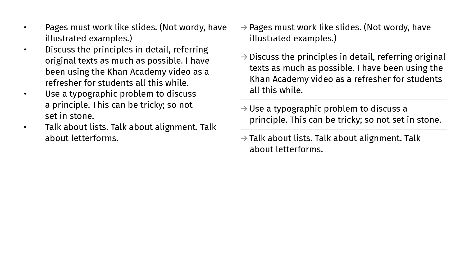
Here is an untouched (Default-Systems[3]) list straight out of Illustrator 28.5 typeset in 12pt Fira Sans (on a 1920×1080 artboard). I believe here is a basic Gestalt-principle solvable grouping-and-direction problem like almost everything else typographic.
When we look at the basic-shapes version of that default-list, the grouping issues are obvious-er. I’m cheating and made the text-blocks black [4] instead of grey. (Otherwise this would be obvious-er-er.) The textblock here is a group and the bullets are one kid with a pencil away from being a separate line.

Making Lists Work: Paragraph Spacing
Starting with the most basic of measurements (extrinsic), we must add an adequete amount of paragraph spacing to separate listed items into their own units. The list is no longer a paragraph-with-a-string-of-dots-for-company.
Paragraph spacing, like everything else vertical-spacing related, is a function of how much we lead lines of type.
Making Lists Work: Indents, Intents
After spacing list items better, we tweak the indents-to-bullets to make them more intentional. This indentation takes care of most of the grouping issues around lists but doesn’t solve the aimless dots-waiting-to-form-a-line problem, especially if the listed items are equally tall.

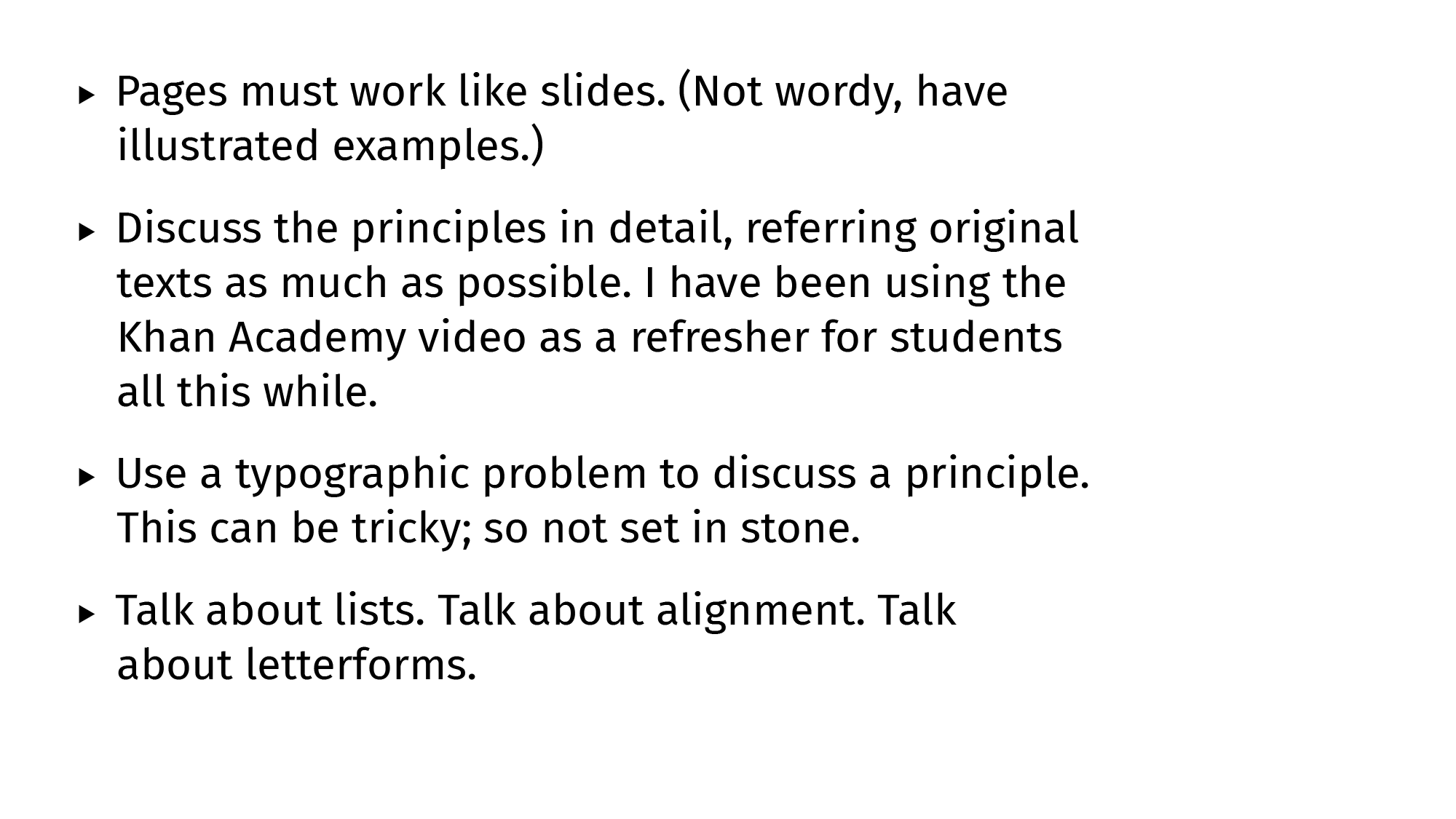
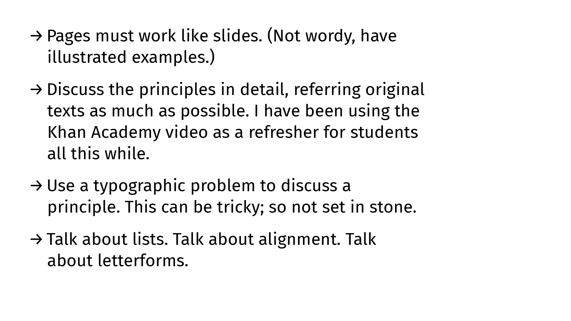
Making Lists Work: Directional Signs
For fixing this similarity-related problem, we need signs with a sense of direction to point to the listed items rather than to the other signs below. Countering similarity with suggestion works (lines suggest a horizontal movement stronger than the vertical similarity).
Triangles work too, as long as one downplays the similarity by making them small or grey.
A mix of both lines and triangles (arrows!) works even better given how obvious the ‘direction’ suggestion gets. It also helps that the font file has arrows too, and those glyphs are an even grey like the letters and punctuation.
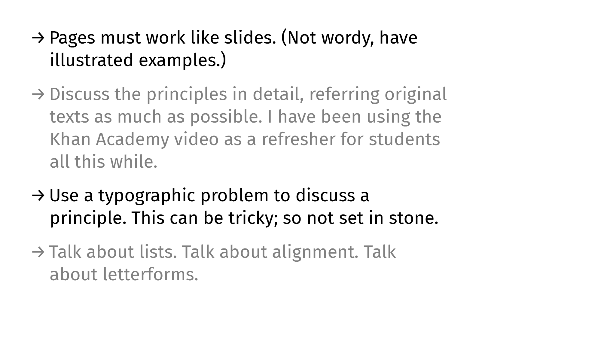
Optional: Alternating Rows
A fancier (not essential) way to establish even better grouping would be to iTunes-ify the list items. Either by using colour (values are a better way to go to keep the general group intact), or by using rules to break the last remnants of proximity-and-similarity-groups. Both are overkill.
B&A
No self-respecting guide is complete without a B&A comparison. Here.
This is an early draft (of Chapter 6) of the Gestalt-Typography book I’m not-writing writing over weekends. I haven’t managed to zero in on a tone for this yet. I also don’t really know what I expect out of it either. Is it going to be required-reading for T101 courses I mentor? Am I trying to be the ‘teacher who wrote the textbook’ and revel in the ego-boost? Etcetera, etc. There’s an unhealthy amount of self-doubt attached. Feel free to write in and tell me everything is fine. Or not.
There is way too much work at the River HQ that it’s started messing with life at home and going home. I take work home and work late nights (early mornings) after coming home late. I work early mornings after sleep evades me at a rest-break at 2 AM. Not proud of any of this. Too old to be able to be proud of anything after an allnighter. I haven’t withdrawn a salary in three months thanks to how oldschool our bank back at KL11 pretends to be. There is so much ad-hoc stuff to pdf-print now that there are more stores and more people and—finally—a space to work from in the HQ building. M tells me he has dreams about presentations typeset in Söhne. We need to balance all this better.
H joined the brand team two weeks ago but hasn’t gotten the necessary silicon for work yet. We’re also stuck in a hardware/software acquisition limbo that has reached Catch-22 levels of absurdity and pain. Piano-piano. We’re happy to have someone we can trust and have normal conversations with. Ru (UX expert) has been here for two months now. Same boat. Good people good at their work. Much peace when you think about them being around. Etcetera.
1: The best portfolio is a well-indented Resume with proper punctuation, clear hierarchy, and decipherable connections. Date this quote so I can somersault my way out of the responsibility later if necessary.
2: Cast Away reference. Appropriate because lead type.
3: Lined and Unlined: Default Systems in Graphic Design
4: Unrelated and fun read from Norma. Also read the rest of the logs.
Two Wheels and Some Juice
→
April 11, 2024 |
Reading time: 6 minutes | Permalink
I rode the Indie home and to places around WF for the past few days. Took the scooter to regular-mundane daily tasks and took it on dedicated test-rides in the night after the traffic thinned. (The photo looks like a potato-quality spyshot but that is just because I am awkward at taking photos in public. Even when it is early in morning and the only three people outside the chicken stall are more interested in other more pressing everyday stuff. R couldn’t take pictures because of the hurt leg and we are left with this crappybara I’m constantly apologising for. I even had to content-aware-fill the eff out of a piece of crumpled newspaper somewhere in the bottom left corner. See the bird-droppings on the seat above the pannier mounts? That is how ‘stock’ the vehicle was running. We’ll fix all this soon. Let R get well soon.)
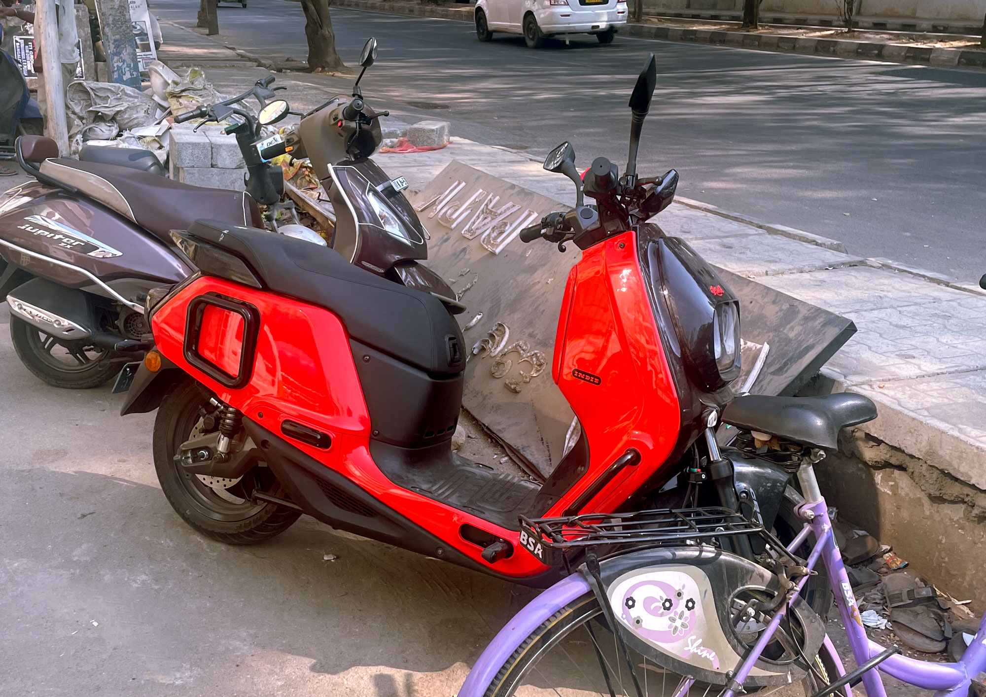
The scooter rides really well, planted to the ground as if it were a car with nice suspension. (Reminds me of podimol in many nice ways.) The last time I felt this amount of ride-refinement was with the Thunderbird 500 back in GurgaonOfTheFlatRoads[1]. Like all EVs, the torque is instant and it is fun to make the motor spin up on open roads. (The whine is divine.) The range anxiety is real (started most of my rides with under 50% charge and that is not a nice thing to have running in one’s mind or flashing in the instrument cluster) and reenacting the charging sequence reminded me of trying to memorise a particularly longwinded hydrocarbon in class twelfth. That—despite how my marksheets turned out—is not a memory I’m particularly interested in revisiting everytime the chariot runs out of juice.
The Indie is a beautiful machine with a lot of well-intentioned details. We’re working on the second version of a small part on the vehicle and it is nice to see assumptions from version one fail faced with the three-dimensional experience of riding the Indie and having to charge it at the shared bays in the HQ parking lot. Looking forward to making some small significant (and above all, friendly) improvements soon.
I also did some impulsive helmet buying. Unlike my usual matte black-grey-white-with-stripes palette, this one is ‘colourful’ to say the least. R was surprised and went on to say she doesn’t recognise me anymore. I know she wasn’t talking about the second (tinted) visor-lette having come down over my grin-painted face. But the point remains noted.
There was a particularly busy traffic situation near Brookfield where I stopped next to an RE (a Bullet 350 with the golden 3D logo on the tank; not the retrofitted abomination that passes for decals at RE these days[2]). It was nice. Was happy and talked to R about it when the traffic situation let me get home sunburnt.
In other news, showed myself the proverbial door at the current temporary office this morning (before getting thrown out ceremonially perhaps; my ego wouldn’t have been able to take that fall after all the serendipitous traffic-light spotting of beziers). Looking for a tea-break friendly room and working from home till that materialises. After all these years wringing pixels behind oddly angled screens held together with velcro and bulldog clips (and sheer force of will to continue making a reasonable enough living), a proper workspace is something I’ve come to care the most about (after certain other things in life, ofc) and it is not okay to compromise. There was something that S wrote about that I wanted to discuss here. Will soon. Context.
There is a lot of work to finish. Some of it is exciting. Some of that exciting work is tweaking carpet designs in the middle of the day and tweaking them again much later. Some of that exciting work is mundane out of context but take a lot of patience and craft. (Like putting vehicle loan options and terms and EMIs in handout-friendly A5 cards. Or a 3-by-9 cm newspaper ad for hiring store staff. This last one I had so much fun with.) We are looking for capital G graphic design people to help do some of that boring/tedious work that needs an unsustainable level of attention to detail, fairly advanced typography/gestalt chops, and a lot of empathy and humility. If this sounds like I’m trying to glorify tedium and perfectionism and all those ideals that usually work against people having a life, apologies. I have heard what Carson had to say about graphic design saving the world. Also read this Nick Asbury essay on ‘purpose’ and fully agree. None of this work is ‘noble’ in itself but are good opportunities to manipulate form and order in service of someone’s experience. (Send in a PeeDeeYeff CV via hello-at-kl11-dot-in if still interested. Know that we expect a significant amount of fundamentals-in-place-ness and an unconditional willingness to work on many many many versions of things; we too do this. We also pay fairly well while being sufferable bosses.)
1: The difference is that I did not want to get one for myself immediately then, given how smitten I was with the Classic with the upswept silencer.
2: I wonder how the current B350 tank graphic even passed the basic-est of reviews. Can hear Mr. D grind his teeth everytime one enters my line of sight. I believe crapfest is the most family freindly technical term to describe that waste of materials and space. Like how a friend’s new boss describes stuff, I must start saying ‘shambolic’ and ‘gargantuan’ and suchlike.
Serendipity Now!
→
December 16, 2023 |
Reading time: 2 minutes | Permalink
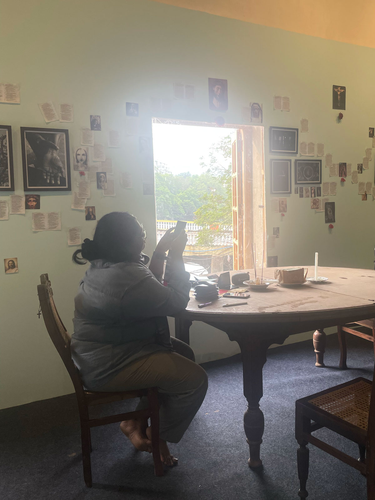
The photographs are up along with the roses and rosaries and pages off the Book and the mouldy old bread and the candles burning and the light filtering through hastily pasted acrylic panes over window panes at the Old PWD Complex in Panjim. R’s Mother Beloved is on display till the 23rd. We are here till the 17th and would love to have any of my three regular readers to check in if around. More on all the prep later (we did some lovely die-cut exhibition pamphlets in black and red). Here is the day before the day before.
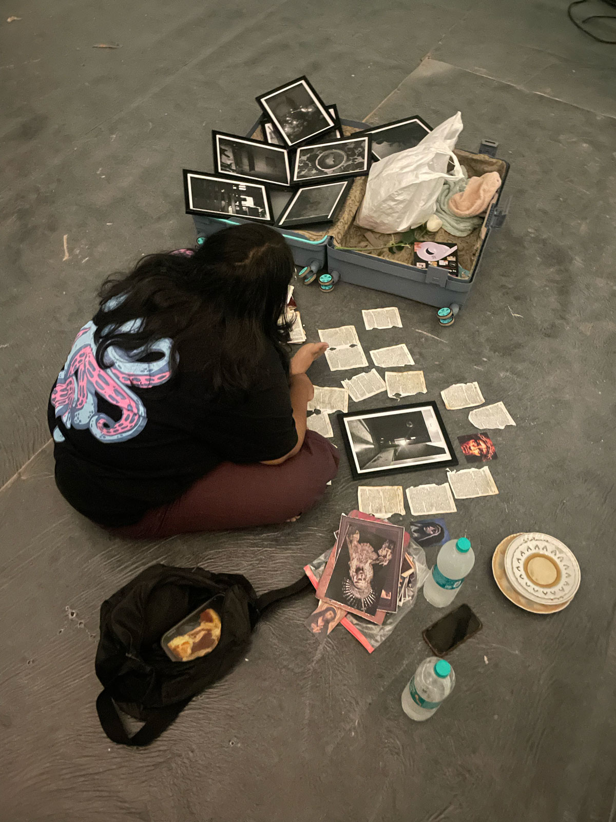
In the evenings there is mellow music and loud lights. Yesterday was lovely except for people trying to one up Lucky Ali (one simply can’t) at O-Sanam (especially). The streets are full of art and -ists and people and dogs. Gradients are out in full bloom. Viva Panjim is quite and lovely and feels like home.
R took the nice photograph above, obviously. We are here, R is hopeful and tensed. Wish her luck.
It Flows
→
March 5, 2023 |
Reading time: ~1 minute | Permalink
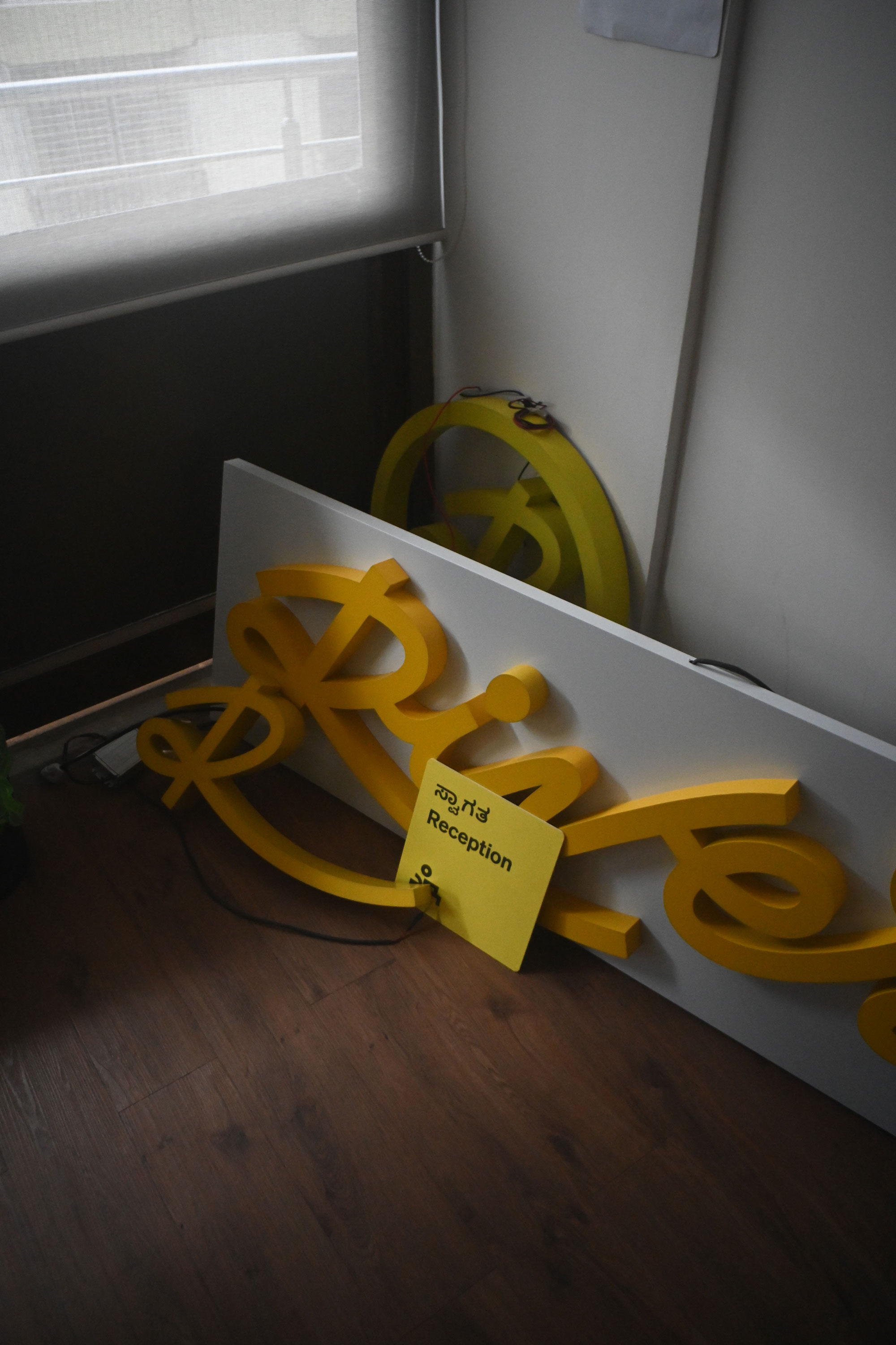
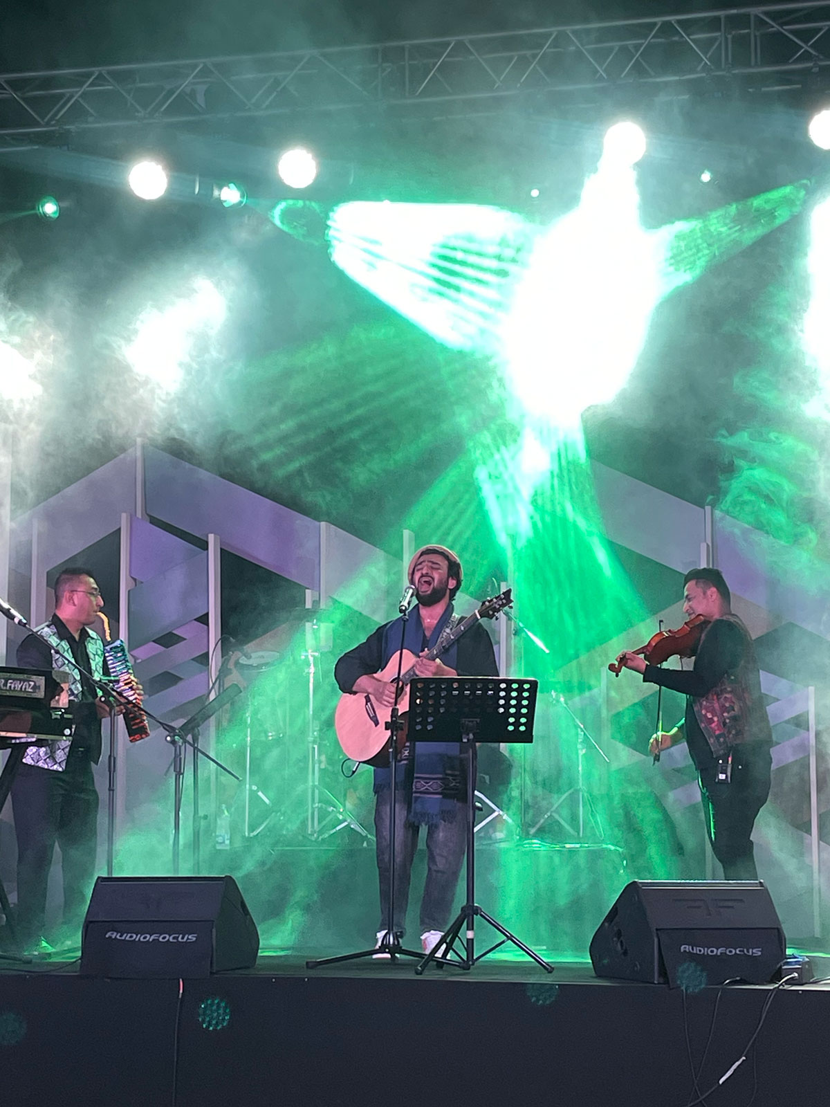
We have been working with the River team from when it was just the two founders looking for an office and a name on the office-door. They unveiled the Indie last week; it was a sweet-as-in-dreams milestone on a long and eventful and hair-pulling-tense journey. (The event was also a millstone on a hectic two-way bus-trip from and to Vijayawada—perfectly in the middle of a supershort course—over a day and two nights. More on that—hopefully—later.) There is so much behind-the-scenes on this project we may need a microsite for it on KL11.
At KL11, we had a lot of help from a lot of folks; some new friends, some old. We had help with visual design, iconography, photography, copy, animation, web—everything. We also grew in new and fun and painful and rewarding ways as an ‘organisation.’ I had sleepless nights and work sandwiched between more work and winter-courses than I could physically endure. And seeing the logo writ large and small on stages and backdrops and products and webpages and over videos makes it somehow worth all that trouble. I’m not sure I will do all of that nightoil burning allover again, though.
To the Print-shop, With Love
→
December 27, 2021 |
Reading time: 7 minutes | Permalink
Great print-shops don’t just print well; they reciprocate your love for print.
It isn’t often (more like never than ever) one looks forward to seeing a PDF that has gone to the printer come back all inked and kissing paper in ways nicer than what the screen approximates. It is rare for a printer to be consistently good at what they do at prices that aren’t approaching personal-scribe levels of indulgence. That brings us, conveniently, to this thinly disguised love-letter to our friendly neighbourhood print-shop in Kozhikode. Trendz (Flash? TrendzFlash? FlashPrint? I never get that right or anywhere near consistent; you will see.) is a big-ish floor of discerning (but mostly—for no fault of the shop’s—restless) people seeking print-outs (mostly Xeroxed copies of huge A1 sized architectural drawings, lanyards of pretty colours, large sheets of business cards that most definitely need to fit into A3-express-es and not just A3s, etcetera), unimaginable-otherwise-ly patient designer-DTP-professionals who know what they are doing and are in no hurry to let you know they know, the odd Errando person who is amused and restless in turn (thanks to how crowded and how on edge the rest of us leave the floor), etcetera. Trendz can print white (and silver, and gold) on all kinds of paper and not-paper. Trendz can print and frame photos on canvas. Trendz can print on off-the-menu-paper if you promise to bring it (the paper). I don’t think they can walk on water. I haven’t asked for a quotation for that, yet. The point is that printing at Trendz is much more exciting than it theoretically has any right to be.
Printing is meant to be hit-or-miss (hit-and-miss) in most small-ish towns. We were worried about finding passable quality printers in Kozhikode moving in, in 2014. Then we found Trendz and haven’t looked anywhere else yet. (I—regrettably in 20/20 hindsight—did, once, in 2018. I apologise for the Pantone promiscuity.) The flat swathes of colour don’t look like a second-year textile-design-student’s weekend (no-lines!). The flat-colours are flawless. The flat colours sing in that special voice only coloured-paper does, otherwise. The registration, while not perfect under bright light and some push-pins, is easily masked with 3mm bleed on all sides. The colour reproduction is great, considering how slightly off all the monitors at the home-studio-setup tend to be; the shades almost match their Pantone swatches more often than not. They’re great even with bad (RGB) sources. They’re good with scaling/cropping/flipping/rotating. You don’t have to ask them to ‘leave the artwork be, don’t fit it’ every time a PDF goes to get birthed again. Etcetera. You know what I mean. This is print the way print should be. With people-who-care manipulating the machines. Etcetera.
The people there are perhaps overworked but manage to find joy in helping when they hear you speak of spot colours and wait patiently behind their supposedly revolving chairs. I have had plenty of time watching people like B-chechy at work on CorelDraw and Photoshop (she admits she’s not good with Illustrator, fixing white spot-ink selection for my sorry CC-ed ass) and I am convinced she/they can race me to a corner, with their left index finger alone finishing alignment on some unnecessarily complex client-layout. I watch them deal with pressure and a need for making things right. I watch them deal with disillusioned customers after they realise source-quality matters. I watch them levelheadedly deal with bad contrast and esoteric typeface selection. I watch them deal—with grace—with fellow enthusiasts who are eager to teach them how to do their jobs. Often the younger ones would crane their collective necks to B-chechy and ask for expert advice on some obscure paper-sizes or print-processes. (I just go straight to her or to one of the print-engineers who come out and work the DTP-end once in a while. There was a DQSellman-haired youngster there who used to be a pro, too, but I think he found greener Pantones.) The work isn’t easy, with people whose mental-models of how print works is modelled after wide printer-margins and ant-sized type on everything, demanding multiple edits at once and ‘discerning’ eff-ers like yourstruly looking for a special-colour-on-craft-paper fix to deal with loneliness, and some misguided sense of purpose. Etcetera. The lady at the counter (simply, chechy), a lean, forty-plus-ish looking woman of impeccable dress-sense and solid work-habits (who reminds me of a Maths teacher that likes to moonlight as girlshostelwarden for kicks) is curt in a likeable way with impossible arguments and requests from customers. She’s all politeness and care the moment she spots my mug from across the counter; because I have learnt the superpower (the only one that makes sense at a print-shop) is patience. Patience and an ability to bend and support yourself on your knee-balls without weirding out the designers. So, counter-chechy (whom I assumed to be Christian—but isn’t; she worked the day before Christmas so some colleagues could take the day off—for the longest time because of her convent-like manners) is all efficiency and nothing much else, often. (She recognised me through the one-and-a-half inches of exposed specs and said ‘goodmorning’ as she walked in late today. It felt great. No. Scratch that. It felt effin fantastic and I smiled through all six layers of my mask.) Even the behind-the-scenes-but-actually-the-whole-scene-people, the print-engineers (including R and the chettan with many threads on his wrist) are fantastic beyond their job-title. Most would come out with your print and make sure things are okay before they commit acres of forest to torture.
Trendz recently got a Xerox Iridesse press to Kozhikode and I had been waiting to print with speciality inks. We have been working with an EV startup that doesn’t call itself such, for the past year, and had the opportunity to make something that stood out in print for their up-coming presentation at CES. The covers (C1 through C4) are craft-paper and white and glorious, printed at T. I had to keep myself from ordering unnecessary test-prints after the first two. I’m looking forward to picking fifty copies up in the evening.
The white isn’t screen-print-thick (of course) but has that nicest of show-throughs when looked at from an angle. The paper feels great. And the whole affair smells great—kerosene-ey and paper-ey in equal measure while managing an essential earthy nuance. It screams ‘ecofriendly’ in subtler hues than green.
So, yes. We have a great print-shop in town and this is—as promised in UG-third-year—my love letter to the place. Please don’t crowd our little slice of ink-paper-heaven on weekday mornings; that’s when we get our kerosene-pulp-fix. If you choose to anyway, maybe we’ll let the shop-folks know how well-loved their work is.
WaterFountain: PDF Drift
→
February 11, 2021 |
Reading time: ~1 minute | Permalink
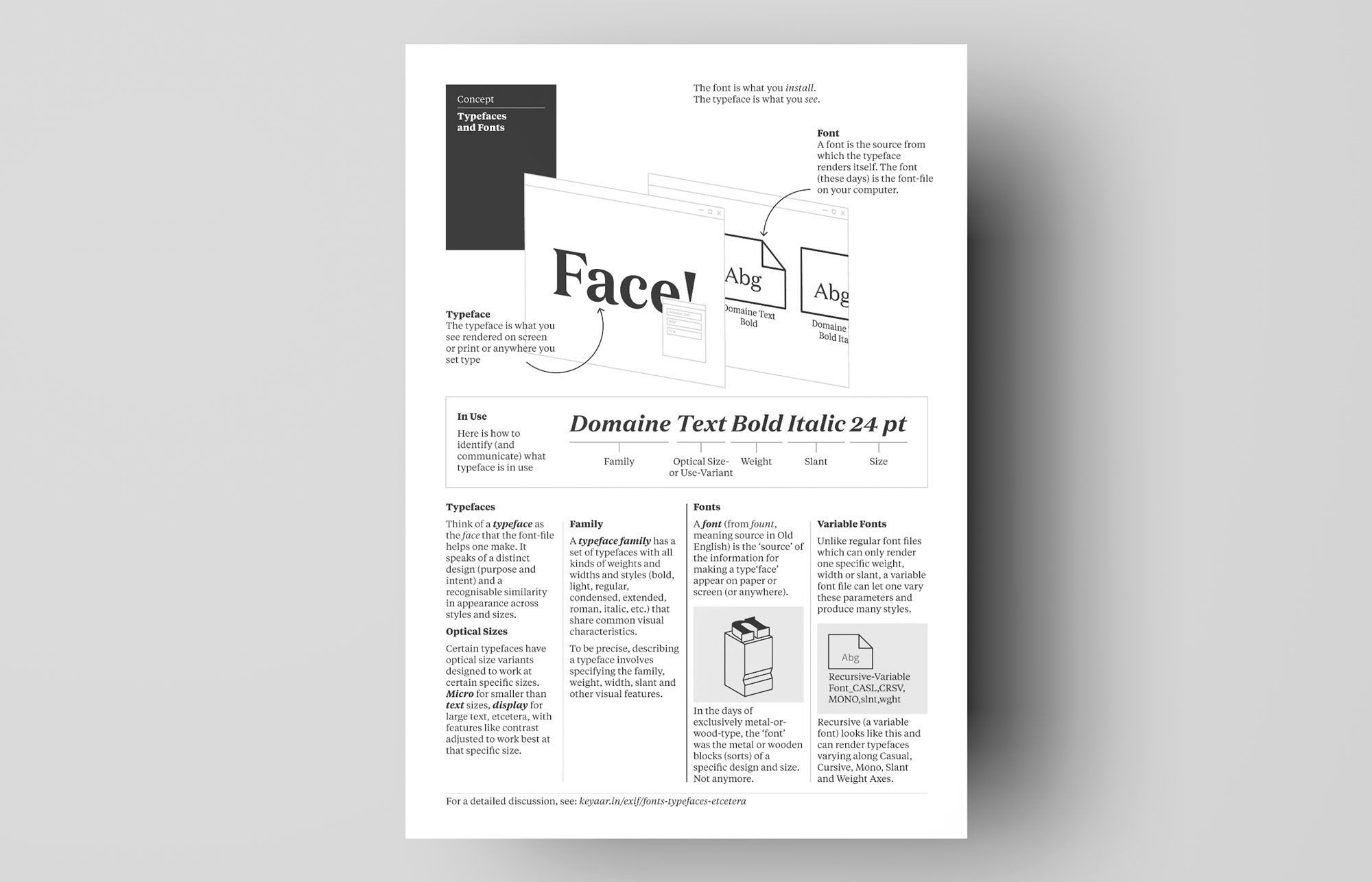
Here is a pixels-and-ink version of the ‘fonts vs typefaces’ discussion as a printable A4-sized PDF. Feel free to use in a classroom (thankses!), pinned on a board, printed and made a boat out of, wallpapered on a PC (why?), etcetera.
Download (PDF, 106 KB)
MalayajaMaruthan: The Wind Blows
→
November 1, 2020 |
Reading time: 2 minutes | Permalink
Here is a thing I was part of, for Keralappiravi day. (My sunlit mug comes in at around the 3:50–3:51 mark; don’t blink too much or you will miss it.) The rest of the folks are all very good at what they do and it was doubly nice to see a former student of mine in there! (Do they ever become ‘former?’)
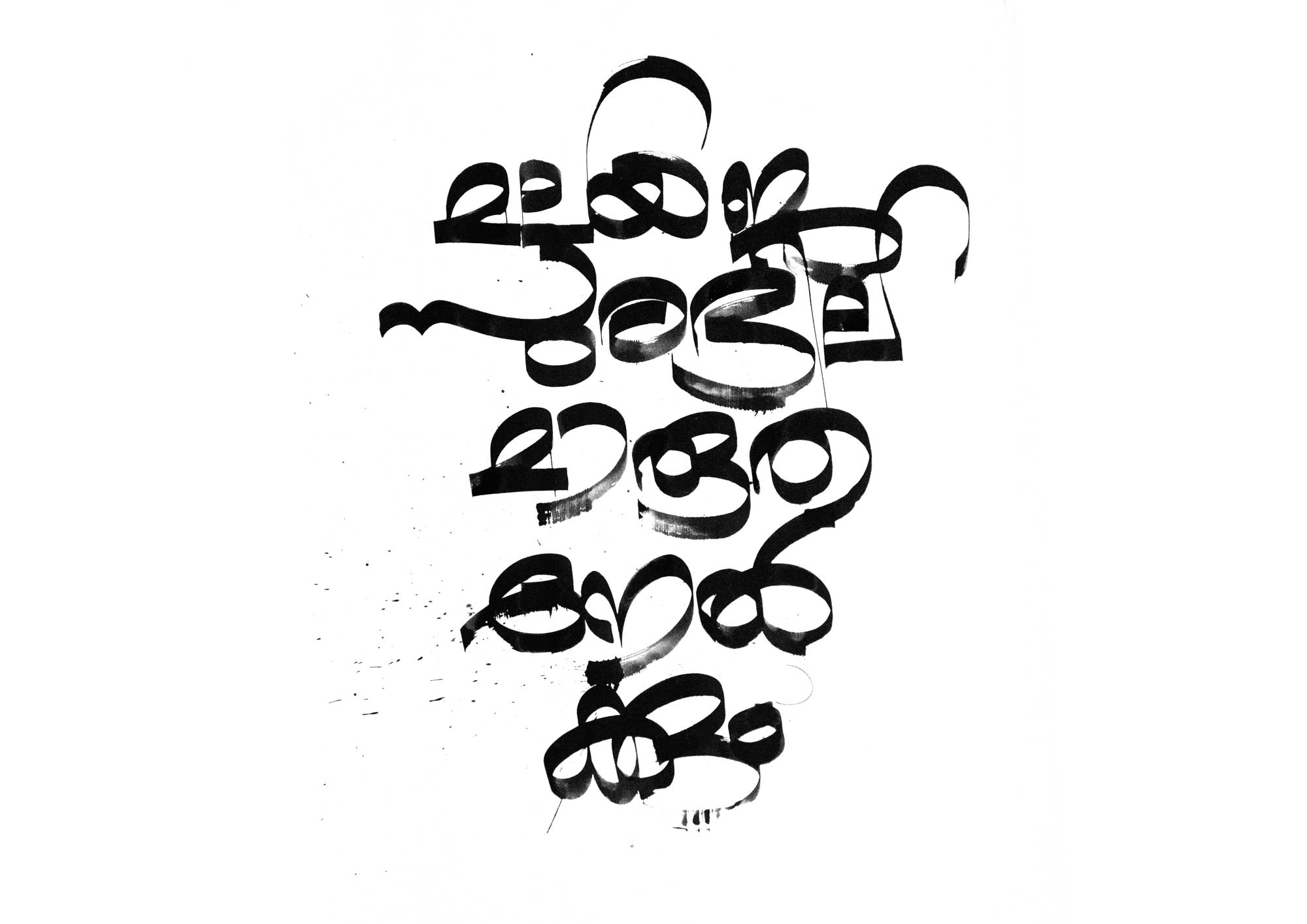
This (and the others) illustrates Bodheshwaran’s 1938 song on what makes Kerala, Kerala. My bit reads ‘malayaja-surabhila-marutha-nel-kkum’ and translated, that says touched by the richly sandal-scented breeze. UnniMaman explained the meaning in detail and suggested we shoot against some trees. (He is my first calligraphy-teacher and used to cut normal-tipped sketchpens into chiselled tips as if by magic. These letters reference what I remember from the college magazines he used to lay-out by hand.)
R shot the clips and framed it so the sunlight made it all look presentable. Thanks to GV-sir for the opportunity. Thanks to Somettan and Vijayettan for forcing the coconuts to fall so they didn’t have to on their own, ruining the shoot.
Here is the un-hyphenated (normal? broken?) composition, drawn on cheap-ish chartpaper with a dip-pen and counterfeit Parker Quink. There were so many trials before this one (and after) since I was nervous and the papers kept texturing the letterforms where I didn’t want them to.