On Lists
→
July 11, 2024 |
Reading time: 8 minutes | Permalink
The List is a Paragraph That Stood in Front of a Mirror
Lists are one of my favourite things to typeset. I love how they are a near-perfect stage set for all the fundamental form- and type-related gymnastics in service of clarity and brevity. They are also so easy to mess up with the tiniest amount of extra paragraph indents or the wrong choice of bullets. The ‘risk’ thus involved is quite rewarding. I’ve also come to judge people (design people, not general people so much) by the lists they design. I find it easier to tell if someone is an excellent graphic designer looking at the way ‘bullets’ in their lists are indented, than by looking at tastefully rendered simulations of loremipsummed app screens.[1] Yes, I am fun at parties I don’t attend. Moving on.
What Lists Do
At the text level, the list strips away fluff even from otherwise well-sculpted paragraphs to surface all the crispy little chunks of stackable information. The list breaks walls of text into more ‘porous’ walls of text. Typeset well, the list pauses and takes stock of whatever has been, and whatever will be. Typeset carelessly, the list breaks the text’s flow into random islands where meaning keeps facepainted volleyballs for company. [2]
I Detest Bullets
Broken down to fundamental shapes that form them, ‘bulleted’ lists are an exercise in Gestalt theory. The directionlessness of bullets and our years of connecting dots to make meaning out of them are a match made in typographic hell. All the ‘dots’ form a line and the listed stuff floats away (sometimes together) looking like badly spaced (and punctuated) paragraphs.
Default Lists and Disconnect
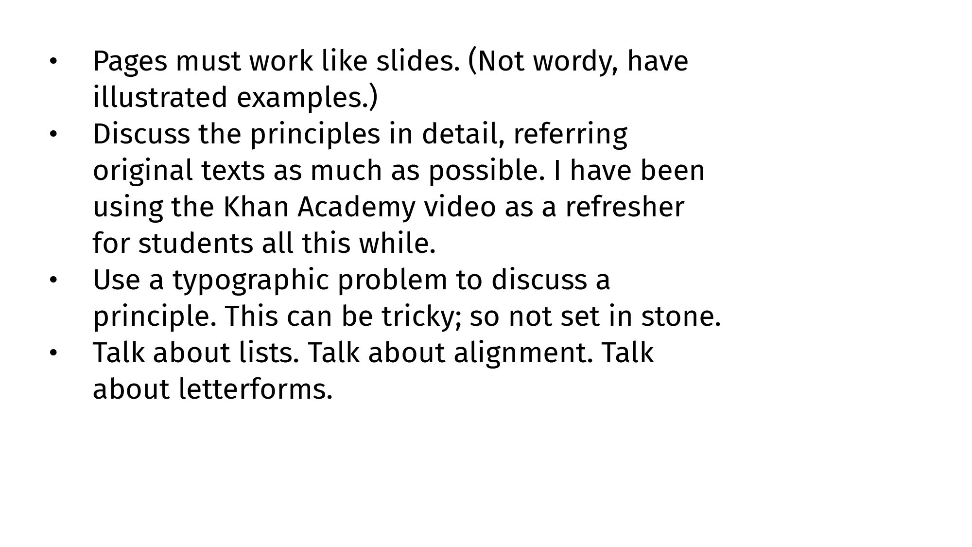
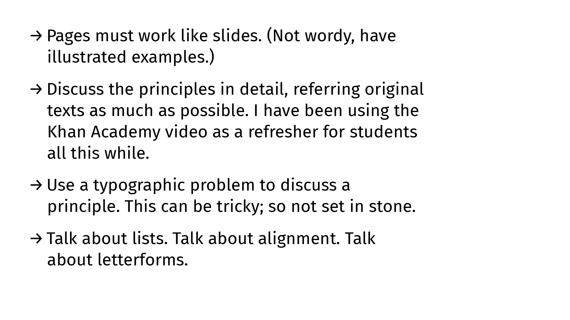
Here is an untouched (Default-Systems[3]) list straight out of Illustrator 28.5 typeset in 12pt Fira Sans (on a 1920×1080 artboard). I believe here is a basic Gestalt-principle solvable grouping-and-direction problem like almost everything else typographic.

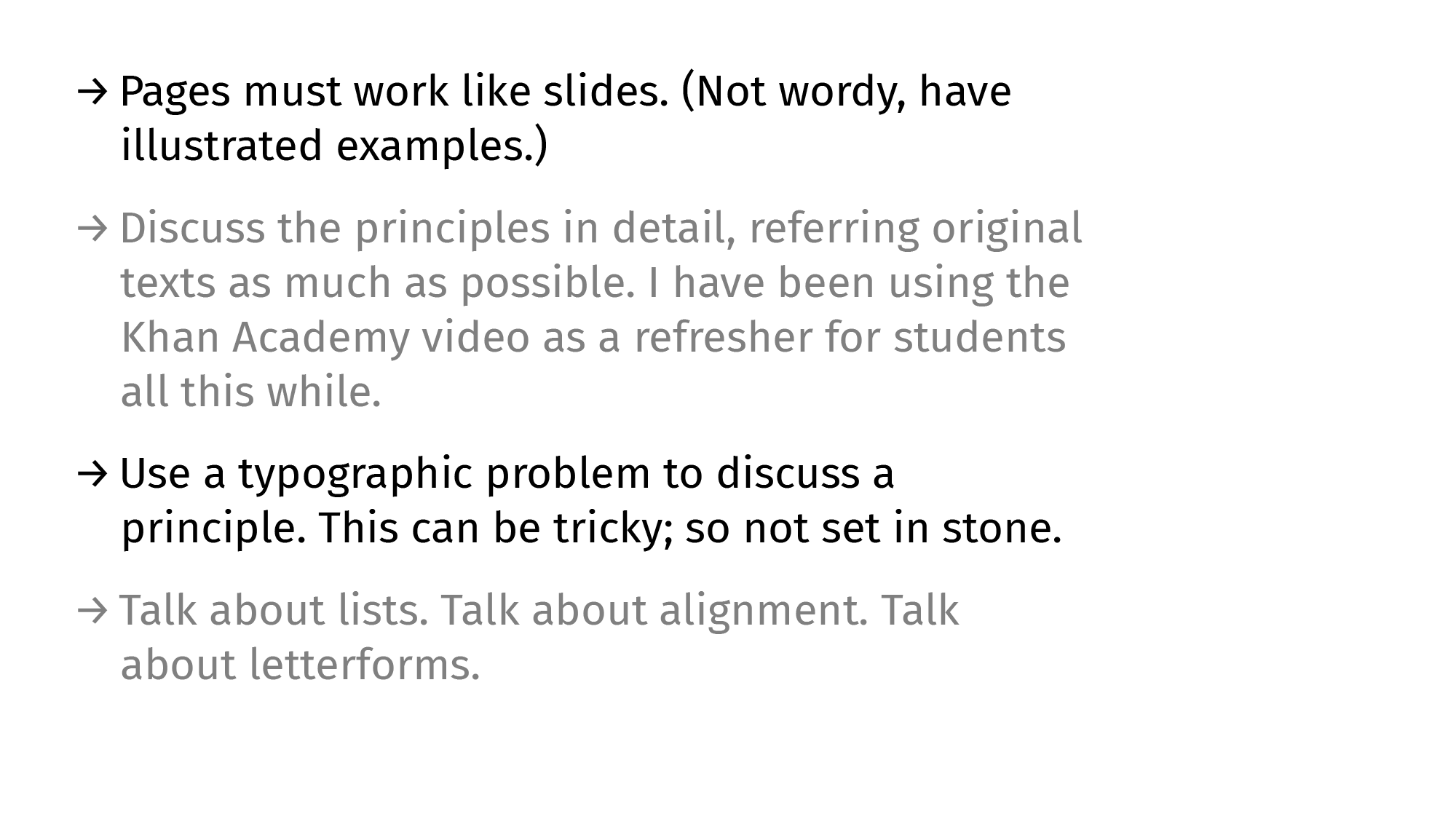
When we look at the basic-shapes version of that default-list, the grouping issues are obvious-er. I’m cheating and made the text-blocks black [4] instead of grey. (Otherwise this would be obvious-er-er.) The textblock here is a group and the bullets are one kid with a pencil away from being a separate line.

Making Lists Work: Paragraph Spacing
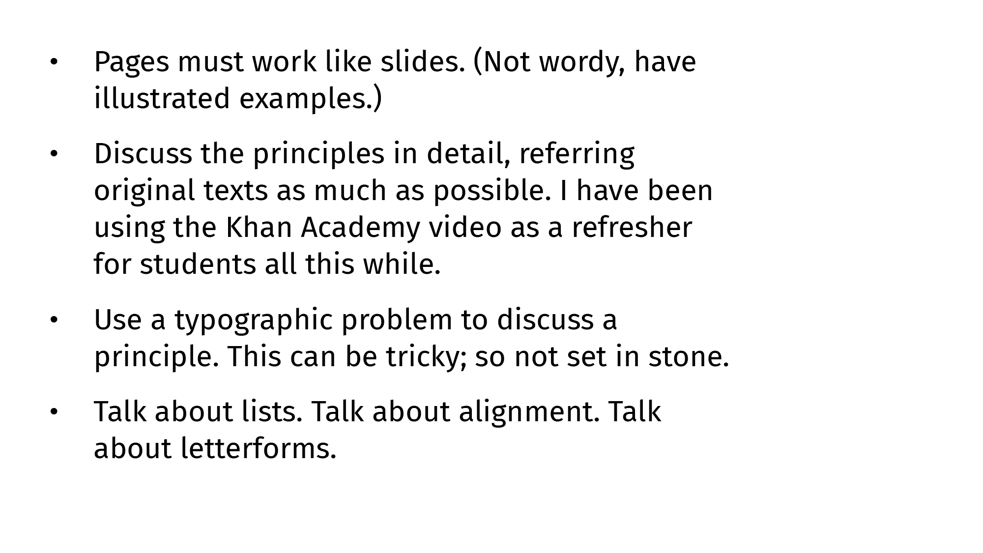
Starting with the most basic of measurements (extrinsic), we must add an adequete amount of paragraph spacing to separate listed items into their own units. The list is no longer a paragraph-with-a-string-of-dots-for-company.
Paragraph spacing, like everything else vertical-spacing related, is a function of how much we lead lines of type.

Making Lists Work: Indents, Intents
After spacing list items better, we tweak the indents-to-bullets to make them more intentional. This indentation takes care of most of the grouping issues around lists but doesn’t solve the aimless dots-waiting-to-form-a-line problem, especially if the listed items are equally tall.

Making Lists Work: Directional Signs
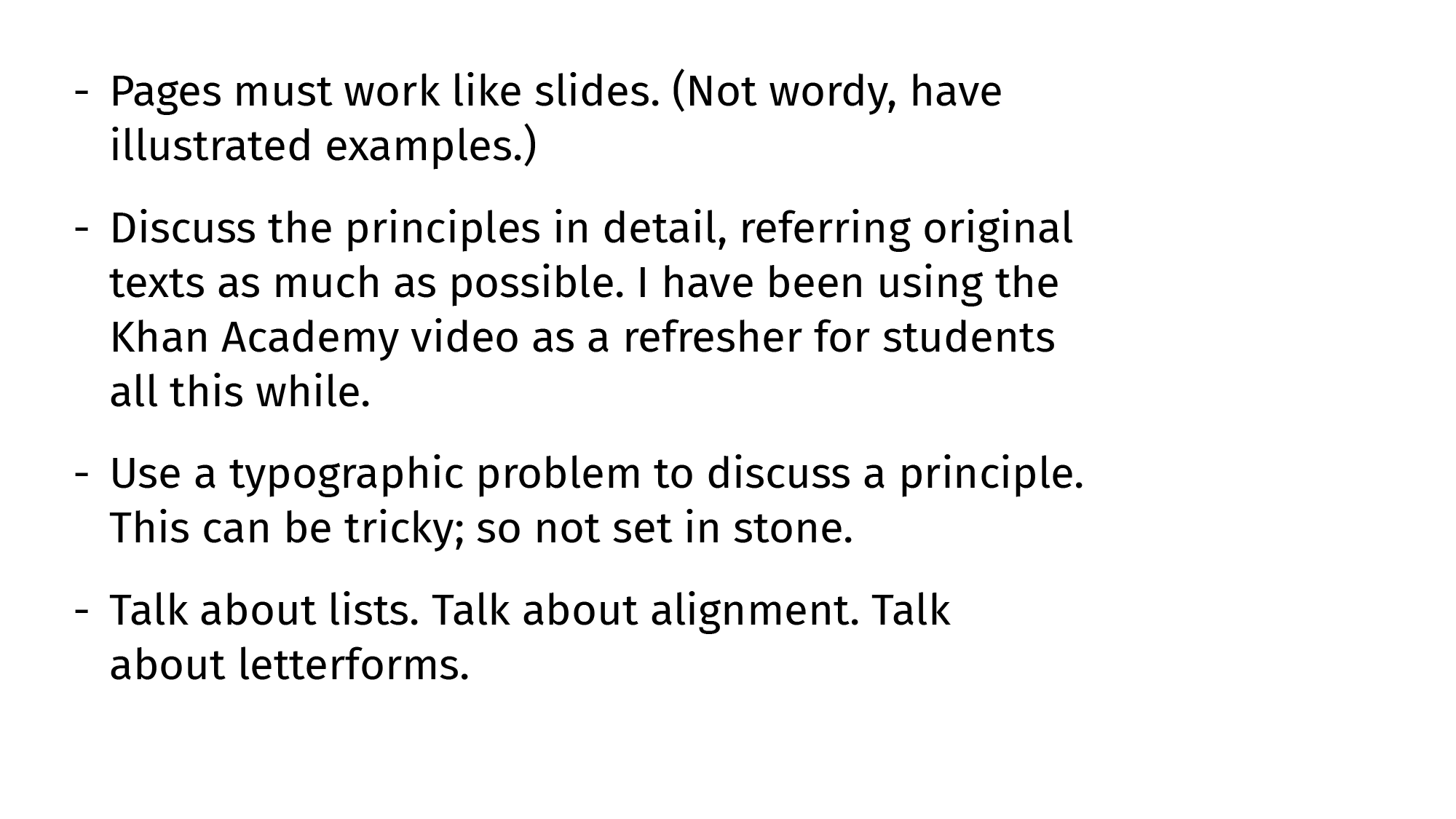
For fixing this similarity-related problem, we need signs with a sense of direction to point to the listed items rather than to the other signs below. Countering similarity with suggestion works (lines suggest a horizontal movement stronger than the vertical similarity).

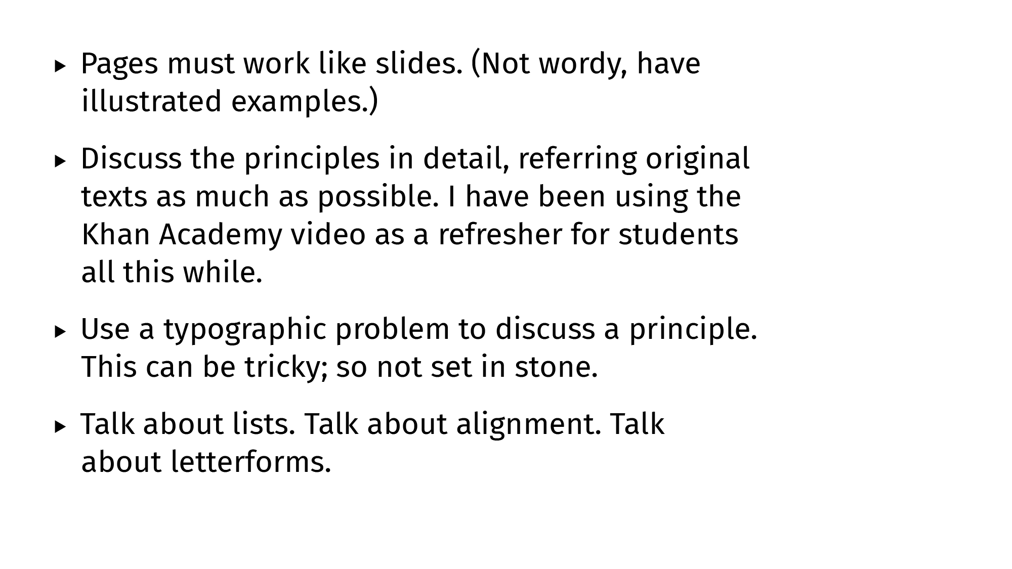
Triangles work too, as long as one downplays the similarity by making them small or grey.

A mix of both lines and triangles (arrows!) works even better given how obvious the ‘direction’ suggestion gets. It also helps that the font file has arrows too, and those glyphs are an even grey like the letters and punctuation.

Optional: Alternating Rows
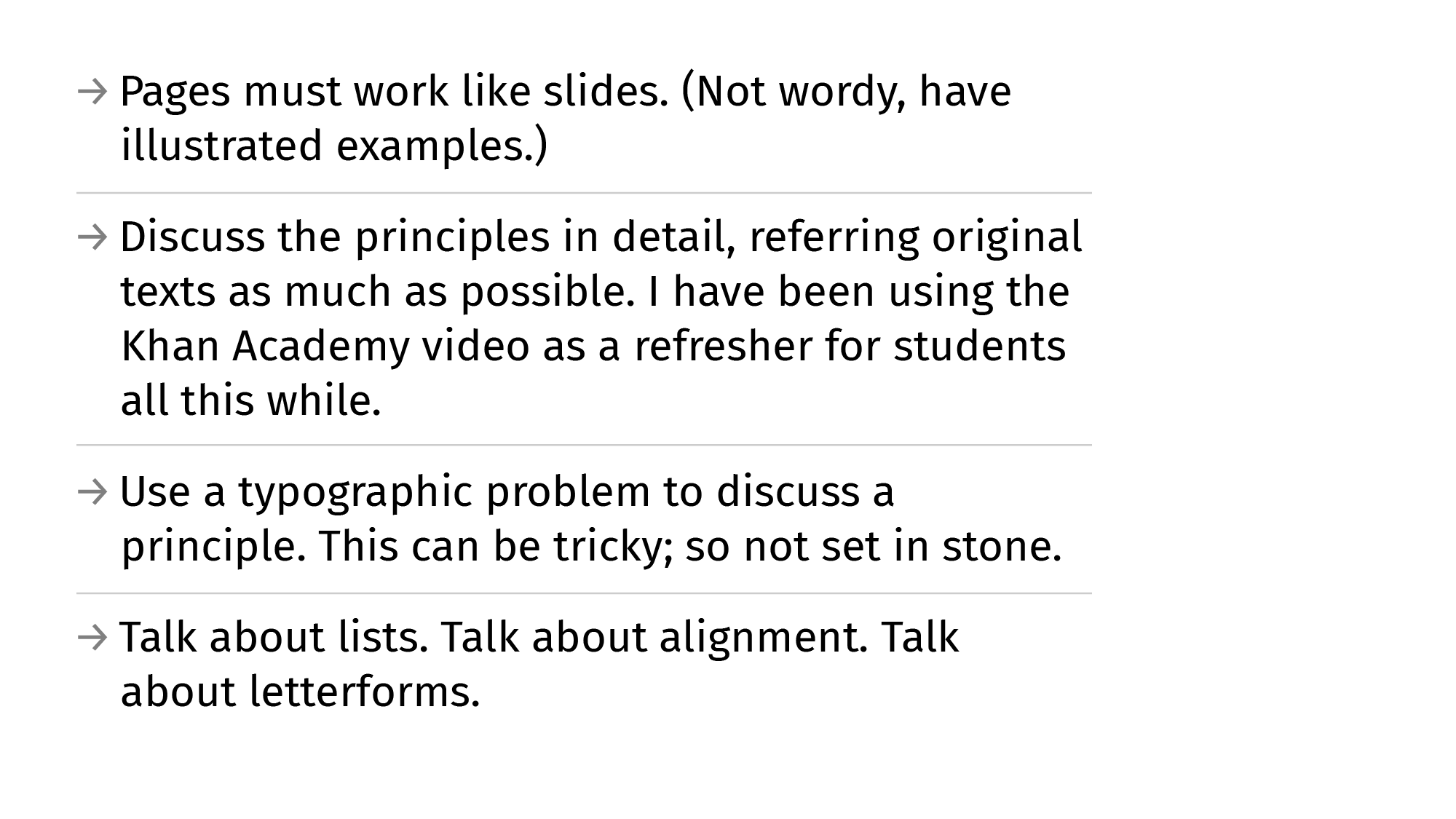
A fancier (not essential) way to establish even better grouping would be to iTunes-ify the list items. Either by using colour (values are a better way to go to keep the general group intact), or by using rules to break the last remnants of proximity-and-similarity-groups. Both are overkill.


B&A
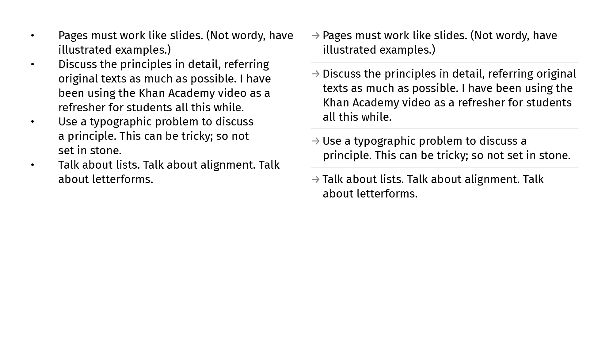
No self-respecting guide is complete without a B&A comparison. Here.

This is an early draft (of Chapter 6) of the Gestalt-Typography book I’m not-writing writing over weekends. I haven’t managed to zero in on a tone for this yet. I also don’t really know what I expect out of it either. Is it going to be required-reading for T101 courses I mentor? Am I trying to be the ‘teacher who wrote the textbook’ and revel in the ego-boost? Etcetera, etc. There’s an unhealthy amount of self-doubt attached. Feel free to write in and tell me everything is fine. Or not.
There is way too much work at the River HQ that it’s started messing with life at home and going home. I take work home and work late nights (early mornings) after coming home late. I work early mornings after sleep evades me at a rest-break at 2 AM. Not proud of any of this. Too old to be able to be proud of anything after an allnighter. I haven’t withdrawn a salary in three months thanks to how oldschool our bank back at KL11 pretends to be. There is so much ad-hoc stuff to pdf-print now that there are more stores and more people and—finally—a space to work from in the HQ building. M tells me he has dreams about presentations typeset in Söhne. We need to balance all this better.
H joined the brand team two weeks ago but hasn’t gotten the necessary silicon for work yet. We’re also stuck in a hardware/software acquisition limbo that has reached Catch-22 levels of absurdity and pain. Piano-piano. We’re happy to have someone we can trust and have normal conversations with. Ru (UX expert) has been here for two months now. Same boat. Good people good at their work. Much peace when you think about them being around. Etcetera.
1: The best portfolio is a well-indented Resume with proper punctuation, clear hierarchy, and decipherable connections. Date this quote so I can somersault my way out of the responsibility later if necessary.
2: Cast Away reference. Appropriate because lead type.
3: Lined and Unlined: Default Systems in Graphic Design
4: Unrelated and fun read from Norma. Also read the rest of the logs.
On Ze Road
→
August 11, 2022 |
Reading time: 3 minutes | Permalink
We had a nice Vijayawada teaching-road-trip last month. It was the first post-Covid-lockdown offline course (abstract doc) for Communication Design so the benchmark for awesomeness/okayness was set quite ground-level and below. The bachchalog did well, with some well-written books in the last week. I was impressed (capital I) with the depth and breadth of work; kind of reminded me of the good old times as a student in Paldi. R cooked everyone dinner (like the good old times in Paldi). We had fun (capital F) and some spicy Andhra food. On the way back (Vij–Chennai–Coimbatore–Kozhikode) there were friends, Tamizh food, football-field-sized roads, shady hotel rooms, aeroplanes, Burmese food, near-miss Tollbooth stucknesses, etcetera. (More on all that later.)
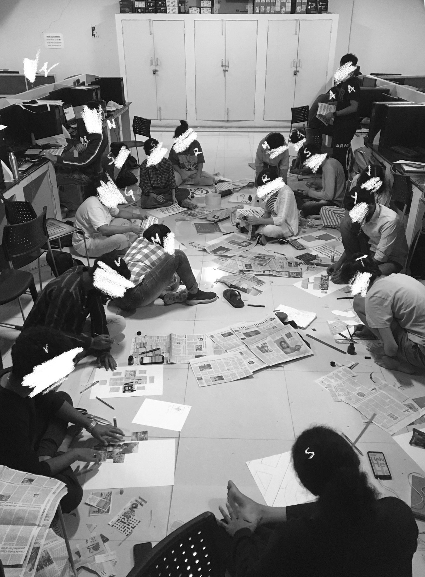
Here is everyone making posters out of thin air and newspaper at the makeshift CD-studio (IT Lab) at Vij. Capital F.

At home in Wayanad, Podimol is ‘in’ the Monsoon way more than we are. We just had her power-washed yesterday (because she was looking more terracotta-sculpture and less metal-sheet-stamped) and today, she looks like this (below). We—not so—accidentally drove into a green patch that turned out to be a Rasayanam-consistency patch underneath. Getting out was harder than getting in. The mud flew everywhere.
The Monsoon (coupled with rising prices for everything) is really hard for many people in many places in Kerala, but we are okay. Dealing with leaks in the kitchen and more-slash-bigger wasps-and-technicolour-bugs is not much of ‘dealing with’ really. We had some hard-ish times a couple of months back (delayed payments and some such logistical effups) and sailed slowly through them.

KL11 has resumed work on River and I’m looking at multiscript wordmarks. We are also looking for interns/project-associates to help us for three months (more on that too, later). Some expansive icon-sets, web-design, brand-guidelines and extending the product identity, etcetera, are in the works. Drop me a line (KL11 mail) if interested. I’m putting together a document on the what and the why and all that soon. We are kind of particular about some basics (like third-year-in-college-basics; not unreasonable basics) of type and form but are hoping to be able to mentor people as well. We shall put our semi-abandoned Instagram page to some use, maybe. And I have so many emails to catch up to.
Chelgato has put on good weight and has no hesitation anymore before jumping into bed before we do. That usually means we end up fighting her for realestate but are also kind of halfhearted about it thanks to the added warmth. (Our part of Wayanad gets cold like most other parts of Wayanad). She pretends to guard the house while secretly hoping for strangers to come and pet her.

GyanBhaskar-GyanBharti-GyanBhashaposhini
→
December 16, 2021 |
Reading time: ~1 minute | Permalink
Finished a distracted-as-hell-but-saved-by-the-penultimate-exercise Typography-1 course with second-year students at NID Bhopal (MadhyaPradesh). The students were hardworking multitaskers who managed to stay awake through really long (not!) history-presentations, and found much energy to laugh appropriately after so many sad jokes filtered through a three-layer-mask. The winter was cold, the food was cold often, the guest-house-hot-water-situation, still a mystery. The people’s warmth and the excellence of ShreeVinayak’s samosas made up for all that hostility with un-parallel-penn-able hospitality. I wish the course was longer (than a packed-to-the-brim two weeks). Apparently some students wish so too. Win-win-type situation, then.

The title is, as they say, an inside-joke on the only (excellent) stationery-shop in BhopalCity. They (the shop) use a Didone for the wordmark and we discussed that to the moon and back, over multiple lunar missions. And PS, you can open the 6000px wide image and read all the unfunny and informative annotations if you’re good at deciphering handwriting on weirdly contrasty backgrounds.
R came along and mentored an NID-H course from the NID-MP guesthouse. If that is not collaboration, I don’t know what is. We had copious (illegal, even) amounts of instant noodles with a smart TV running YouTube-food-shows as witnesses. What a life.
WaterFountain: PDF Drift
→
February 11, 2021 |
Reading time: ~1 minute | Permalink

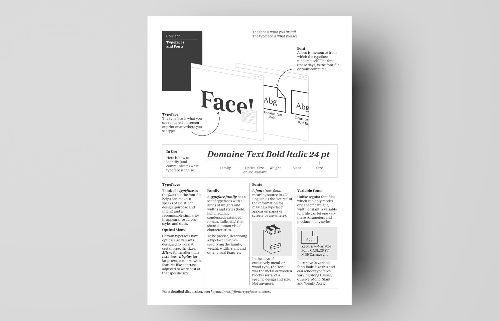
Here is a pixels-and-ink version of the ‘fonts vs typefaces’ discussion as a printable A4-sized PDF. Feel free to use in a classroom (thankses!), pinned on a board, printed and made a boat out of, wallpapered on a PC (why?), etcetera.
Download (PDF, 106 KB)
My favourite jury-moment of undiluted confusion is when someone attempts to differentiate between a font and a typeface. That is when I extend the chair on its creaky springloaded extenders and stretch out like a variable font on its widest end and stare at the screen while sipping old-, cold-, dark-tea wishing life was simpler.
Here is an attempt at definitions. (Taken from a variety of sources—listed at the end—and validated with usage in a variety of scenarios.)
LISTICLE-VERSION
1. Concept: A font is the source from which the typeface renders itself.
2a. Object: The font (these days) is the font-file. The typeface is what you see rendered on screen or print or anywhere you set type.
2b. Object: In the early days of exclusively metal-and-wood-type, a font was the metallic-slash-wooden object—of a specific size—engraved with glyphs.
3. Use: The font is what you install and render a typeface with. The typeface is what you use in a poster-brochure-banner-logo to type-set words and other glyphs.
IN DETAIL
Think of a TYPEFACE as the face that the font-file helps one make. It speaks of a distinct design (purpose and intent) and a recognisable similarity in appearance across styles and sizes.[1] So, ‘Domaine Text Regular 10 pt’ is different from ‘Domaine Text Bold 10 pt.’ They are two different type-faces. (Also, if you want to be really pedantic, ‘Domaine Text Bold 10pt’ is a typeface while ‘Domaine Text Bold 50pt’ is another. With digital type that just scales from 10pt to 50pt, this detail doesn’t make much sense anymore. But often, a text or small-size-specific letterform differs in shape from a display or large-size-specific letterform. Look at Domaine Text and Domaine Display. In the metal-type era, these could both be called Domaine, even with all the variations in shapes and contrast. (Think complications in hand-cutting type combined with optical adjustments.) Therefore it would have been necessary to specify the size to really understand what the face looked like. Simply saying ‘Domaine’ would fail to tell us what kind of contrast to expect. The correct—or more pedantic—answer to ‘what typeface?’ in that sense would be ‘Domaine Text Regular 10pt’ and not simply ‘Domaine.’)
If one were less pedantic, ‘Domaine’ is one typeface and ‘Helvetica’ is another, but that fails to specify the appearance well enough. These names could refer very well to complete families of typefaces including versions like regular, semibold, bold, italics, etcetera. So, Domaine is a typeface-family while Domaine Text Bold 15pt is a specific typeface.
That is to say a TYPEFACE FAMILY has a set of typefaces with all kinds of weights and widths and styles (bold, light, regular, condensed, extended, roman, italic, etc.) that share common visual characteristics. For example, the family Helvetica Neue LT contains more than 15 variations (weights, widths, slants). There are SUPERFAMILIES that contain serifs, sans-serifs, slabs, monospaced ones, different scripts, etcetera. (PT Sans, PT Serif, PT Mono, etc., from Google Fonts is an easy-to-find example. The Noto family of typefaces is a good example of a multi-script typeface family.)
A FONT (from fount, as in fount-ain, meaning source in Old English) is the ‘source’ of the information for making a type‘face’ appear on paper or screen (or anywhere). In digital typography, this is the font-file on your computer (as a thing you can cut-copy-paste or upload-download-share). The font (file) has a definite presence (often kilobytes of data) and can be thought of as the software that makes the letters and glyphs appear. All the instructions for making the shapes, spacing the letterforms, replacing specific combinations of letters with a ligature, etcetera, are coded in this file. A variable font lets one change the appearance over defined ranges in addition to letting one pick instances like light or regular or semibold or upright and italic versions of the same. The variable font-file-as-software has set minimum and maximum values for such characteristics. When you license a font, you are paying for the use of such software to make a specific typeface(s) that it helps you make.Websites like Photolettering from House Industries used to let one purchase/license typefaces instead of fonts (words in a specific typeface as outlined shapes) but don’t anymore.
The beauty of this (above) definition of fonts is that it works well for variable fonts as well, by bringing clarity to the sources-origin of the word font.
WHO MAKES THESE THINGS?
Here is an easy distinction to remember. Type-designers design type-faces and font-designers or -foundries make them into usable fonts. Often, these two are the same person(s). A typographer then sets them (free) by using them well.
YE OLDE FONDRE
The other confusing bit comes from the word ‘font’ being a derivative of fondre (French for melt, cast, pour). Font-as-physical-objects matches this definition but doesn’t work that well with digital type. Back in the days of exclusively metal-or-wood-type, the ‘font’ was the metal or wooden blocks of a specific design and size. Not anymore.
TTF, OTF, ETCETERA.
TTF and OTF (and WOFF and WOFF2 and many more) are font formats, much like png and psd if one were to oversimplify. Apart from the differences in how they are drawn (quadratic- versus cubic-or-postscript-curves [2]) TTF and OTF also often render differently on screens (TTFs can be hinted better but it is finally on the OS-es how they render type on screen). These two started out with different capabilities with respect to features like ligatures, stylistic alternates, etcetera but modern versions of OTFs and TTFs are equally capable formats when it comes to these features.
IRL
The correct answer to ‘what font is that?’ could be ‘88FFSeq_34.ttf’ or ‘download-042.otf’ while the correct answer to ‘what typeface is that?’ could be ‘Domaine Text Regular 12pt’ or ‘Domaine Display 42 pt’ or even ‘Domaine Display.’ Just ‘Domaine’ would work too, as long as you are prepared to be judged. In general, the world will not stop making sense if one were to use ‘font’ and ‘typeface’ interchangeably. Just that in doing so, one eschews clarity for ambiguity and has to depend on the listener to decide whatever it means to them.
SOURCES
They’re Not Fonts from AIGA. Alan Haley, 2002. Also, look at that job-description! I am stealing it pronto.
Is it a font or a typeface? from TNW has more perspectives. Harison Weber, 2012.
—
PS (Not that kind of Postscript)
The current correct answer to ‘what typeface is exif-the-blog set in?’ is ‘whatever serif your browser defaults to.’ I’ve pared the CSS down to the essentials and the site looks as close to ‘default’ as ever. The only rules are the type size (20px) and the line height (1.5). Since I am a fancy person, the numerals are set to oldstyle. Yes; I’m willing to spend some keybees that way.
—
1: A notable exception is the typeface family History from Typotheque. The only easily recognisable (and useful) similarity is the physical size of each glyph. Yet, this is a distinct (as in clearly defined) design choice.
2: A beautiful explanatory post I always link to in classes is at Scannerlicker. This is almost required-reading for Typography-01, supplemented with discussions.
We spent a week of Typography-2 in Vijayawada before COVID-19 arrived and we abandoned the third bird exercise mid-way. The first two were paper-and-glue-type exercises that could only have worked IRL. The third exercise helped establish type-face and -size choices along with leading and basics of forming a type scale. I am glad we had the time to do that somewhat extensively before we shifted everything online. The fourth one onwards, I made the exercises lockdown-friendly and mostly screen-based for printer equality wasn’t a given. The final exercise (where we borrow Abbott Miller’s line “a book is a movie you hold in your hands” literally) isn’t fully baked; I will try and do a version of that with paper and ink and printers and shared softboards once we get back to whatever is close to the old normal again.

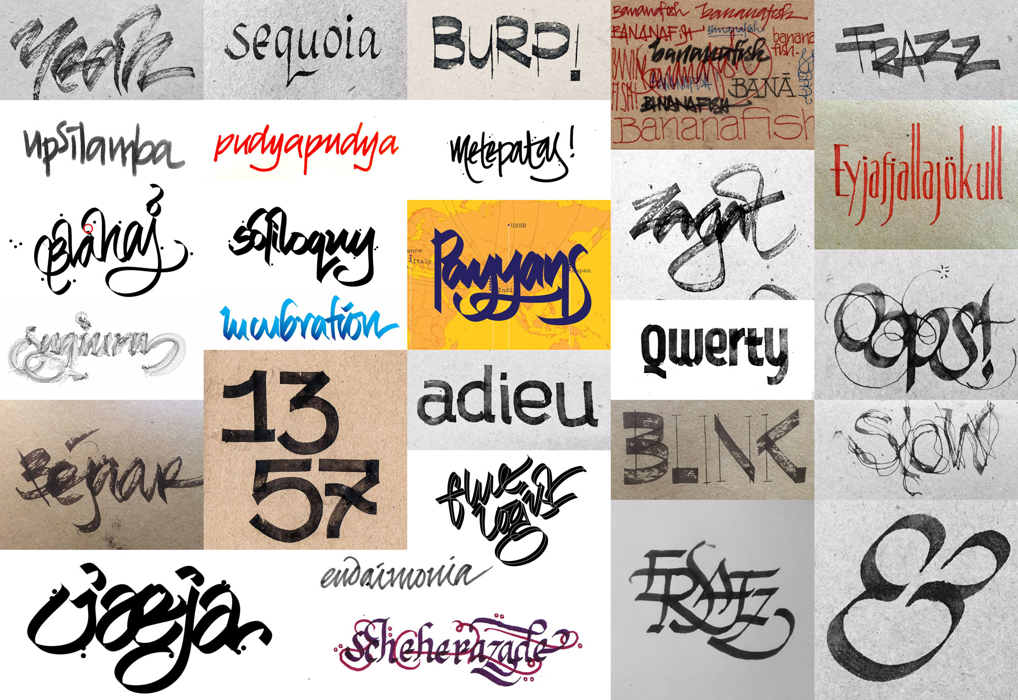
Above: Attendancing word prompts. Read downstairs.
This was (perhaps) the first typography course in the country to be taught over the internet since the COVID-19 lockdown. Some of these resources and experiences are potentially valuable as a babysteps-type-deal. They are neither new nor untested in similar contexts, yet our stumbling upon their hard edges and navigating around them through the course of this course is perhaps new enough to warrant a few kilobytes. As expected, the first couple of days saw struggles with tech (even with preparation-runs the day before) and we settled into a rhythm the third day onwards.
It helped that I had been in a studio with walls and a ceiling and softboards with these students before. I’d even played volleyball with some of them and shared sweaty walks home in the evenings via the GreatAmalod (dhaba). I could fall back to inside jokes and phrases that condensed feedback into a couple of letters. (‘Gymnastics’ is a favourite. Introduced them to ‘juju’ when we started the packaging exercise.) It would’ve been be appropriately harder to do something like this online if we were meeting each other for the first time.
On Exercises
There is perhaps some re-looking-sideways needed in deciding to have the second and final course in typography in the fourth semester (second semester in the chosen discipline) and then moving on entirely.[1] I do see where more growth could have come in handy in terms of having encountered more problems (in life, as well) and having worked with a variety of teachers between type courses One and Two. Exercises like the packaging redesign one and the temporal dimension one (Ex 11) are therefore a bit ‘advanced’ for the year the kids are in. I stuck to comments based on a foundation-level understanding of Gestalt as much as I could, to work around this otherwise major issue. For Type-1, the exercises mimicked the evolution of letterforms and printing surfaces and a small history-lesson tied it all up. For type-2, such theatrics was harder to maintain. We managed to remain faithful to the original Course-Abstract somewhat wholly.
Seeing Everyone
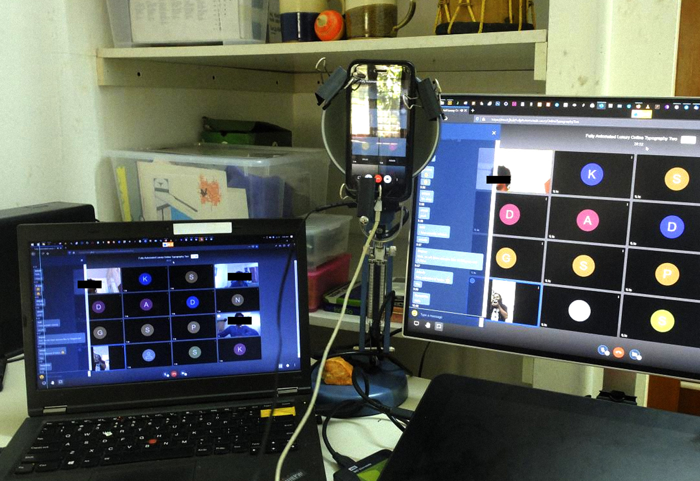
We used Jitsi for the three video sessions (across twenty one days). My setup was a phone mounted jugaad-esque[2] over an IKEA FORSA (much DIYed elsewhere too) and the laptop sharing its screen from a Mozilla Nightly Build (the regular Mozilla had some permissions issues for the Camera, Mic, etcetera thanks to tweaked registry entries or something I was not keen on peeling back). The phone faced me while the talking bits were on, and faced the Cintiq screen when we were working on software. (The pointer gets lost even when the screen-stream switched down a notch in quality and practically disappears on a mobile device. On shooting a screen, you get to point to stuff with the stylus and overall that worked way better. I guess a dedicated screen-share software works better.) While the world (read a couple of the twentyseven students) demanded we give up and use Zoom, we I persevered (or conveniently unanimously decided Jitsi weighed less on our collective consciences and bandwidths). Jitsi lets you join a call with the basics; an app on the phone or the browser and a unique meeting-room ID. There is no need for passwords and account info and all that combined make switching to a different device at home easy. Students from Assam and the south of Kerala had network disruptions (and disruptions in network disruptions) and we limited the videos to token sessions to make everyone feel like the class was officially on and that we were all in a classroom; jokes could be heard and seen, etcetera. Occasionally, some students dropped by the Jitsi meet link and we had more face-to-face feedback.
One piece of advice from the anonymised feedback was that there could’ve been more video sessions. I have a feeling this comes from folks with good-ish bandwidth, no pots clanging in the background, no drills going full blast on a wall nearby, no cats claiming territory over keyboards, etcetera. In the rain, even an otherwise-robust BSNL landline internet connection glitches in and out of existence. I would rather have a record of discussions accessible post the session than have a video session that excludes the bandwidth-challenged. I should’ve had more one-on-one video chats to work around this, perhaps, to work with people who had working internet almost always.

Telegram Sessions
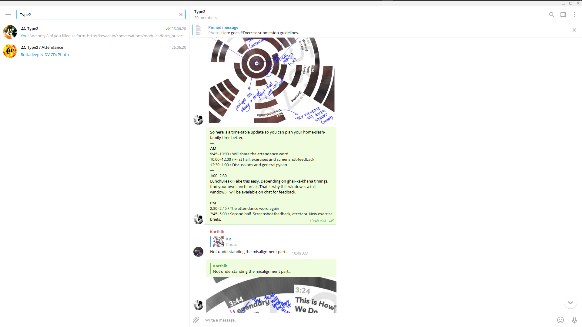
For the major major part of the course, we had two groups on Telegram and used Direct Messages for specific feedback/file-shares and requests. The chats could handle hash-tags and messages could be pinned to the top of the window. We used #Exercise, #Brief, #Tips, #Word (for attendance, below) and #ReadingMaterial among others, to easily navigate the steady stream of messages. Telegram supports a drag-and-drop interaction when it comes to sharing stuff of all kinds. The mobile app came in handy when I was tending to household chores and lunch and other stuff. It was important to not keep people waiting for feedback. The class-hours were thus loosely set; students shares screenshots and files throughout the day and when I wasn’t around in the group, they sorted things out themselves and it was nice to see.
The students made and managed a separate Telegram channel for my comments and prompts (exclusively) so someone who missed the trail of texts could find the MVP bits easily. Often, the text-stream got real busy and for sanity’s sake we switched notification sounds off and used the ‘send without making dings’ function to send stuff across. (AAG was furious and compared the situation to adding a dish noiselessly to a noisy dishwasher.)

Attendancing
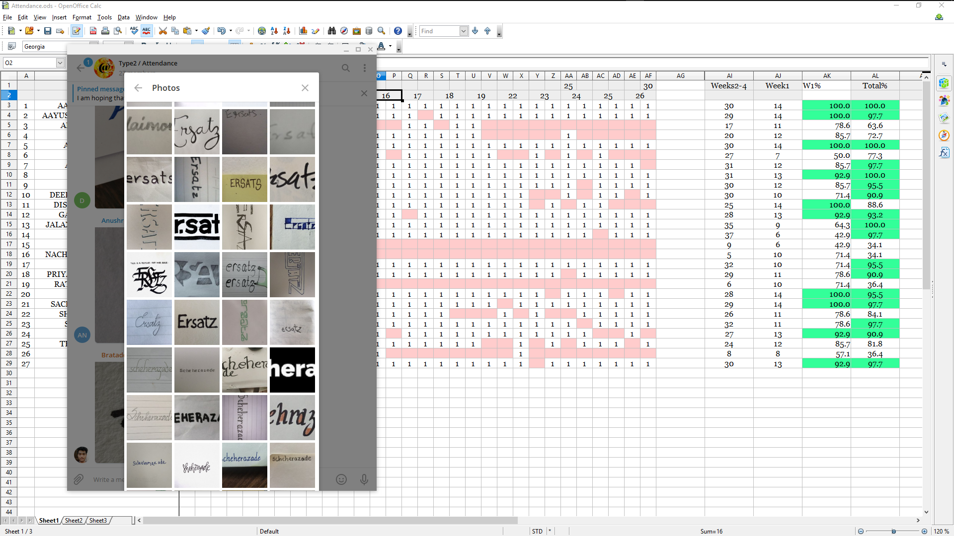
At 9:30–9:45 (AM) and 2:30–2:45 (PM), I shared #words that the students lettered on pieces of paper, then photographed (awkward angles at first) and uploaded to a separate attendance group. Initially, these were conjured ‘real-time’ based on what I was feeling at the moment and a De Boinod book. Later, I queued them up in advance and scheduled messages on Telegram. As the days passed, stuff got complicated and many Idlis (SSK) were used to make modular letters, dusty- surfaces were partially cleaned and visual puns intended. Some animated GIFs, some animated themselves and some missed sessions to come back and comment on other people attendancing. The trail there gave way to some interesting discussions on accessibility, monospaced characters, true italics and chopped terminals.
The attendancing kept the course alive (more than my type-dad-ish jokes even) and more than a couple of anonymised feedback-ers said it helped them come back to the sessions and find surprises often. Managing the counting wasn’t as easy and it got cumbersome once when I left the tally un-tallied on Excel for a couple of days. There are attendance-specific apps like Acadly that apparently work well. For a type course, it made sense to involve letters somehow.
The attendance looked better, too. On the week we spent at Vijayawada, only ten had a 90%-plus attendance. During the three weeks, seventeen did. I realise it is easier to send twice-in-a-day texts and call it a day, yet the submissions, screenshots-for-feedback and the discussions showed people present in the group-chat. The timings were flexible enough to account for family-and-home-stuff as were submission deadlines. My major demand was to keep sharing screenshots of progress.

Feedback
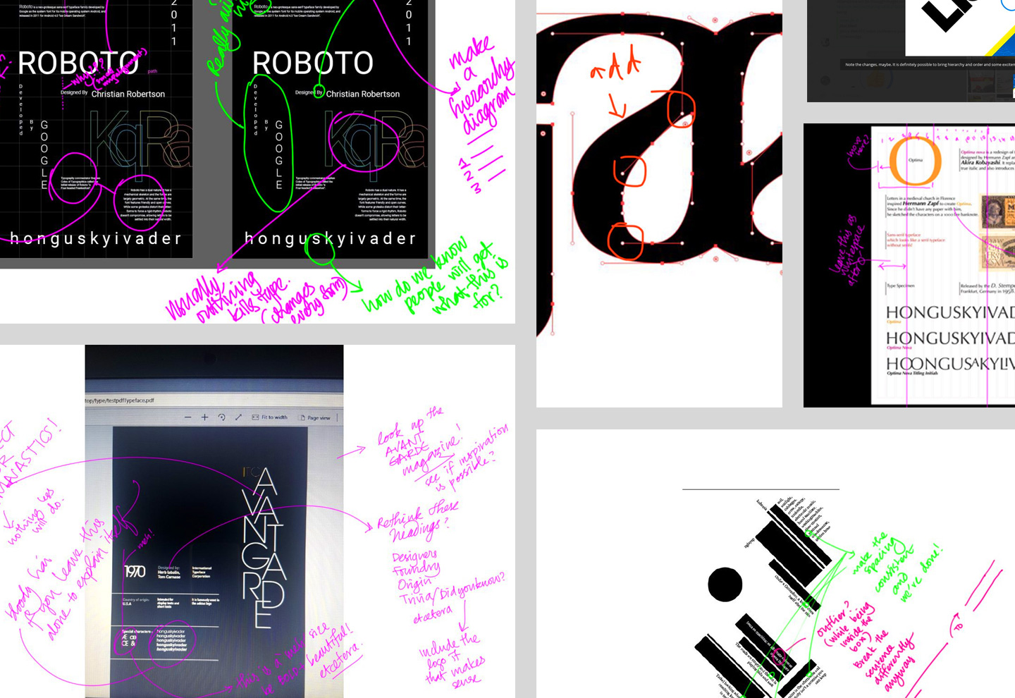
Feedback over Telegram is excellent for it is concise and stays there for a while. Messages are searchable, replies can be made to specific screenshots/files/texts and it is possible to link back to previous feedback to mess with people who missed out on specific notes as they improved stuff. Most shared images were heavily annotated and shared back on the group and with individuals. I figured this was the equivalent of having a common/group discussion in class along with a softboard full of penpricks and stickied notes. The Cintiq (which broke a little after one week and got fixed with some electrical tape and a wheel off a tiny plastic toycar; long story, later) helped. I would copy images off the chat and paste them onto a new PS artboard, then annotate the daylights out of the image in scrawly, pink letters and occasional sideways emojis.

Submissions
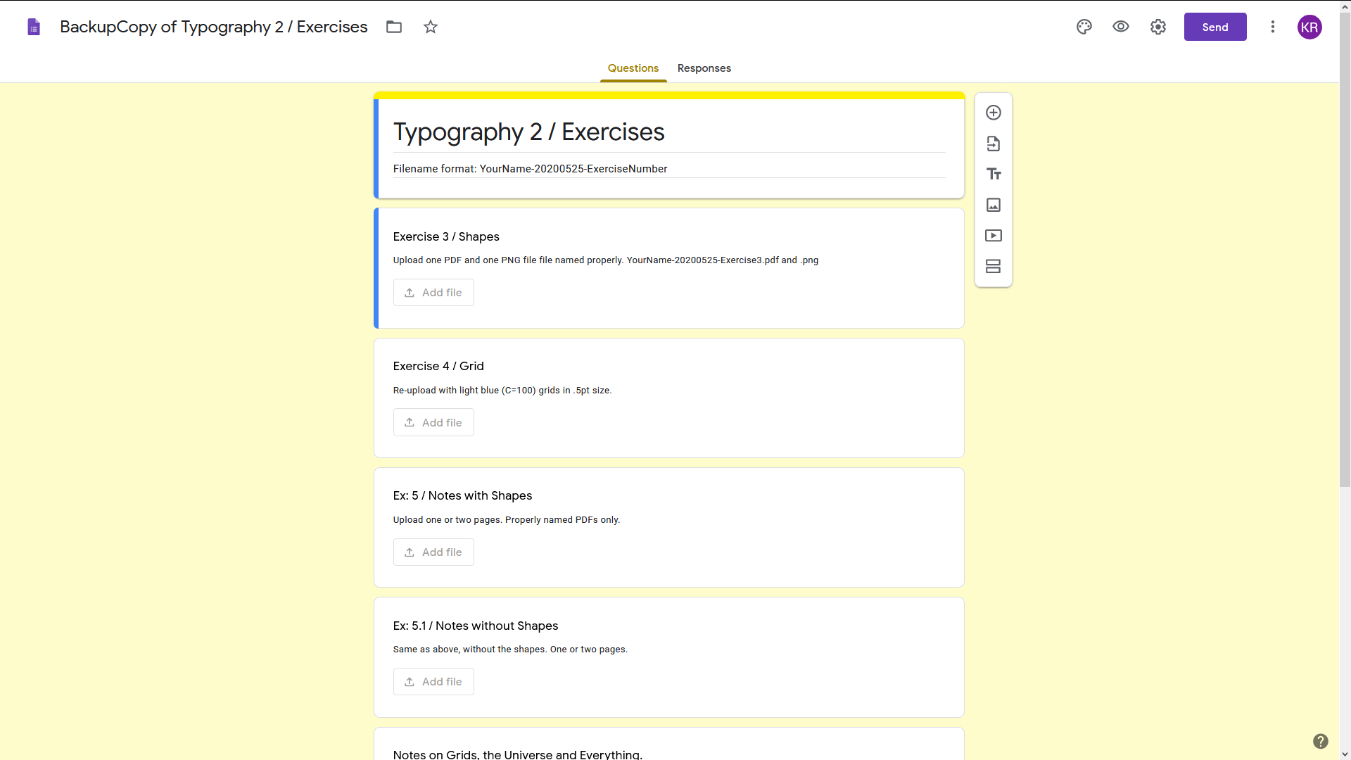
This is where the privacy armour broke. I set up a Google Form and had separate fields for submitting exercises (with file type and size limits to see if they could export artwork with some control over the software). The form sorted files for us into folders and the Drive could be viewed (not edited) by everyone, including the course coordinator from Vijayawada. The view-only permissions helped make sure no-one deleted files I had commented on already and it took care of folder-structures when it came time to downloading stuff at the end and keeping track of submissions. I had gotten rid of the big G from my life years earlier and created a new account to make all this happen.

I realised FormTools (which we used for anonymised student feedback) could have handled this equally well without an account and more autonomy, only much later.
See GDrive full of submissions here.
Student Feedback
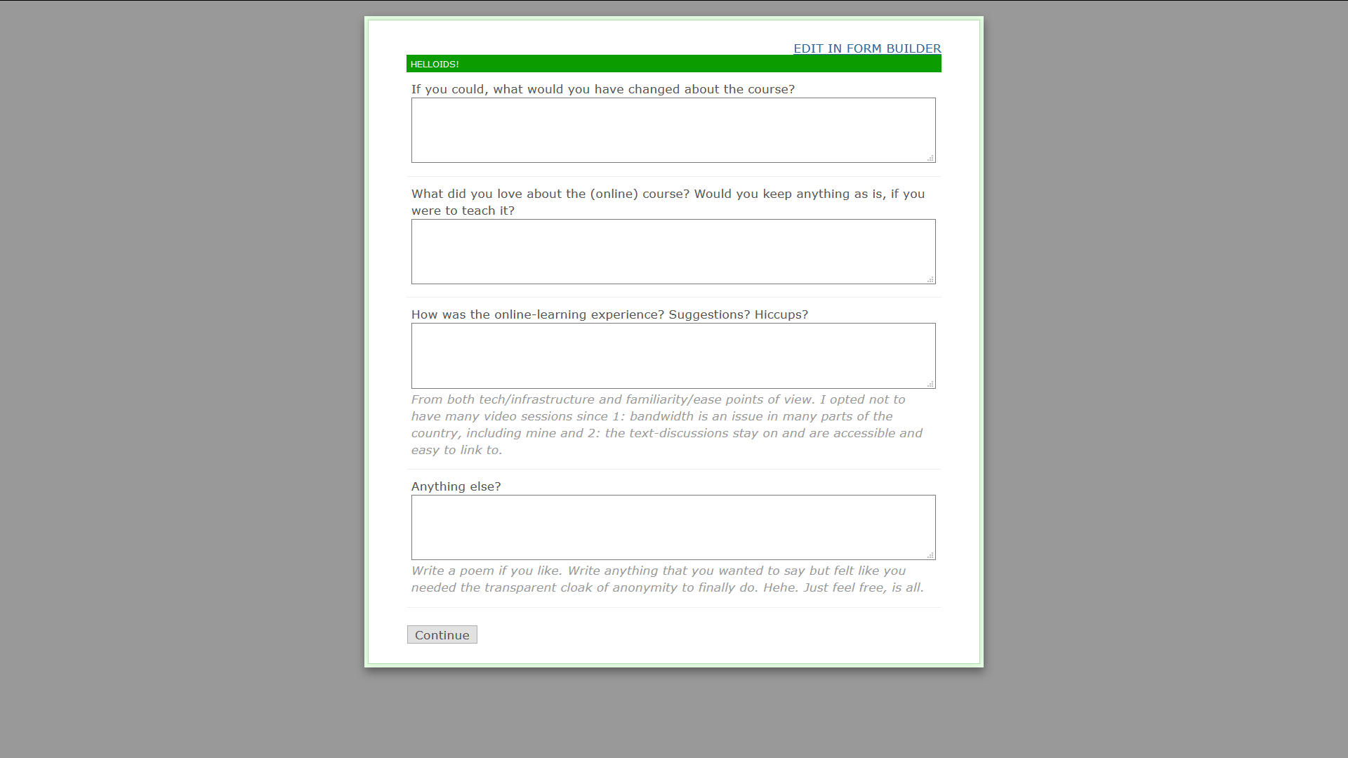
FormTools helped make feedback collection easy. There were four questions, including one on how the online part of the online course went. The feedback-form questions were open-ended and non-compulsory. 14 of the 23 students who showed up, responded. I did have to send three strategically worded texts though.

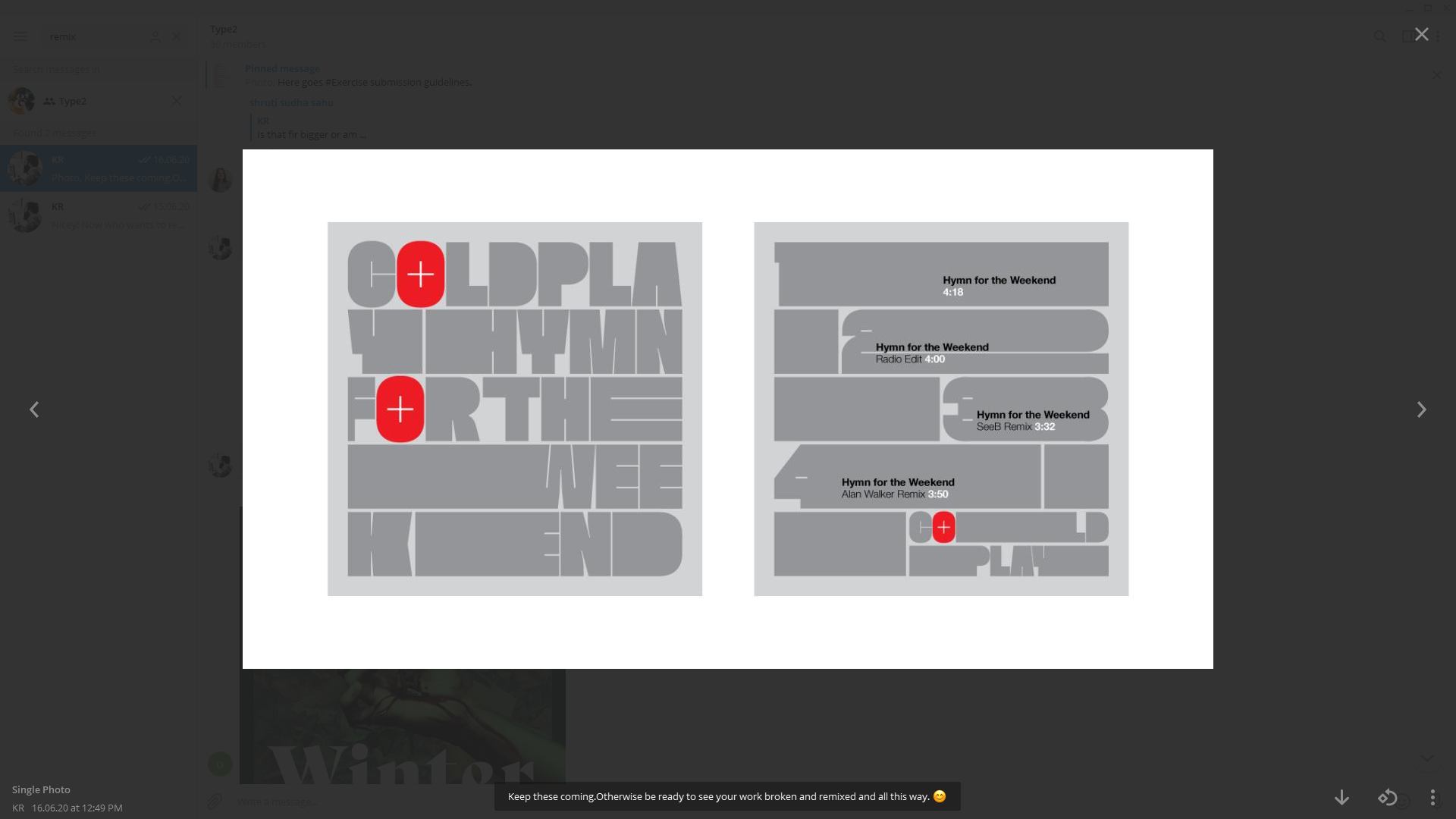
Remixes
Since there was no proper way to carry a tripod-stool around for feedback and working with people’s files, I decided to remix people’s work occasionally. As always, the exercises are all ones I would love to work on, so that helps.

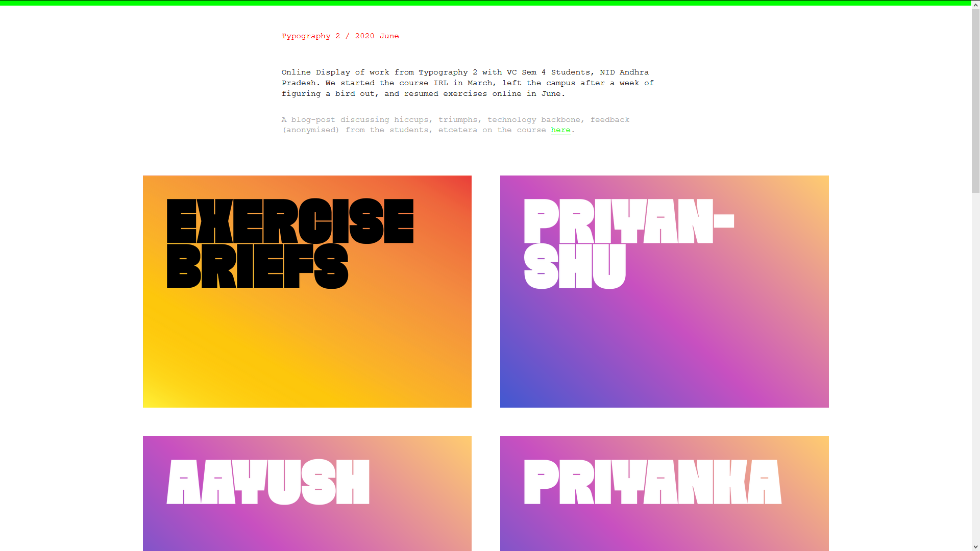
An Online Display
Traditions ought to be honoured and we tried displaying the work online, here. I repurposed bits of the StaceyApp installation for a quick kutti website.

Thankses!
Since it was fully automated and I had the luxury of taking it online, the course could use feedback and opinions from friends. I invited FTV to pitch in and he obliged. A Product-Design student wanted in and he lurked. And thanks to all the second-year folks from NID-AP (Vijayawada) who kept the course going. Kurma and Chewang helped coordinate stuff from Vijayawada. R helped with tea, sanity and comments on photography. The family helped with space. The clients helped by letting me run out of deadlines yet again.
—
On a chat with someone post the course, we discussed how it was easier to teach a text-focused course over text. I know there needs to be a week (luxury!) of type in a classroom to finish things off well after all this. Or maybe, internships will polish the hard-edges. Ever since reading the Victore piece on education, I am on the other side of smoothening the edges, though.
I kept track of Exercises by drafting them and saving them locally (in the Saved Messages on Telegram) and used OpenOffice Calc to keep a track of who did what and attendance. Win+Ctrl+S saved a lot of time by getting screenshots off in a jiffy. iOS Screenshots let me awkwardly annotate images when away from the computer. For Attendance words, after the DeBoinod book I ended up choosing stuff that worked with the exercises and how the students were dealing with them. Often non-words too, for they made for good visual experiments.
—
1: That is a long, serious and potentially fun exercise, spreading courses over semesters.
2: Switched to a Mechanix build that held the phone in place way more efficiently toward the end of the course but never really got around to using it.
Rulz (?)
→
October 6, 2019 |
Reading time: ~1 minute | Permalink
Ten (…ish) rules for students and teachers. Half-way through the Typography-1 course. Good kids, unforgiving weather, too many holidays, not enough LAN cable, too many exercises in the spreadsheet, not enough hours in the day. Better chocolate-tarts at Baker’s Inn (no apostrophe in the original and I do have a problem with that) this time around. Number six reads:
Nothing is a mistake. There’s no win and no fail, there’s only make.
Link
Ha!
I don’t know how I feel about design education—I honestly don’t know very much about it. The one thing I do know though, is that kids matriculating through undergraduate design programs need to be better prepared intellectually. Not nearly enough attention has been brought to the question of the basic literacy of our young designers. It is vital, especially if a designer wants to work in publishing, but also vital in general, that students be taught the fundamentals of reading and writing. Not to mention that designers should be able to express themselves verbally. If I were in charge of an undergraduate design program, there would be literature classes, science classes, logic and rhetoric classes…it would be a much less fun school to attend, granted.
— Peter Mendelsund, on BBIC
Shoulders of Giants (1)
→
April 3, 2019 |
Reading time: 2 minutes | Permalink
Why go to all that trouble, to do all this? [Talking about typographic niceties; dashes, quotes and the like.] Aesthetics… is not such a compelling argument for this. Or for anything. Because it is highly subjective. Furthermore, it is a function of time and space. At a larger level. What we, Indians consider to be beautiful, Americans might not consider to be beautiful. Aesthetics is also very infectious. In some senses, you can be trained to like certain things. If I faff a lot about this font [points to a screen showing various kinds of quote marks, dashes and an ellipsis and their HTML character codes], you will suddenly start liking it. Because I faffed about it. … These are the kind of questions we dabble in… [in] academics. … Ha… matlab, for whatever reasons.
— Girish Dalvi, Practical Web typography (1) on D’Source
I had the browser open to Girish’s homepage on the quirky and sane IDC website and one hyperlink lead to another and in no-time (in real time, though, it was thirty seven seconds into the first video), I was grinning at that lecture-series (in four parts). Outside of the video, he dabbles in teaching typography, books, sharing obscure and critical information—processed, and presented with deliberate commentary after being asked six times, being nice to people, commenting on excel-sheet course plans and helping young kids (…) testing teaching-waters, etc., when not putting together an impressive (intimidating) number of multilingual fonts with folks at EkType.
Paul Vikramadityan Rand
→
March 17, 2019 |
Reading time: 2 minutes | Permalink
Classes were held in the local elementary school. Because the students had the summer off, we were able to [make] use of the cafeteria as a classroom, two students sitting at each of eleven large tables. Paul would go from desk to desk carrying a collapsible garden stool with him so that he could sit and talk to each student about his or her work. Each tête-à-tête went on as long as was necessary to set the student on the right track and was laced with stories from Paul’s vast career as they were appropriate to the issue at hand. When he worked with students, he poured his heart and soul into it.
Paul remained part of the core faculty of the Brissago program until it ended in 1996. It didn’t take long for him to be convinced that this kind of concentrated and intense interaction with individual students was the best way to teach graphic design. He tried to transplant the one-project/one-week arrangement to the Yale program but because of the academic and extracurricular demands placed on the students, it never quite worked.
— Philip Burton on Paul Rand, Paul Rand: Conversations with Students
Part of the fun in teaching is all the -related literature and films and songs and anecdotes one reads oneself to sleep with. The other part of the fun is vacuously imitating the not-so-important parts and hoping things unfold well. There is a txti in there somewhere—of all the ‘material’ on teaching, waiting to be put into HTML. Point being that nothing can replace this extended bakchodi with individuals (on their work), showing them related work, showing them seemingly unrelated texts that make sense, showing off some of one’s own work, etc.
