Patience (nts?) and Scissors*
→
March 16, 2019 |
Reading time: ~1 minute | Permalink

I started teaching typography and accoutrements (mostly accoutrements) in August 2018. This course has me really painted into a corner with the constant struggle with whether to preach the thin-stemmed crystal goblet or twirl a moustache a-la Victore. (Fuck your middle-path.)
It continues to be a process of getting paid for learning new stuff. And I think the learning equation is heavily tilted to the wrong right side. Here is the course-as-a-commentary HTML thingy. (Updated often; some useful links.)
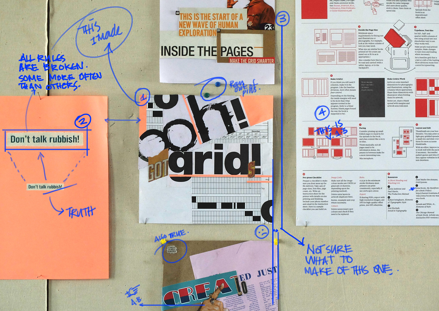
The one on top is Miss. SJ’s attempt at subtly commenting on the course. (I kid.) The bottom one (I need a New Cubicle) is from Miss. AS. She’s repurposed an otherwise dry exercise real well as a back/fore ground.)
* An up+coming Indianie band with its roots firmly in place in the underbelly of a forgotten surgical procedure.
Part of the trouble with setting the blog in monospaced type and letting the browser decide what is best (the CSS reads ‘font-family: “Courier New”, courier, monospace;’) is that there is no guarantee the em dashes will be distinct enough to not have them mistaken for their shorter, less fancy cousins. There is an advanced typography course I’m tutoring soon and I was rereading Bringhurst this time with intent. I realise it is odd and all kinds of unprofessional to have left it run this way—without distinction—for four years. There are spaces around the em dashes now (see last sentence) for making sense’s sake and I don’t recommend it used this way otherwise. (A little piece of javascript runs at the end of each page to replace all instances of the dash with a space-dash-space string. So the ‘actual’ text in its editable form stays the right way, for when the monospace phase passes.) Bringhurst recommends an en dash flanked by two spaces over the em dash without spaces around (which [the actual em] is what the Chicago Manual prefers). The Practical Typography website has this to say on the matter. There is a beautiful bit of prose on the absence of an ebook version of the site, elsewhere.
I shouldn’t have used the word “content” to describe what writers make. Writers make writing. So let’s call it that. Because “content” isn’t a neutral word. It’s anesthetizing jargon that encourages us to see the best (and worst) parts of the web as fungible commodities, like soybeans. Writers are not content farmers. Recognizing that fact is a prerequisite to improving the economics of writing.
— Matthew Butterick

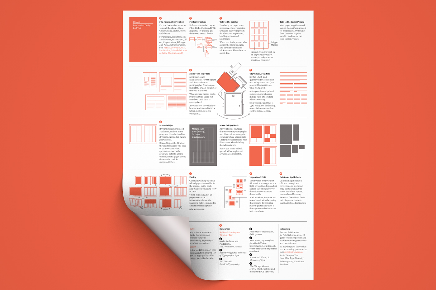
Process: Publication Design for Print is an overview of the print-publication-design process, condensed and appended with a tiny resources list mapped to the stages in the (publication-design-for-print) process. Please download a copy (PDF) from here, and let me know what needs to be improved and added and redacted and written over and edited for clarity, before I commit to print some copies.
This started life as a scribbled-on-an-A4-sheet diagram sent to a senior graphic designer a long-ish way northeast of the border seeking help with a print design project. The poster (if/when printed) measures A3 and is meant to be a two-colour screen printed affair (when printed, in PMS 805 C and black). It is somewhat self aware and the jokes are pointless and annoying as are expected. The rest is by no stretch of my rubbery imagination meant to be the final word on how things ought to be done. If you are a not-so-frequent designer of publications, this is a nice-to-have-by-the-softboard sheet of paper. If you aren’t, this may come in handy when you need to pretend to be one.
Up-hoot 1: Thanks to Miss. AB (product designer), I’ve fixed some stuff so the version up for download now is V1.2. Blame her for the updated post-title, some jokes being more elaborate, some diagrams finally making sense in context, etc. The image above remains that of the old version, since faking it all with a 3D render takes time, etc.
PR
→
October 4, 2018 |
Reading time: ~1 minute | Permalink
Do not misunderstand. I think that the computer is a marvelous instrument. I think the computer has nothing to do with creative work. You are not going to be a creative genius just because you have a computer. In fact the chances are you will be just the opposite. You just will be a computer operator. But the speed and the efficiency are simply incomparable. A comp in the old days consisted of type and artwork and color and Photostats and color prints. Can you imagine how long that took, and how much it cost to do? You do it in half an hour today; it used to take two weeks, literally two weeks. There is something wrong in that, too, because it does not give you time to be contemplative. You do not have time to sit and think about it, and it keeps kicking you in your rear end as you go along. You know it keeps kicking you. You cannot stop to think about it because it is just too damn fast.
Paul Rand, Conversations with Students (Michael Kroeger, Princeton Architectural Press, NY).
It is impossible to decide what to quote from the book full of gems. Wish I’d read it before the current courses I am helping the students with, started. (The Vijayawada Library is full of pleasant surprises.) I’ve been raving about the NID: Structure-Culture Document for weeks now, and the tail-end of Rand in Conversation is strangely reminiscent.
T-101
→
August 24, 2018 |
Reading time: ~1 minute | Permalink

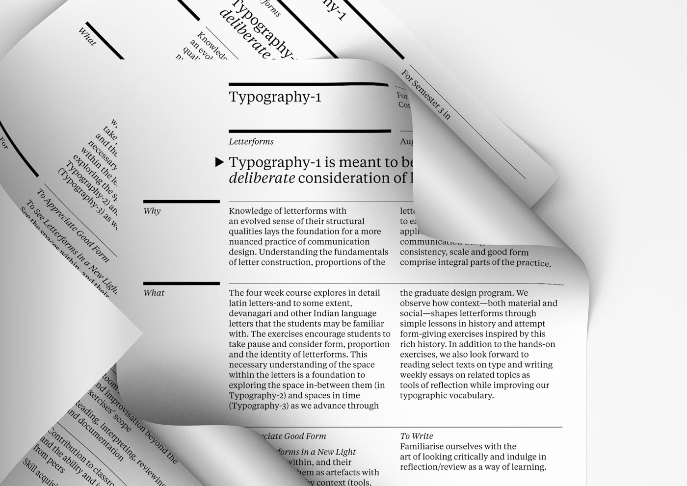
The Course Abstract from Typography-1. PDF here.
Letters to Vijayawada
→
August 16, 2018 |
Reading time: 2 minutes | Permalink

I’m really, really glad I agreed to talk letters for four agonising (I presumed), exciting (I still hope) and terrifying (so very true) weeks. The students, a decade younger, are already teaching me so much in so few words I come home to the unnecessary luxury of a double bed (wrapped in shades of baby blue, wrapped in eerily perfect, wrinkle-free solitude) and crash face-down for tens of minutes of ignorant bliss before V calls out with the day’s menu. It sounds all the more boring to listen to a list starting with chapaathi and always managing to segue its way into daal after a day of counter-spaces and anti-counter-spaces and minor introspections on the nature of form. It is Gurgaon all over again, sans the smiling people on the billboards and no signs of Miss K. The flat-builder’s misplaced sense of irony finds a moment of relief as I realise how sharp and depressingly ordinary all the longing these walls flush out come morning after smoky morning. We live in a building named after pine trees. There are others named after trees named after themselves. It rains on most mornings, except when I can’t be bothered to go out for a run.
The class is an amorphous being and refuses-outright and with more than a hint of absolute contempt-my pathetic attempts at well-worn jokes. Some students pour their heart and sufficient midnight oil out into sheets of straight lines after not-so-straight lines. Some of the faces fill my head with questions. Questions I would like them to ask (me, each other) and they never will, questions I should’ve asked someone long ago and never gathered the innards to and never did, questions to ask later to never be remembered off context.
As always, DFW drives the point home in slow, well-chosen words and well-placed shrugs. (Link)
I stare at a K drama all the way through the kisses and catch myself counting sheep. I do feel like a child.
MPRanjan Lives
→
August 10, 2015 |
Reading time: 2 minutes | Permalink

It is in another ceramic studio, nine hours from Paldi, that Mr.D’s message arrives, bringing with it the news of MP Ranjan’s untimely demise. The message is an austere single sentence; one could see Mr.D struggling to type it out.
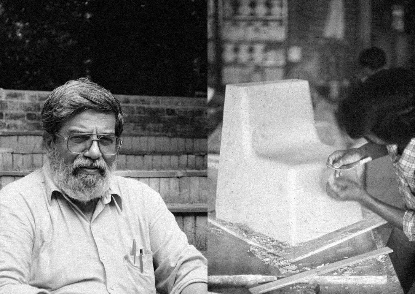
MPR took us through DCC at NID when we were unformed, idealistic teenagers nibbling at this alien, amorphous thing called design, while his contagious passion for a people-centred design practice was almost palpable, like the hot, humid Amdavadi air in the summer. Three and a half years later, I would interview him for my graduation project, and he would talk me through the enormous volume of grainy, digitised photographs from his early days as a student of design, his toy-factory years, the beginnings of DCC, Katlamara and Jawaja projects; images of an Indian design identity being shaped as if in a slow-turning lathe. It is this hands-on-designer in MPR that surprisingly finds scant mention in most media. Among the photographs were moments from field trips across India, making one long for times of simpler, more meaningful things, times when building these things was of greater value than the pedestals they were put on. His insistence on this greater purpose of design as a profession continues to be relevant even after five decades of Charles Eames’ ‘cardboard-computer’ vision for indigenous design.
His spirit will continue to inspire generations of people to look at design as a powerful tool shaping societies and livelihoods.
Anupam Purty shot the portrait for Dekho. The image on the right is from MPR’s archive.
Notes: DCC is Design Concepts and Concerns, the course helmed by MPR at NID. The Eames’ cardboard reference is from An Eames Primer, Eames Demetrios. See page 227 here.
→
July 31, 2015 |
Reading time: ~1 minute | Permalink
On H&F, TVSchneider on universitified design education and prettiness, among other things.
Hand-maids
→
May 5, 2015 |
Reading time: ~1 minute | Permalink
Talking to school-teachers about low-fidelity, hands-on publication design for teaching aids tomorrow. Towards the end of last year, I’d illustrated cover artwork for SCERT textbooks and a few (fresh, still wet) copies just arrived. This looks like a year of education-related projects, and I am looking forward to some cost-conscious fun.
Should’ve, Shouldn’t’ve
→
April 9, 2015 |
Reading time: 2 minutes | Permalink
Quote from EJ, my favourite place on the interwebs to quote from.
We have to admit though, we feel a bit uncomfortable about being involved in the design of the above items. As it turned out, Shoshan’s installation (a recreation of a zoo, functioning as a political metaphor) involved live animals; and we are actually very much against the exploitation of animals, including the use of animals within the context of art. Let humans play all the cruel games that they want among themselves (whether they want to call it war, love, politics or art), but just leave other species out of it.
The director of NAiM / Bureau Europa assured us that the whole installation was monitored by several local animal welfare organizations, and that the animals wouldn’t be hurt in any way – and we totally trust him. But still, on a strictly personal level, we do feel a bit uneasy about our contribution (however small) to this specific exhibition, and in retrospect, we shouldn’t have been involved. But alas, it’s too late now.
Even with the next month’s rent eating into last year’s savings, one is fascinated—ecstatic even—stumbling upon instances of such high levels of integrity and simple honesty in a profession where one is constantly reminded of how an air of superiority, a hint of apoliticism and a downright disregard for where the result of one’s output features in the larger canvas of society and environment, are vital to finding ‘the gold’ in truckloads. One wonders, admittedly quite amateurishly at this point, if it is really that hard to be vocal about matters of ethics and, generally, rear the head of one’s pessimism once in a while, amidst the cacophony (I have a thing about the word possibly involving a murder of crows) of all the happiness driven design around.
