From Russia with Love and Signature-counts
→ September 10, 2019 | Reading time: 3 minutes
Once you get over the SPLRC-C librarians’ own P2C2E way of dealing with Dewey’s Decimals, and one in every ten books with a live moth eating Rorschach patterns into its innards as you grapple with the expertly repurposed cardboard box for a cover, the shelves start to proffer gems like ‘Tower of Birds’ every other time you decide to drop by for new books.
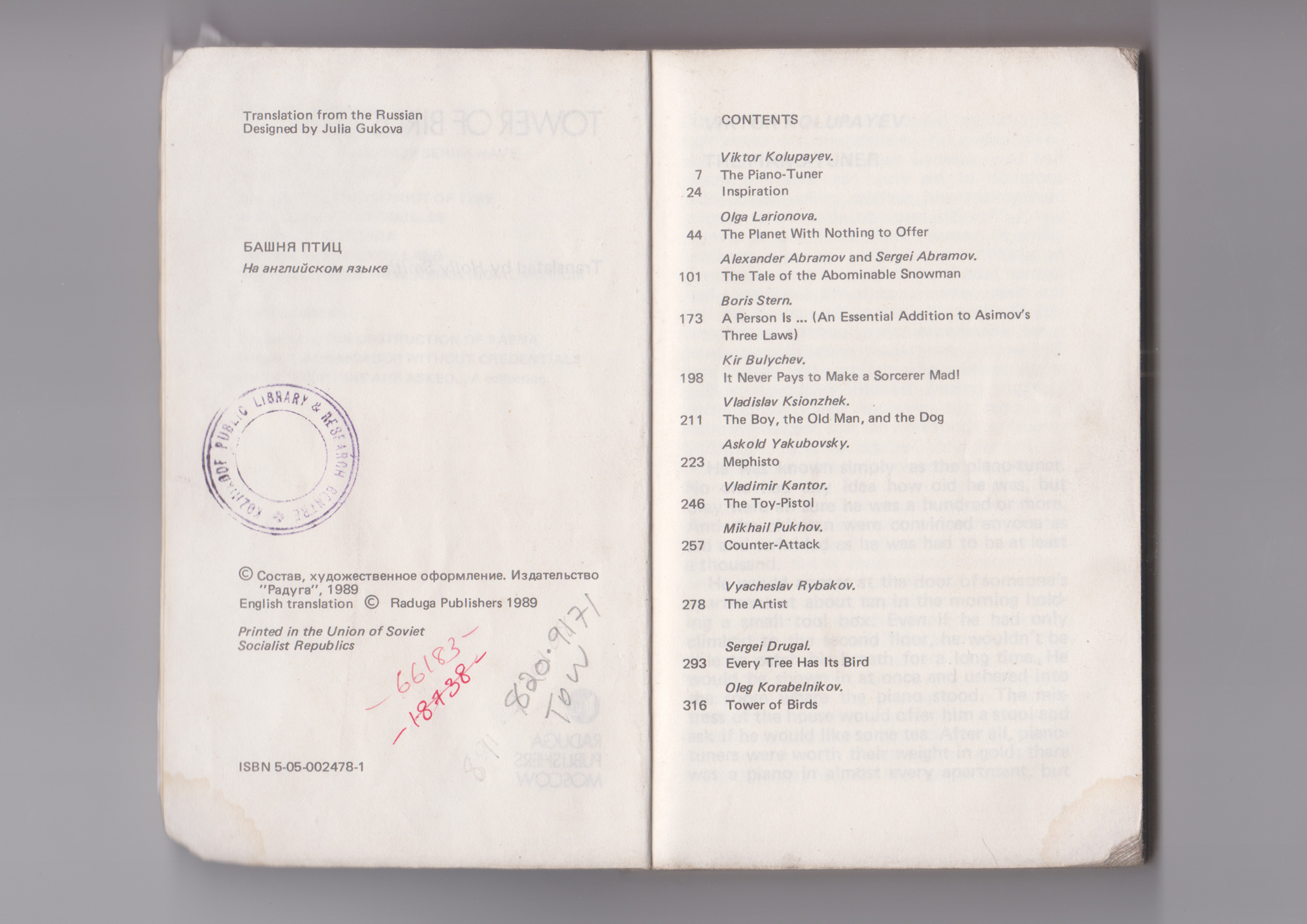
Printed in 1989 by the USSR-state-owned Raduga (Rainbow) Publishers, Tower of Birds was an unexpected (as all things chanced upon at SPLRC-C tend to be) find that turned out to be full of sedate, often quirky tales of man versus (not really) the super- and otherwise natural. ‘The Piano Tuner’—the first, seventeen-page story by Viktor Kolupayev[1]—reminded me of Schickler’s short ‘The Smoker’ and set expectations just right. (A certain somebody may have scanned the pages if you can’t find a copy somewhere.)
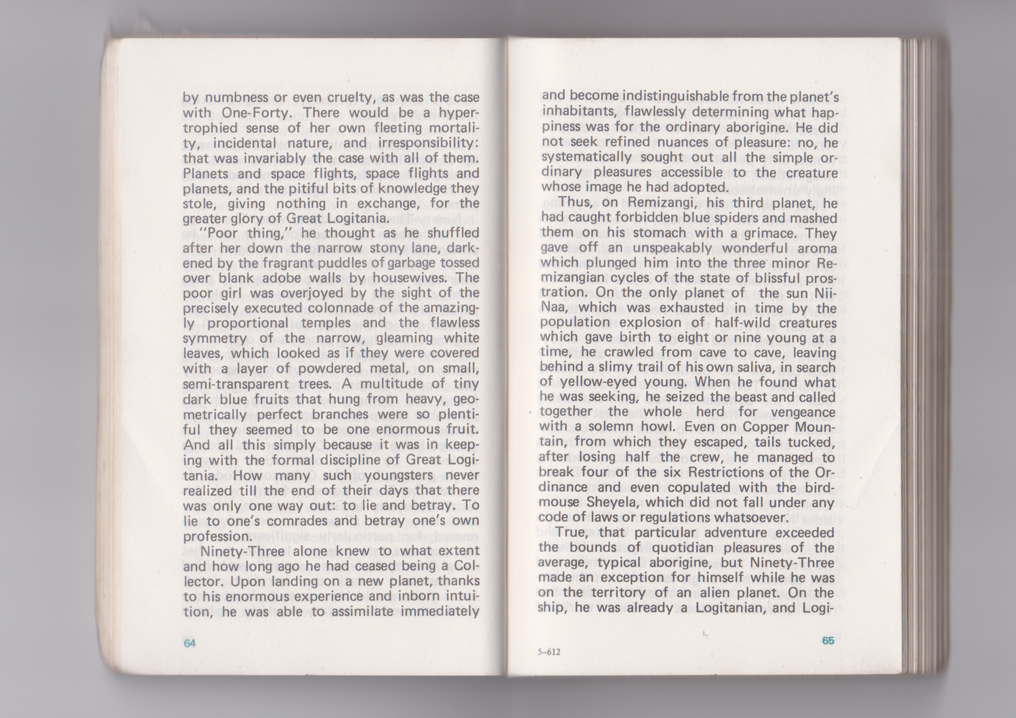
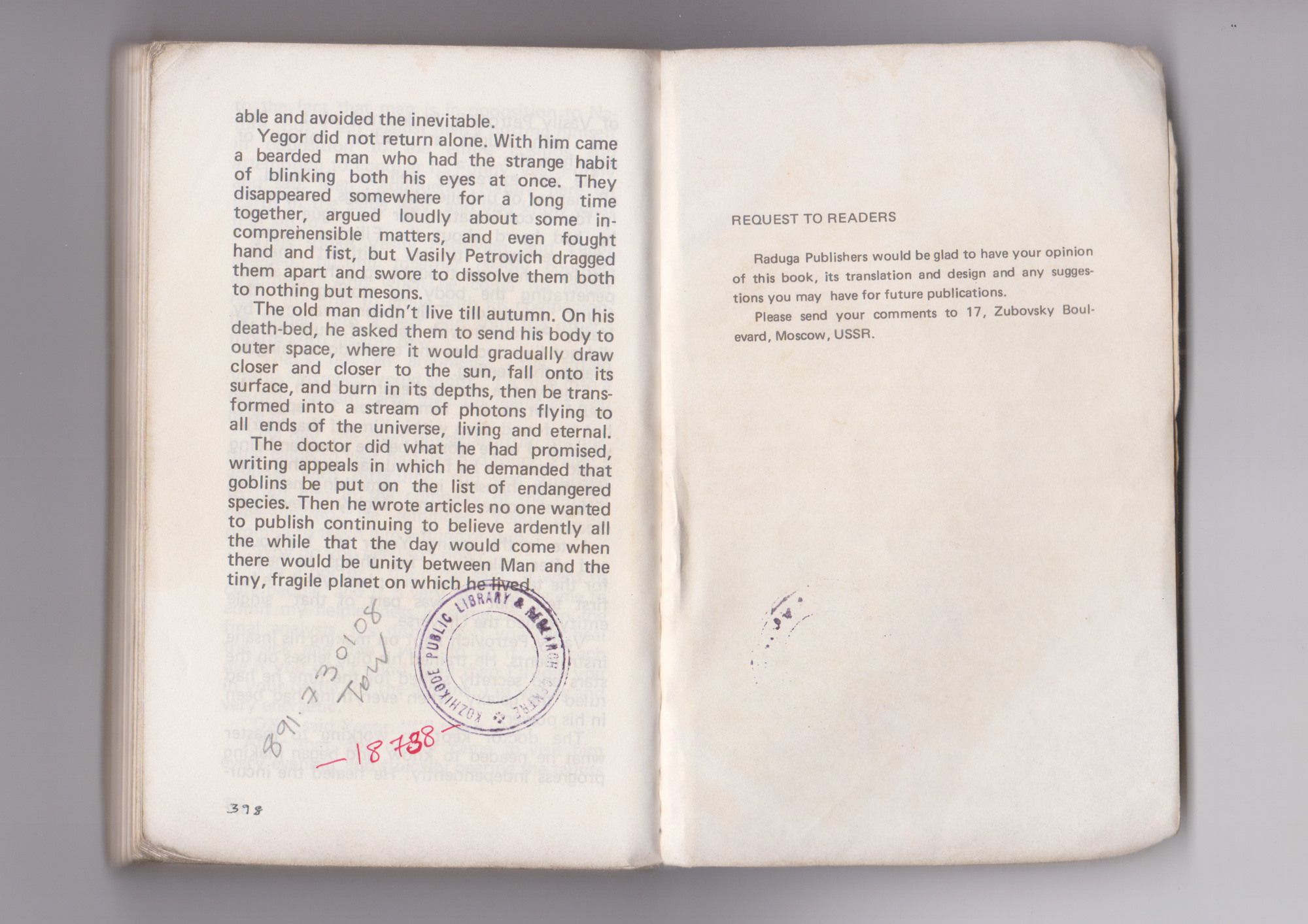
For a chance find, the stories were appropriately overwhelming. That (alone) is not what made me fall in love with the book though. For a book that tiny (from an L*W point of view, not from a thickness one), it is produced with attention lavished to details most others would consider ripe for cost-cutting. (It is perhaps a Russian culture-thing and I am attributing great intent to it.) The book’s text-block is printed in black, except for the page numbers in green. That is a major oddity when nothing else of note—neither the titles nor the book’s half-title—is printed with the same green ink. The margins are lavish for such a small page size; you never run out of thumb-room as you fight the undulations of a packed state-bus over half-full potholes. One other thing that reminds you of potholes is the terrible justification; seven words per column is a recipe for major waterways in the text-block.[2] The colophon credits the designer[3] appropriately and does not make that seem an afterthought. The signatures are numbered (this is not the norm, even for Raduga’s own books I checked later at the library) for some reason. I don’t see that information being useful to anyone other than perhaps the book binding machine. To top things off in true socialist fashion, there is an honest appeal to the readers to share their comments on the book, at the very end.
Edit: Look at that contents page! It is beautifully—if a bit awkwardly around P278—typeset with one font at one size and two styles. Outside of a classroom, I’m a sucker for the one-face-one-size technique. Sadly, it lacks true italics (and oldstyle numerals, if we are at it) and the tabulation is a bit wonky, but its heart is in the right place.
If this is/was propaganda, this is propaganda well-made.
1: Kolupayev was a Mathematician/Bionicist(?) before he started writing SF at the age of 33.
2: The choice of type and the setting positively sucks, if you’re pixel-peeping. I guess the stories and the intent cloud my judgement.
3: Look for Gukova’s foldout books on the website.


