On Lists
→ July 11, 2024 | Reading time: 8 minutes
The List is a Paragraph That Stood in Front of a Mirror
Lists are one of my favourite things to typeset. I love how they are a near-perfect stage set for all the fundamental form- and type-related gymnastics in service of clarity and brevity. They are also so easy to mess up with the tiniest amount of extra paragraph indents or the wrong choice of bullets. The ‘risk’ thus involved is quite rewarding. I’ve also come to judge people (design people, not general people so much) by the lists they design. I find it easier to tell if someone is an excellent graphic designer looking at the way ‘bullets’ in their lists are indented, than by looking at tastefully rendered simulations of loremipsummed app screens.[1] Yes, I am fun at parties I don’t attend. Moving on.
What Lists Do
At the text level, the list strips away fluff even from otherwise well-sculpted paragraphs to surface all the crispy little chunks of stackable information. The list breaks walls of text into more ‘porous’ walls of text. Typeset well, the list pauses and takes stock of whatever has been, and whatever will be. Typeset carelessly, the list breaks the text’s flow into random islands where meaning keeps facepainted volleyballs for company. [2]
I Detest Bullets
Broken down to fundamental shapes that form them, ‘bulleted’ lists are an exercise in Gestalt theory. The directionlessness of bullets and our years of connecting dots to make meaning out of them are a match made in typographic hell. All the ‘dots’ form a line and the listed stuff floats away (sometimes together) looking like badly spaced (and punctuated) paragraphs.
Default Lists and Disconnect
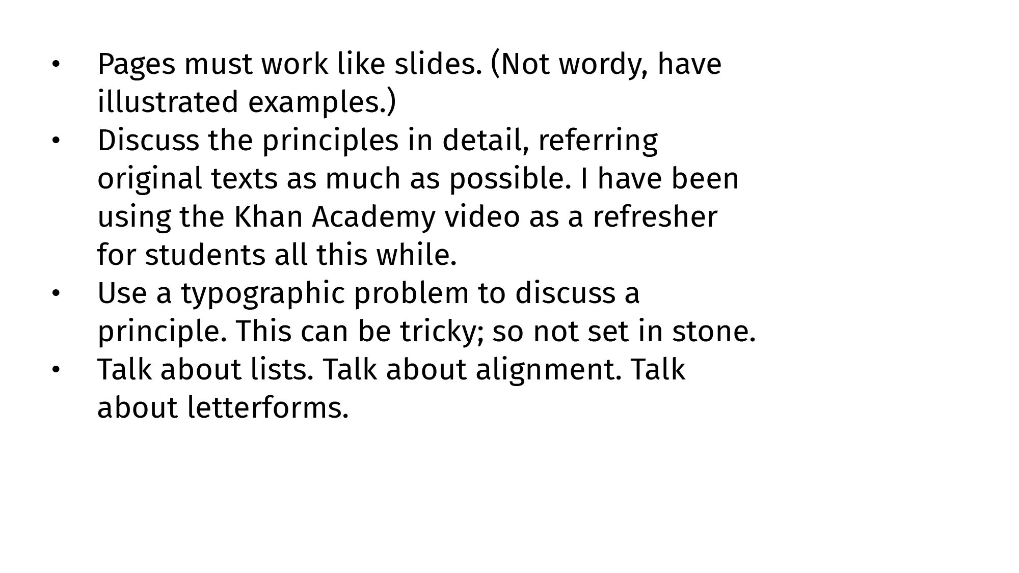
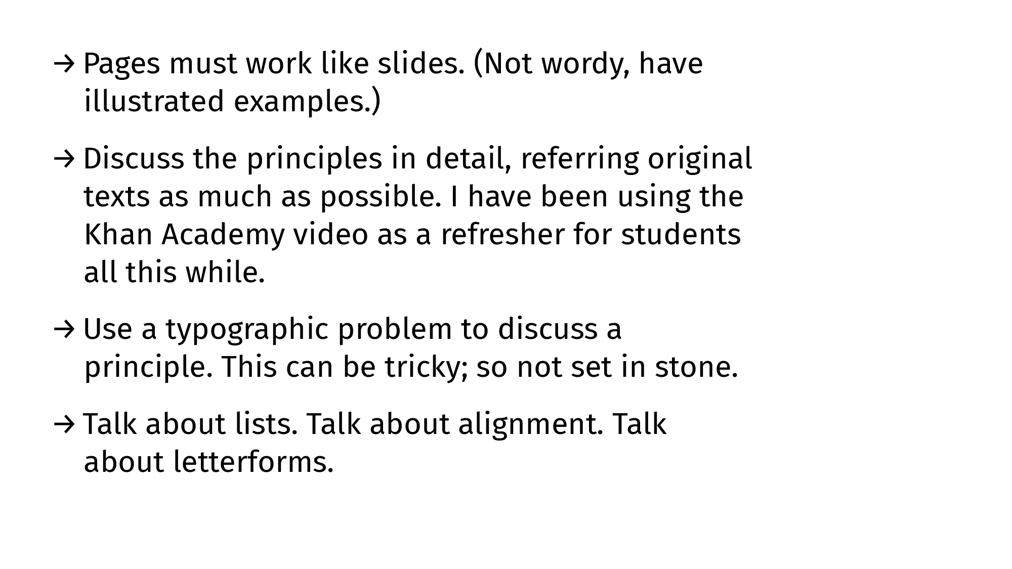
Here is an untouched (Default-Systems[3]) list straight out of Illustrator 28.5 typeset in 12pt Fira Sans (on a 1920×1080 artboard). I believe here is a basic Gestalt-principle solvable grouping-and-direction problem like almost everything else typographic.
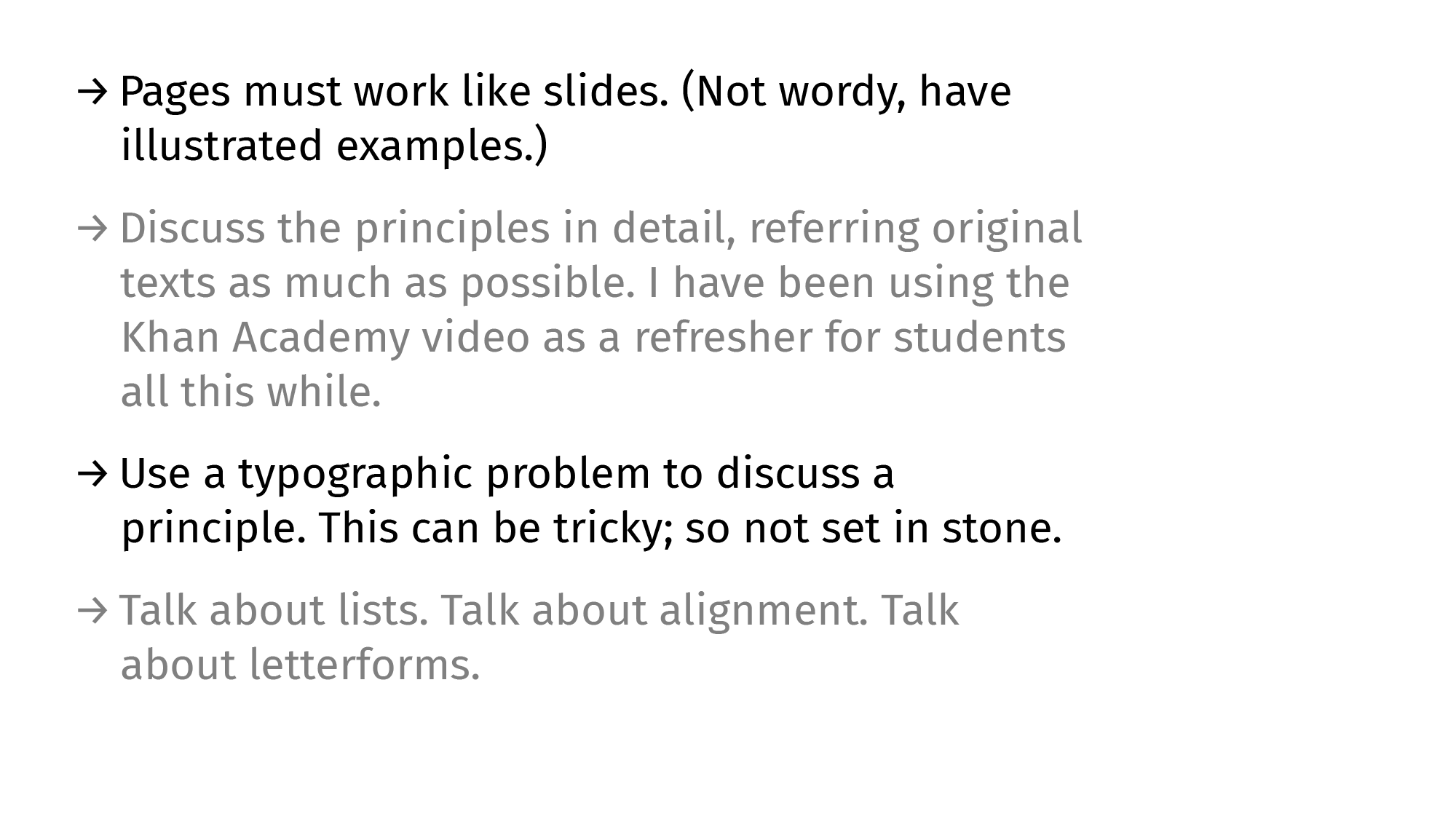
When we look at the basic-shapes version of that default-list, the grouping issues are obvious-er. I’m cheating and made the text-blocks black [4] instead of grey. (Otherwise this would be obvious-er-er.) The textblock here is a group and the bullets are one kid with a pencil away from being a separate line.
Making Lists Work: Paragraph Spacing
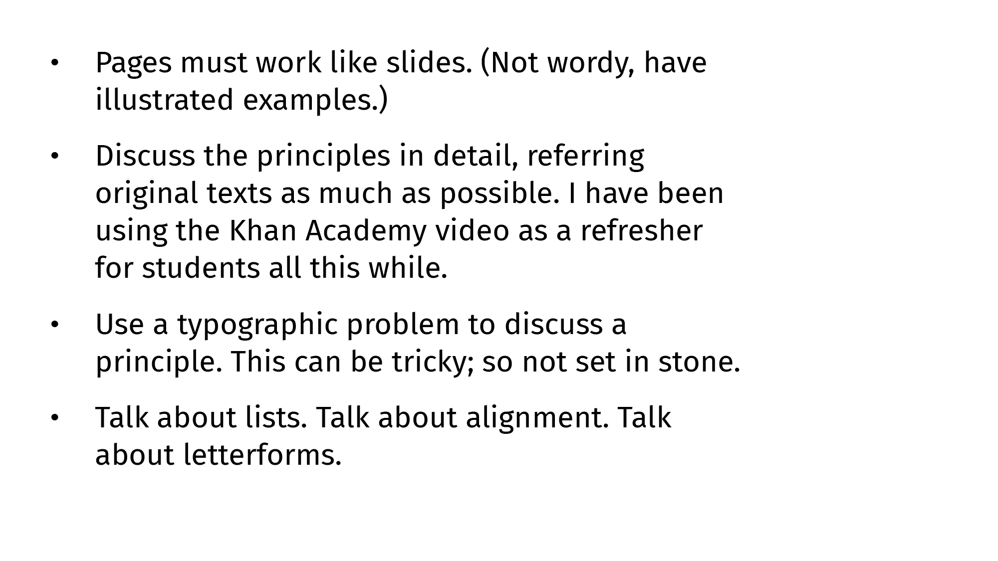
Starting with the most basic of measurements (extrinsic), we must add an adequete amount of paragraph spacing to separate listed items into their own units. The list is no longer a paragraph-with-a-string-of-dots-for-company.
Paragraph spacing, like everything else vertical-spacing related, is a function of how much we lead lines of type.
Making Lists Work: Indents, Intents
After spacing list items better, we tweak the indents-to-bullets to make them more intentional. This indentation takes care of most of the grouping issues around lists but doesn’t solve the aimless dots-waiting-to-form-a-line problem, especially if the listed items are equally tall.
Making Lists Work: Directional Signs
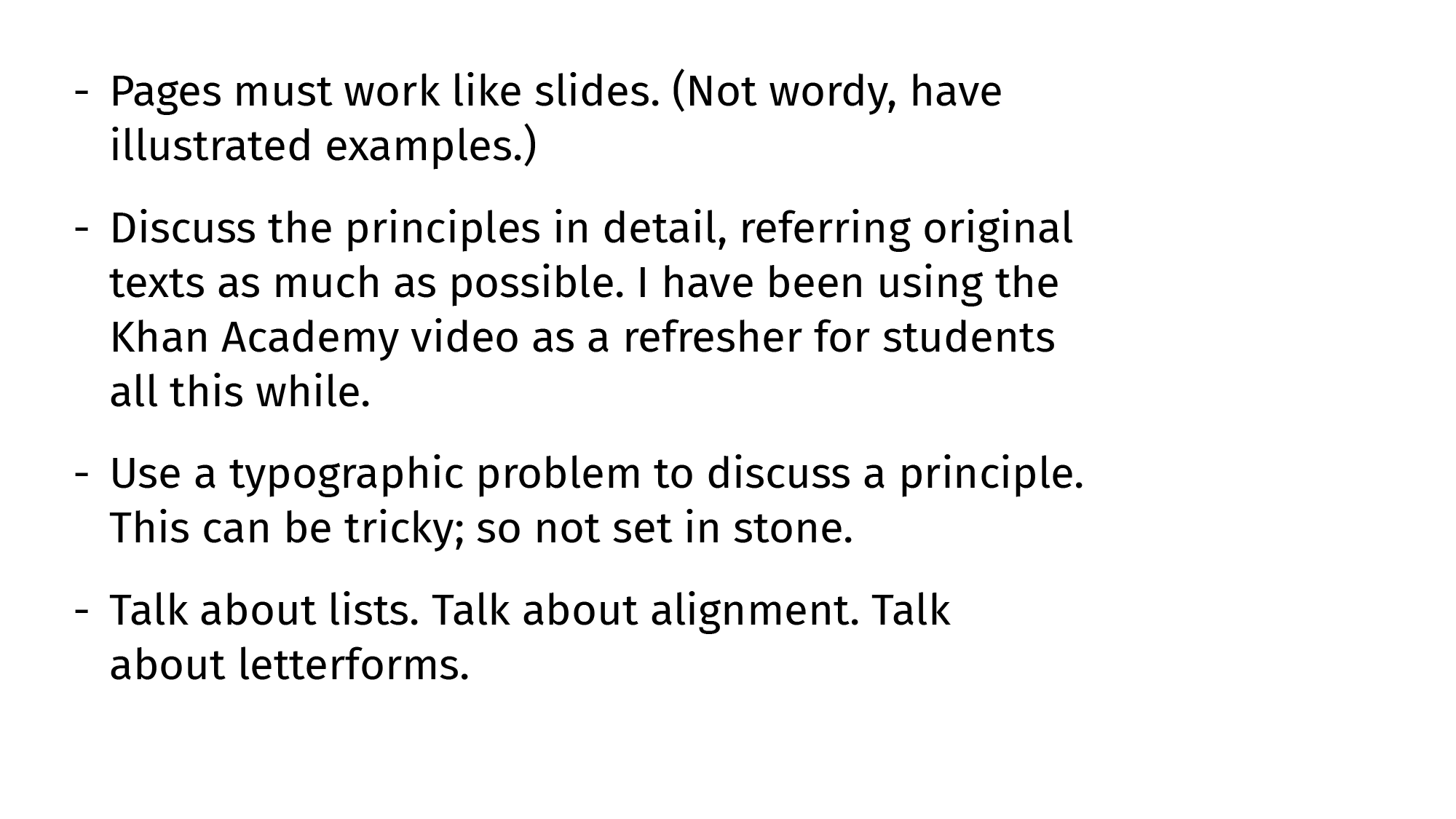
For fixing this similarity-related problem, we need signs with a sense of direction to point to the listed items rather than to the other signs below. Countering similarity with suggestion works (lines suggest a horizontal movement stronger than the vertical similarity).
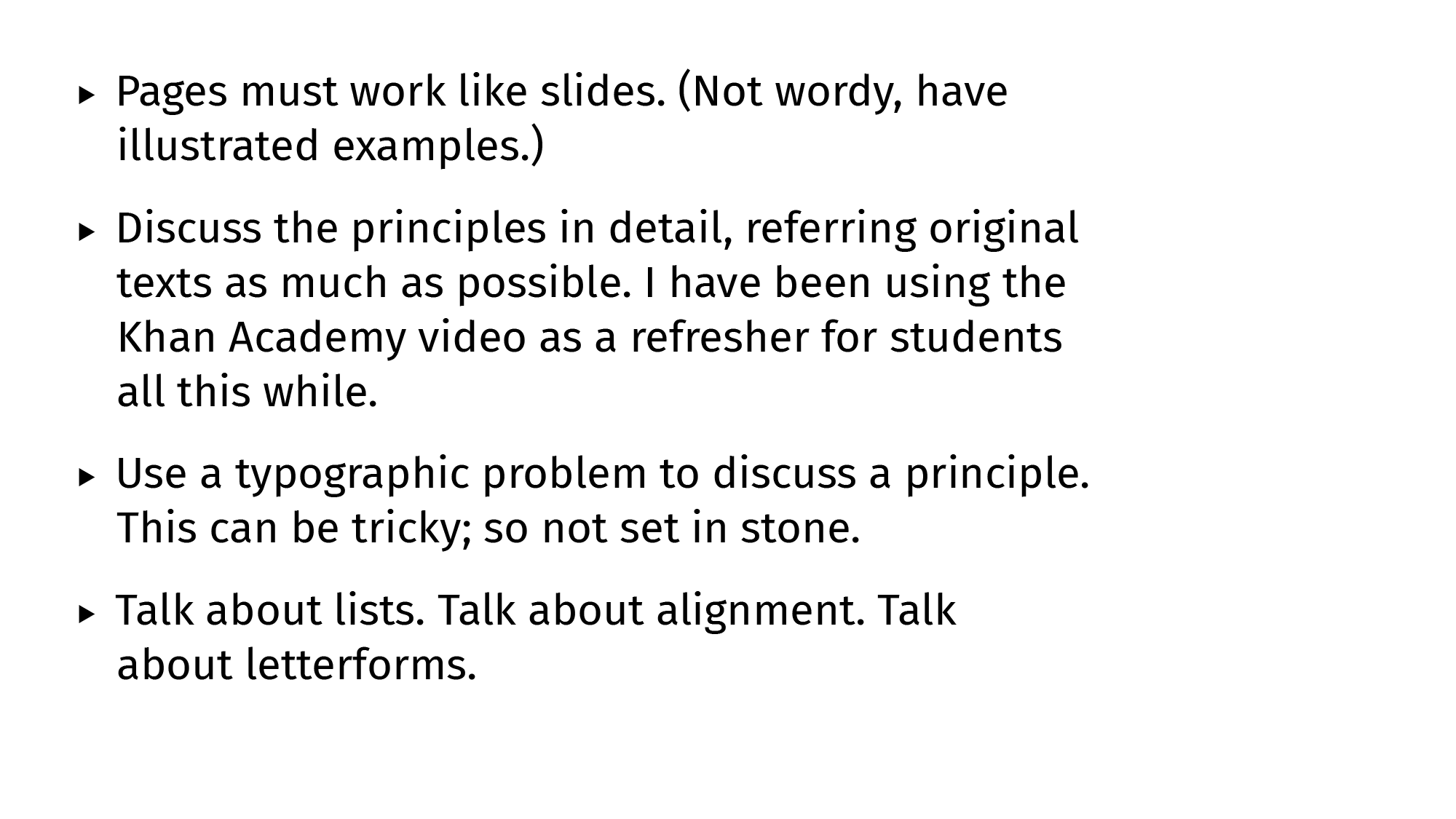
Triangles work too, as long as one downplays the similarity by making them small or grey.
A mix of both lines and triangles (arrows!) works even better given how obvious the ‘direction’ suggestion gets. It also helps that the font file has arrows too, and those glyphs are an even grey like the letters and punctuation.
Optional: Alternating Rows
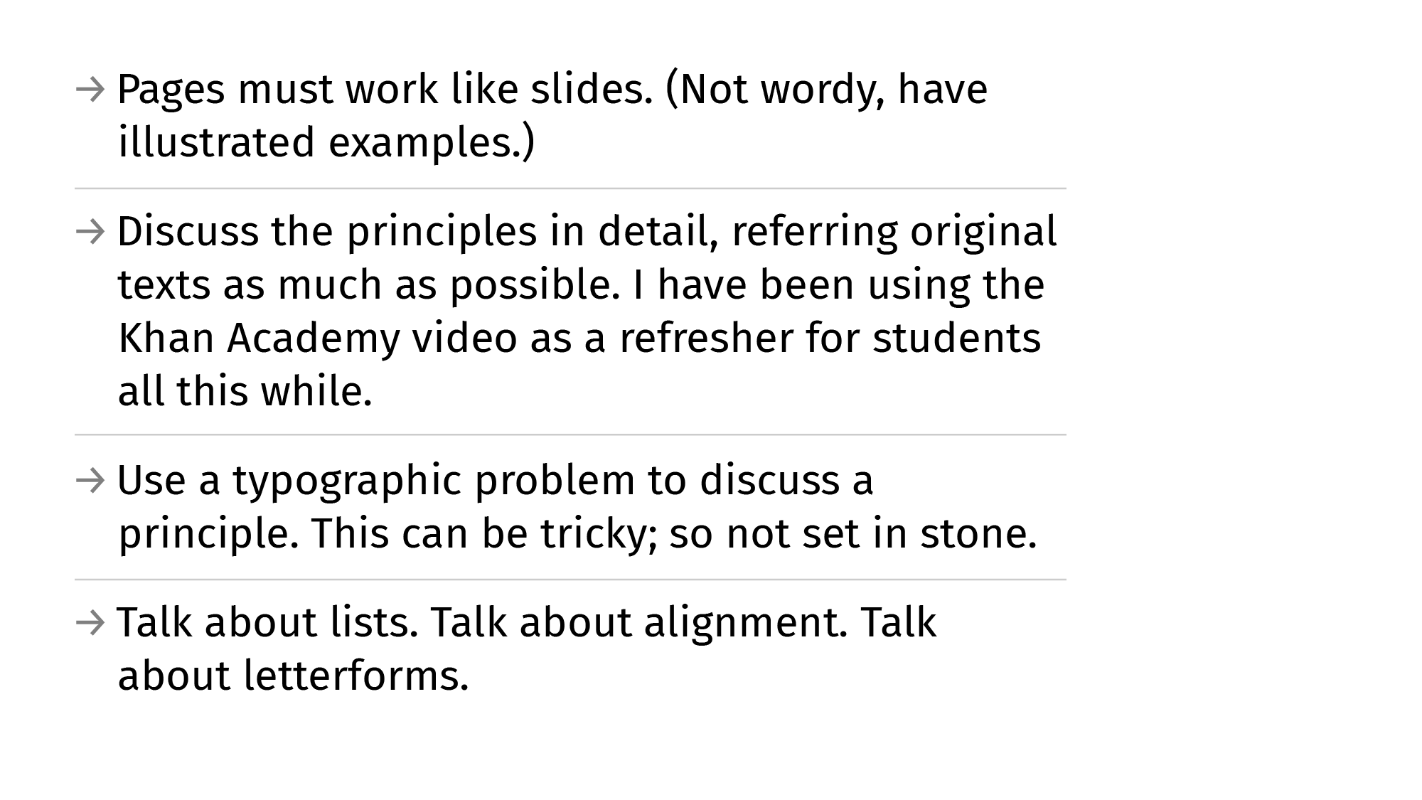
A fancier (not essential) way to establish even better grouping would be to iTunes-ify the list items. Either by using colour (values are a better way to go to keep the general group intact), or by using rules to break the last remnants of proximity-and-similarity-groups. Both are overkill.
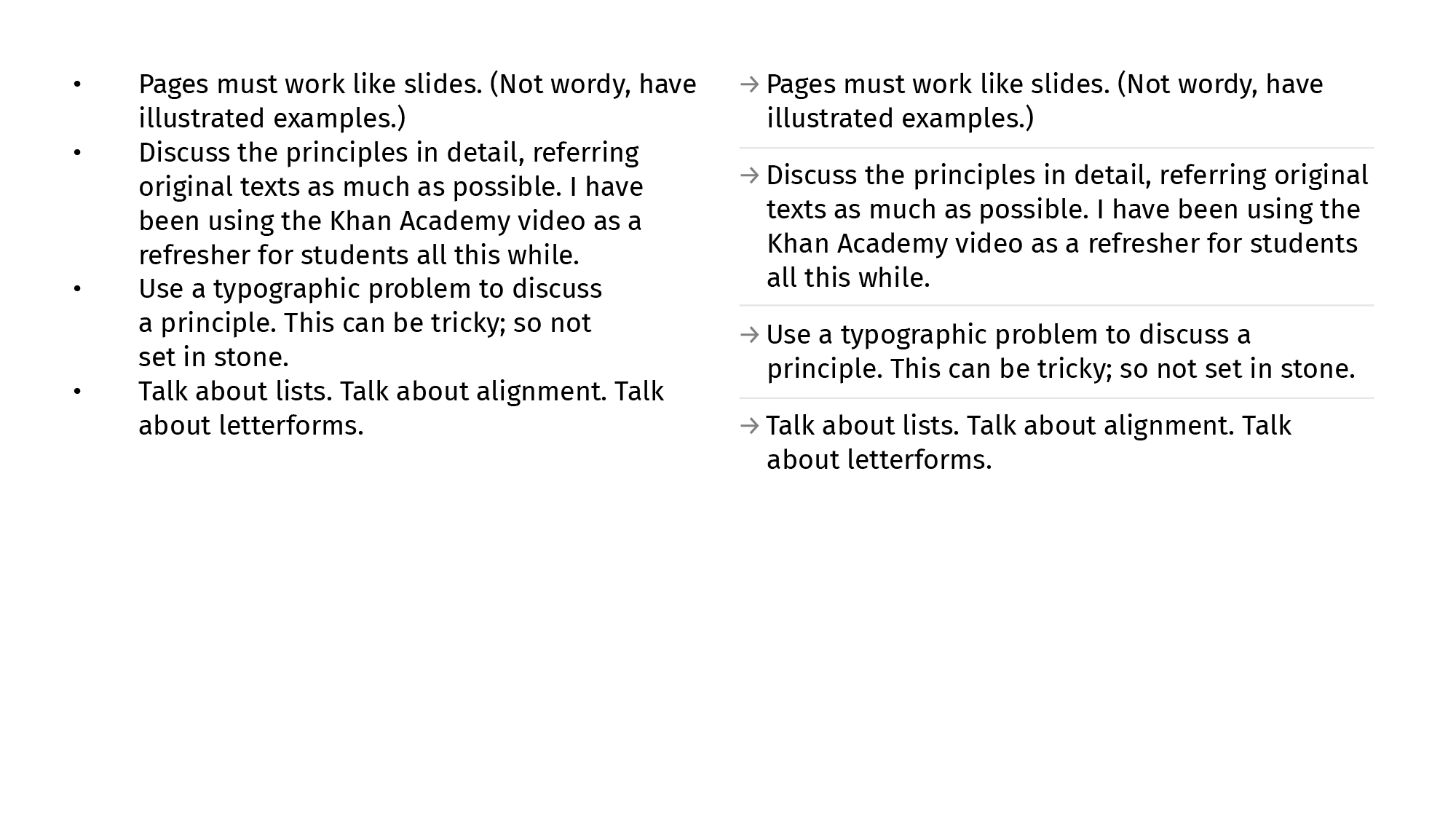
B&A
No self-respecting guide is complete without a B&A comparison. Here.
This is an early draft (of Chapter 6) of the Gestalt-Typography book I’m not-writing writing over weekends. I haven’t managed to zero in on a tone for this yet. I also don’t really know what I expect out of it either. Is it going to be required-reading for T101 courses I mentor? Am I trying to be the ‘teacher who wrote the textbook’ and revel in the ego-boost? Etcetera, etc. There’s an unhealthy amount of self-doubt attached. Feel free to write in and tell me everything is fine. Or not.
There is way too much work at the River HQ that it’s started messing with life at home and going home. I take work home and work late nights (early mornings) after coming home late. I work early mornings after sleep evades me at a rest-break at 2 AM. Not proud of any of this. Too old to be able to be proud of anything after an allnighter. I haven’t withdrawn a salary in three months thanks to how oldschool our bank back at KL11 pretends to be. There is so much ad-hoc stuff to pdf-print now that there are more stores and more people and—finally—a space to work from in the HQ building. M tells me he has dreams about presentations typeset in Söhne. We need to balance all this better.
H joined the brand team two weeks ago but hasn’t gotten the necessary silicon for work yet. We’re also stuck in a hardware/software acquisition limbo that has reached Catch-22 levels of absurdity and pain. Piano-piano. We’re happy to have someone we can trust and have normal conversations with. Ru (UX expert) has been here for two months now. Same boat. Good people good at their work. Much peace when you think about them being around. Etcetera.
1: The best portfolio is a well-indented Resume with proper punctuation, clear hierarchy, and decipherable connections. Date this quote so I can somersault my way out of the responsibility later if necessary.
2: Cast Away reference. Appropriate because lead type.
3: Lined and Unlined: Default Systems in Graphic Design
4: Unrelated and fun read from Norma. Also read the rest of the logs.
