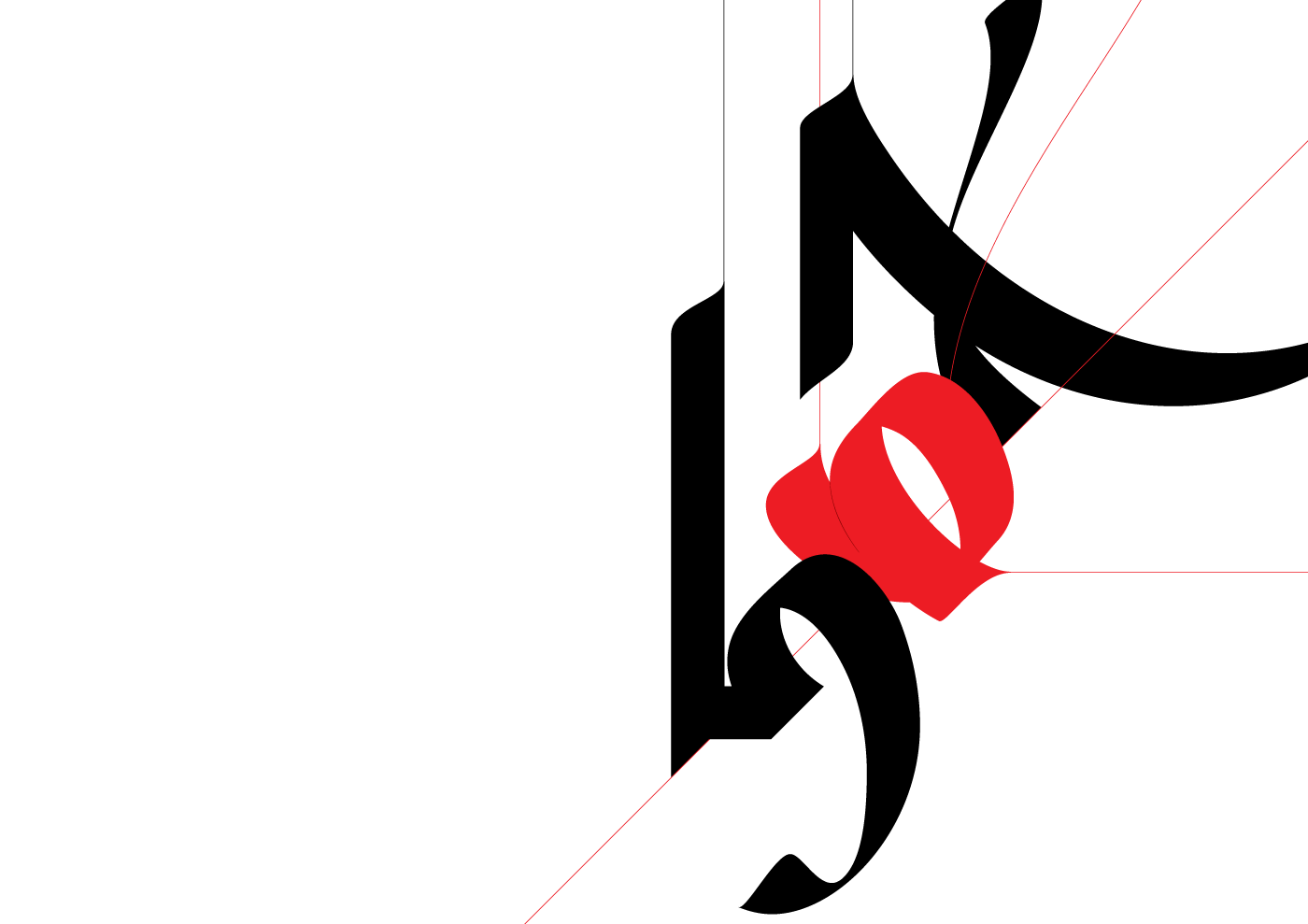
Home / Day 5 / Overlaps
→ March 26, 2020 | Reading time: ~1 minute | Permalink
→ March 26, 2020 | Reading time: ~1 minute | Permalink
→ August 21, 2019 | Reading time: ~1 minute | Permalink
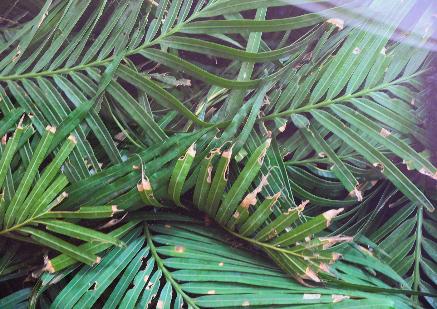
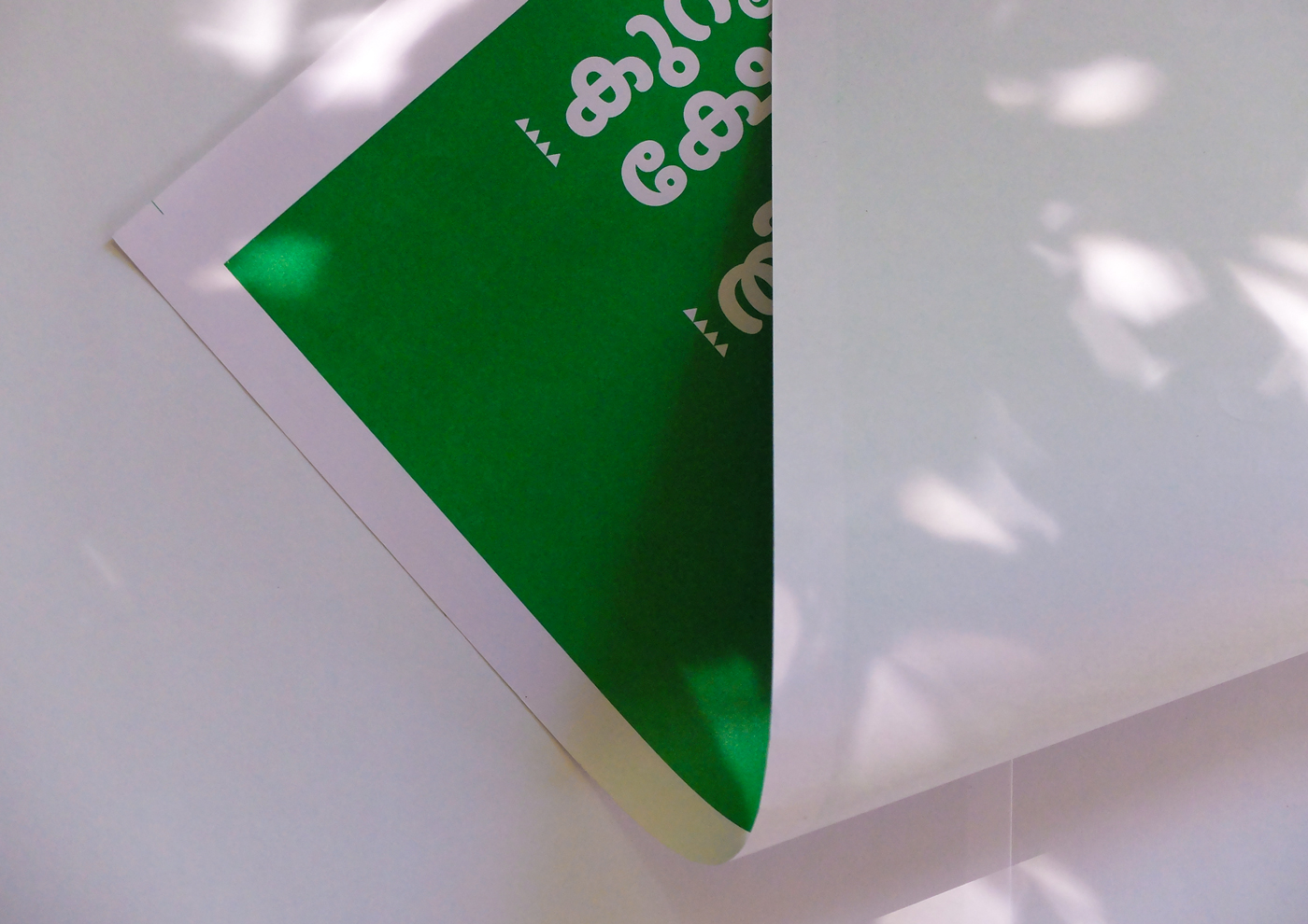
Baloo Chettan in the flesh. Single colour offset on fairly cheap paper.
→ July 3, 2019 | Reading time: ~1 minute | Permalink
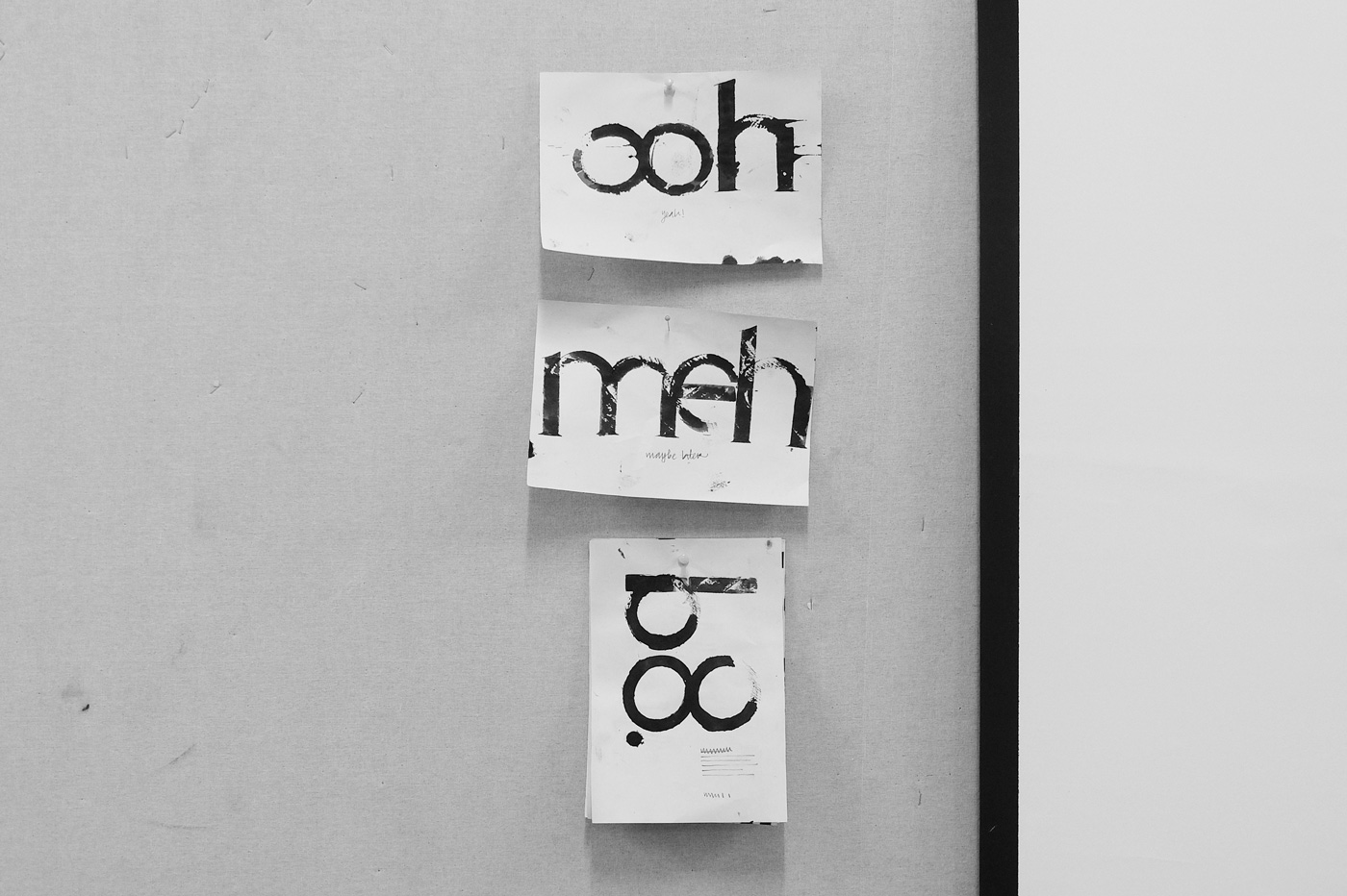
Having an approximation of fun (literally) at the class’s expense, during the T2 course, NID-Av.
→ May 28, 2019 | Reading time: ~1 minute | Permalink
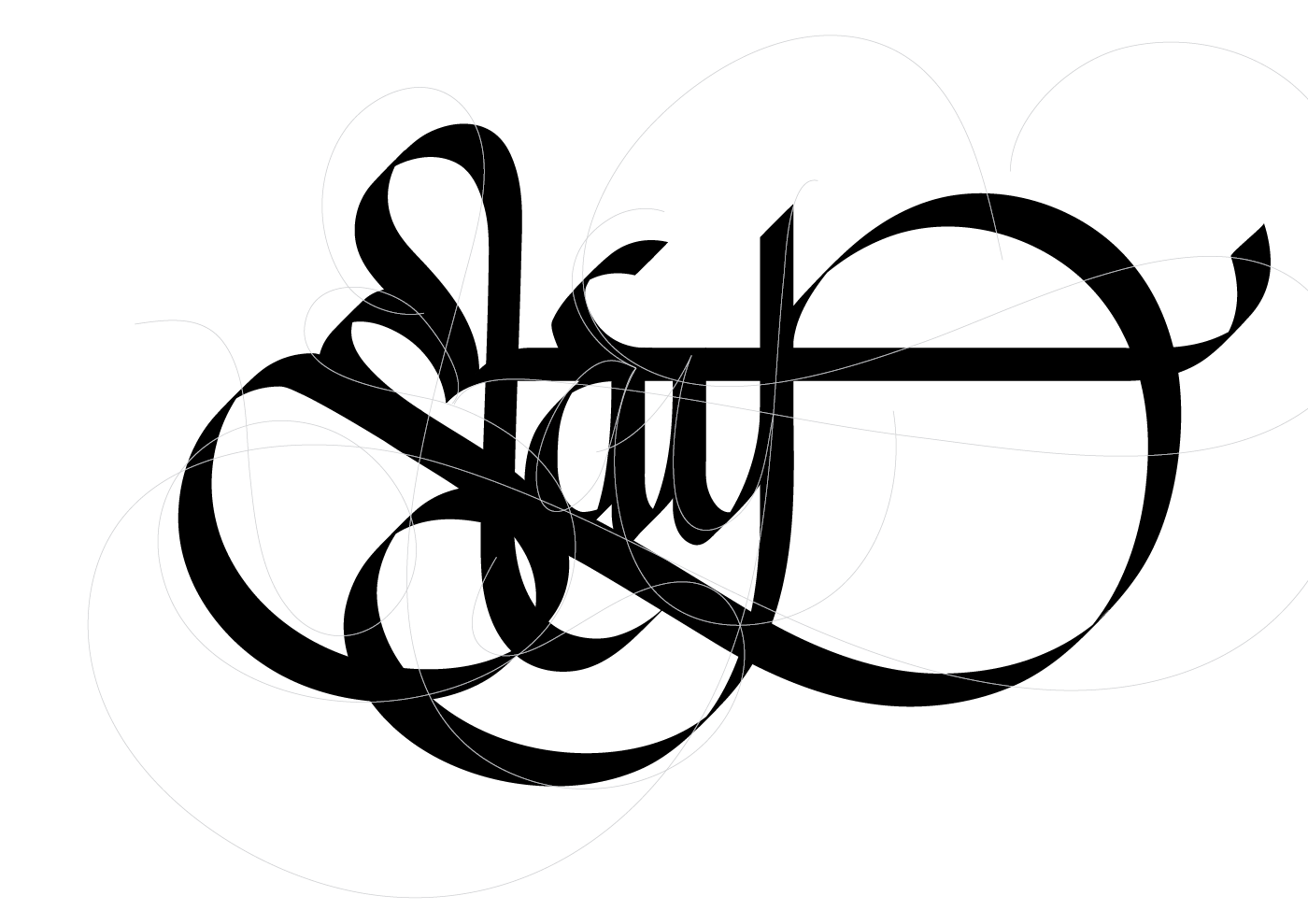
→ May 26, 2019 | Reading time: ~1 minute | Permalink
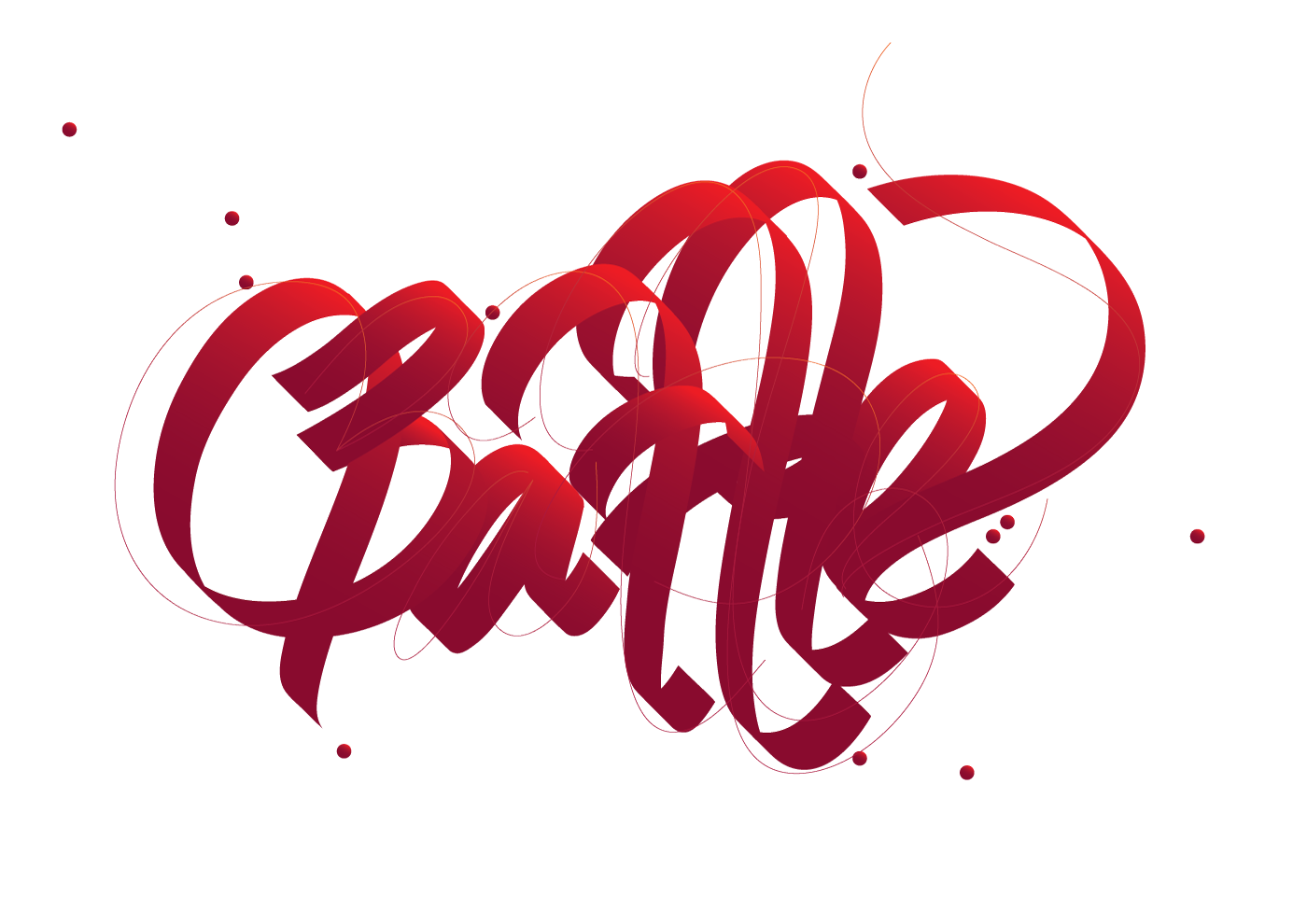
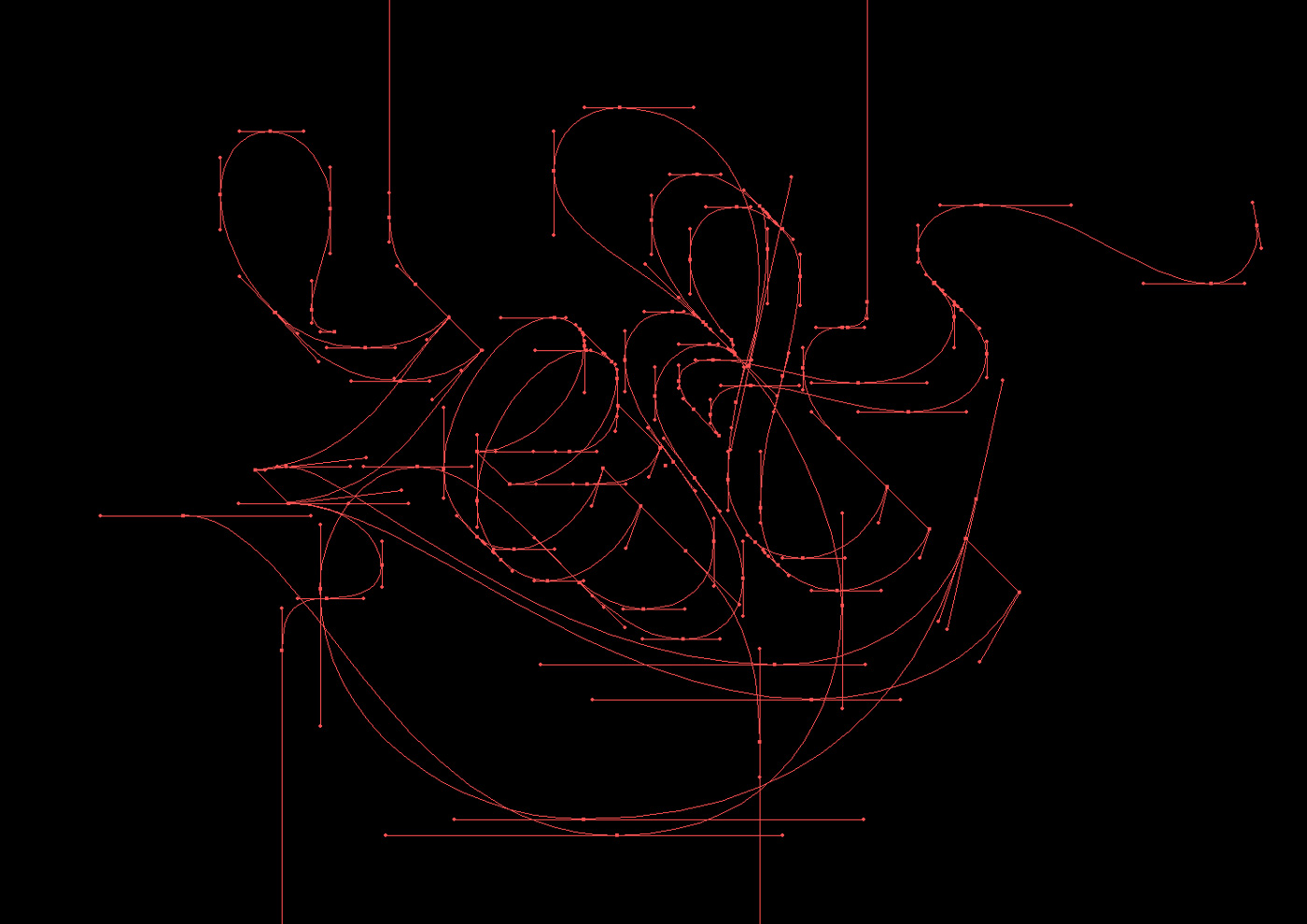
Lightly edited brush-strokes and largely untouched pencil-strokes awash in gradients. Using the tablet on the lap like a much lighter fruit-branded device is an easier way to deal with wide strokes. The fans (and the temperamental device drivers) get in the way and stink of a generously sized BuyersRemorse beast lurking between the almost nonexistent foldout legs.
The two Ts are less than nice to look at but whatever, for now.
→ May 16, 2019 | Reading time: ~1 minute | Permalink
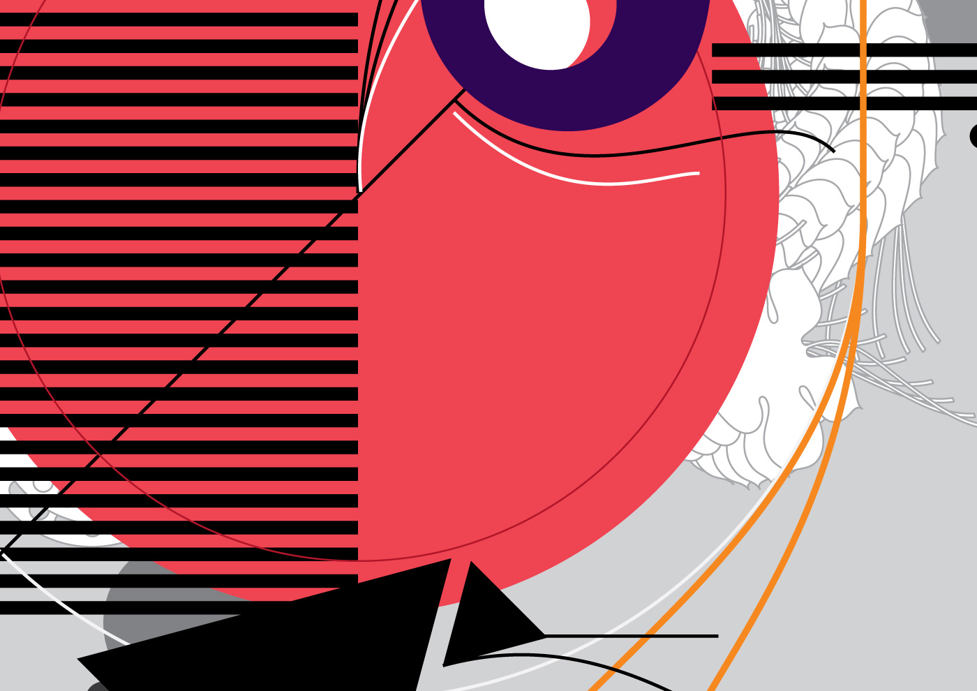
Cropped from a composition in reverence to Chip Kidd’s cover for The Wind-up Bird Chronicle.
→ May 12, 2019 | Reading time: ~1 minute | Permalink
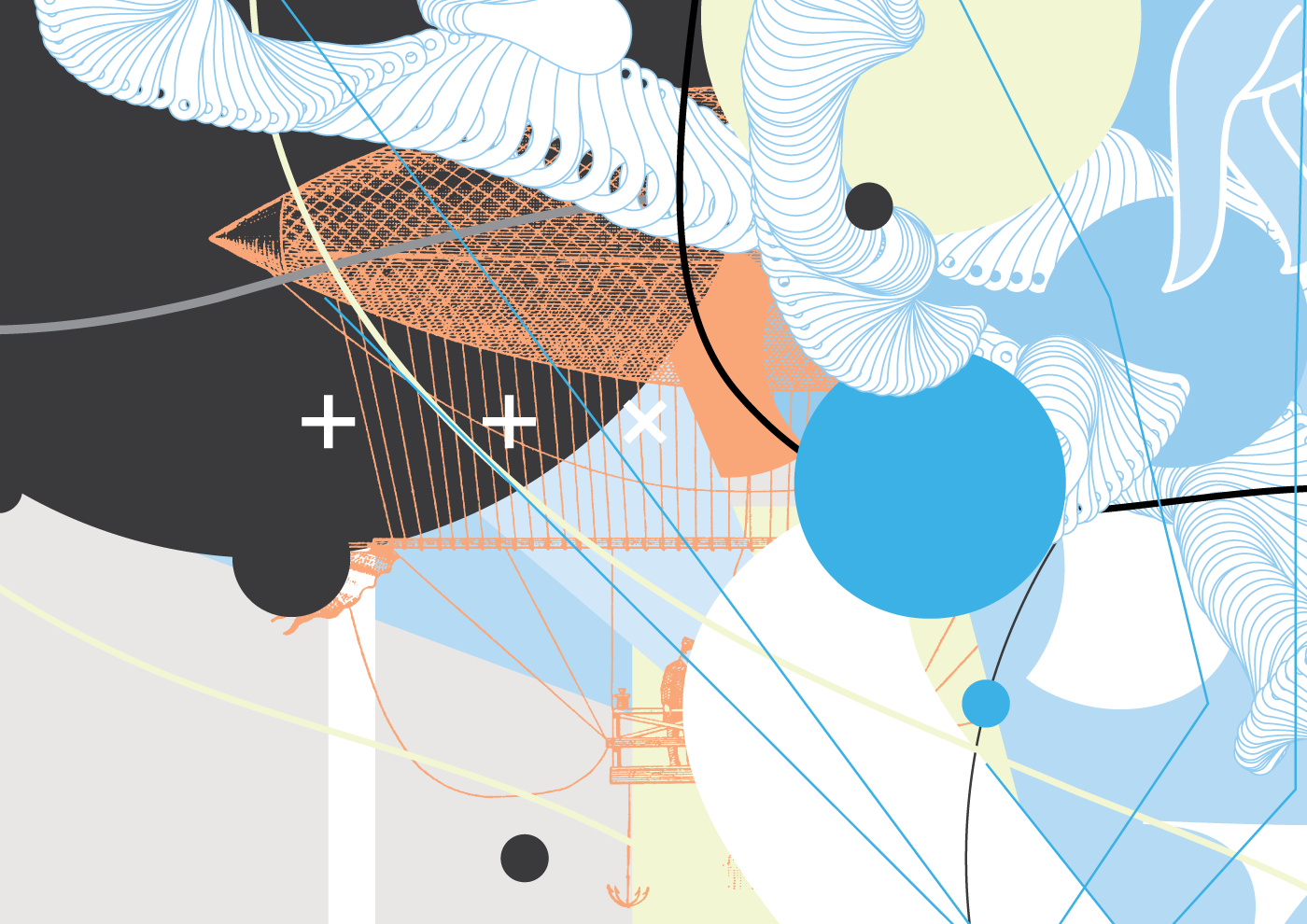
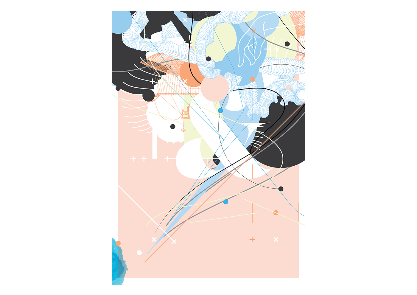
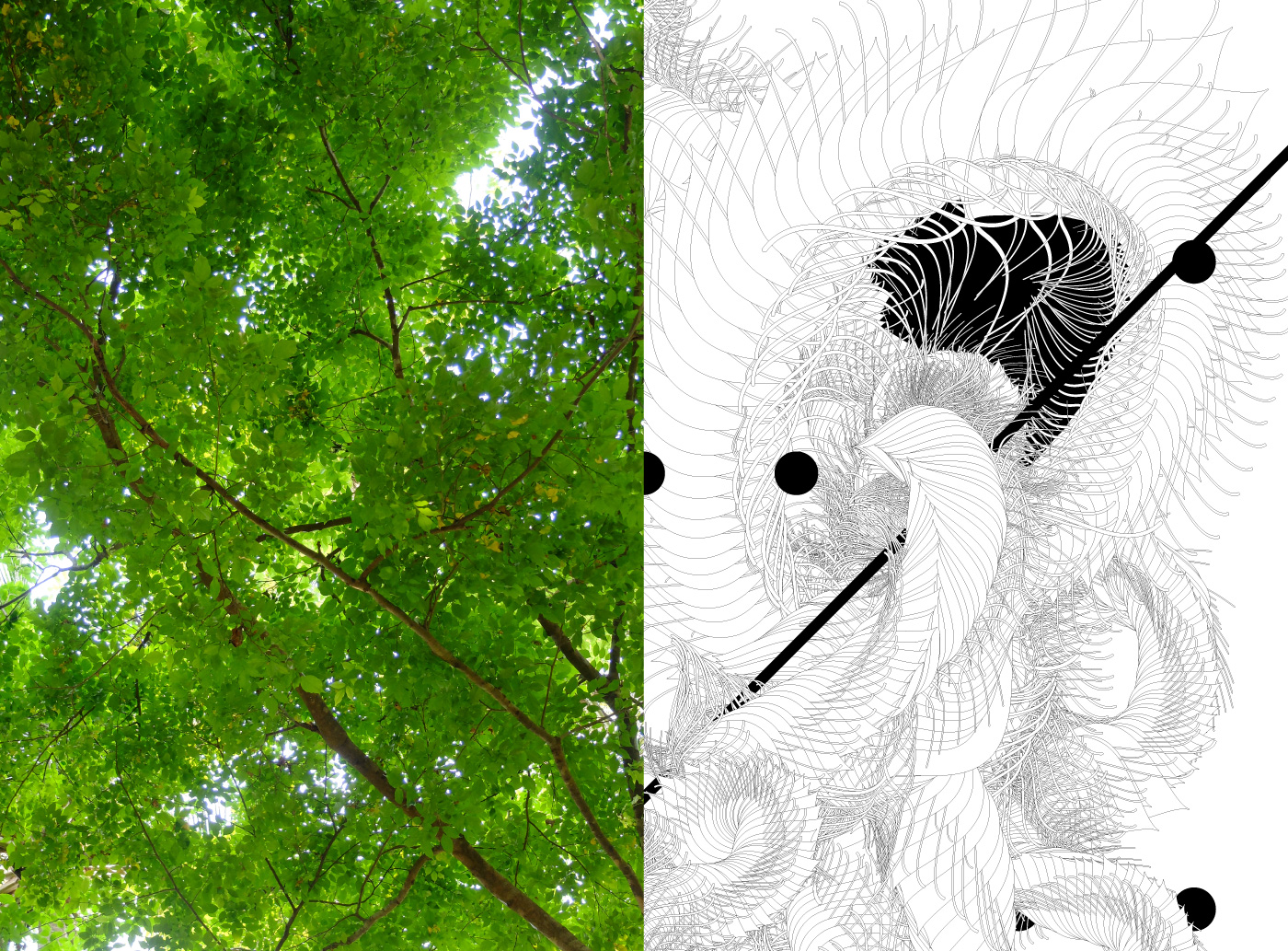
Part generative art, part pen-tablet exercise. The Pencil tool (N) is a much more appropriate bezier-starter (than the Brush tool, B) when tweaked well. The Brush picks up annoying stroke thicknesses by default.
→ May 5, 2019 | Reading time: ~1 minute | Permalink
→ April 8, 2019 | Reading time: ~1 minute | Permalink
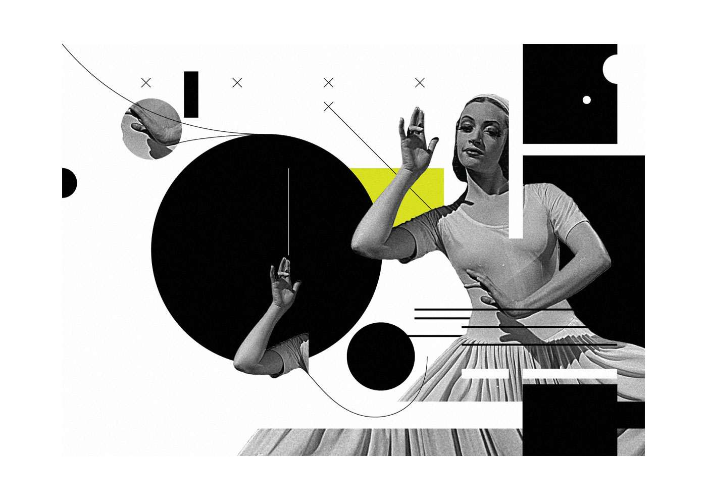
From October January 2014; I’d just left Gurgaon.
→ March 26, 2019 | Reading time: ~1 minute | Permalink
