To the Print-shop, With Love
→ December 27, 2021 | Reading time: 7 minutes
Great print-shops don’t just print well; they reciprocate your love for print.
It isn’t often (more like never than ever) one looks forward to seeing a PDF that has gone to the printer come back all inked and kissing paper in ways nicer than what the screen approximates. It is rare for a printer to be consistently good at what they do at prices that aren’t approaching personal-scribe levels of indulgence. That brings us, conveniently, to this thinly disguised love-letter to our friendly neighbourhood print-shop in Kozhikode. Trendz (Flash? TrendzFlash? FlashPrint? I never get that right or anywhere near consistent; you will see.) is a big-ish floor of discerning (but mostly—for no fault of the shop’s—restless) people seeking print-outs (mostly Xeroxed copies of huge A1 sized architectural drawings, lanyards of pretty colours, large sheets of business cards that most definitely need to fit into A3-express-es and not just A3s, etcetera), unimaginable-otherwise-ly patient designer-DTP-professionals who know what they are doing and are in no hurry to let you know they know, the odd Errando person who is amused and restless in turn (thanks to how crowded and how on edge the rest of us leave the floor), etcetera. Trendz can print white (and silver, and gold) on all kinds of paper and not-paper. Trendz can print and frame photos on canvas. Trendz can print on off-the-menu-paper if you promise to bring it (the paper). I don’t think they can walk on water. I haven’t asked for a quotation for that, yet. The point is that printing at Trendz is much more exciting than it theoretically has any right to be.
Printing is meant to be hit-or-miss (hit-and-miss) in most small-ish towns. We were worried about finding passable quality printers in Kozhikode moving in, in 2014. Then we found Trendz and haven’t looked anywhere else yet. (I—regrettably in 20/20 hindsight—did, once, in 2018. I apologise for the Pantone promiscuity.) The flat swathes of colour don’t look like a second-year textile-design-student’s weekend (no-lines!). The flat-colours are flawless. The flat colours sing in that special voice only coloured-paper does, otherwise. The registration, while not perfect under bright light and some push-pins, is easily masked with 3mm bleed on all sides. The colour reproduction is great, considering how slightly off all the monitors at the home-studio-setup tend to be; the shades almost match their Pantone swatches more often than not. They’re great even with bad (RGB) sources. They’re good with scaling/cropping/flipping/rotating. You don’t have to ask them to ‘leave the artwork be, don’t fit it’ every time a PDF goes to get birthed again. Etcetera. You know what I mean. This is print the way print should be. With people-who-care manipulating the machines. Etcetera.
The people there are perhaps overworked but manage to find joy in helping when they hear you speak of spot colours and wait patiently behind their supposedly revolving chairs. I have had plenty of time watching people like B-chechy at work on CorelDraw and Photoshop (she admits she’s not good with Illustrator, fixing white spot-ink selection for my sorry CC-ed ass) and I am convinced she/they can race me to a corner, with their left index finger alone finishing alignment on some unnecessarily complex client-layout. I watch them deal with pressure and a need for making things right. I watch them deal with disillusioned customers after they realise source-quality matters. I watch them levelheadedly deal with bad contrast and esoteric typeface selection. I watch them deal—with grace—with fellow enthusiasts who are eager to teach them how to do their jobs. Often the younger ones would crane their collective necks to B-chechy and ask for expert advice on some obscure paper-sizes or print-processes. (I just go straight to her or to one of the print-engineers who come out and work the DTP-end once in a while. There was a DQSellman-haired youngster there who used to be a pro, too, but I think he found greener Pantones.) The work isn’t easy, with people whose mental-models of how print works is modelled after wide printer-margins and ant-sized type on everything, demanding multiple edits at once and ‘discerning’ eff-ers like yourstruly looking for a special-colour-on-craft-paper fix to deal with loneliness, and some misguided sense of purpose. Etcetera. The lady at the counter (simply, chechy), a lean, forty-plus-ish looking woman of impeccable dress-sense and solid work-habits (who reminds me of a Maths teacher that likes to moonlight as girlshostelwarden for kicks) is curt in a likeable way with impossible arguments and requests from customers. She’s all politeness and care the moment she spots my mug from across the counter; because I have learnt the superpower (the only one that makes sense at a print-shop) is patience. Patience and an ability to bend and support yourself on your knee-balls without weirding out the designers. So, counter-chechy (whom I assumed to be Christian—but isn’t; she worked the day before Christmas so some colleagues could take the day off—for the longest time because of her convent-like manners) is all efficiency and nothing much else, often. (She recognised me through the one-and-a-half inches of exposed specs and said ‘goodmorning’ as she walked in late today. It felt great. No. Scratch that. It felt effin fantastic and I smiled through all six layers of my mask.) Even the behind-the-scenes-but-actually-the-whole-scene-people, the print-engineers (including R and the chettan with many threads on his wrist) are fantastic beyond their job-title. Most would come out with your print and make sure things are okay before they commit acres of forest to torture.
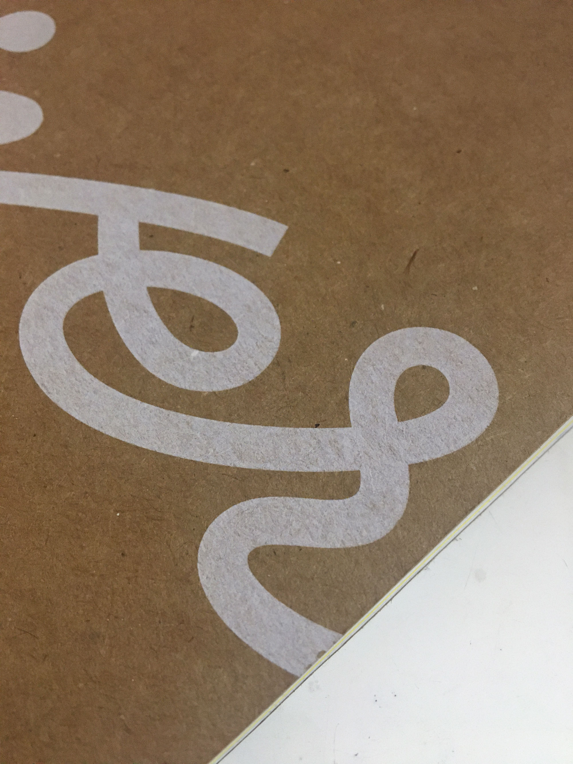
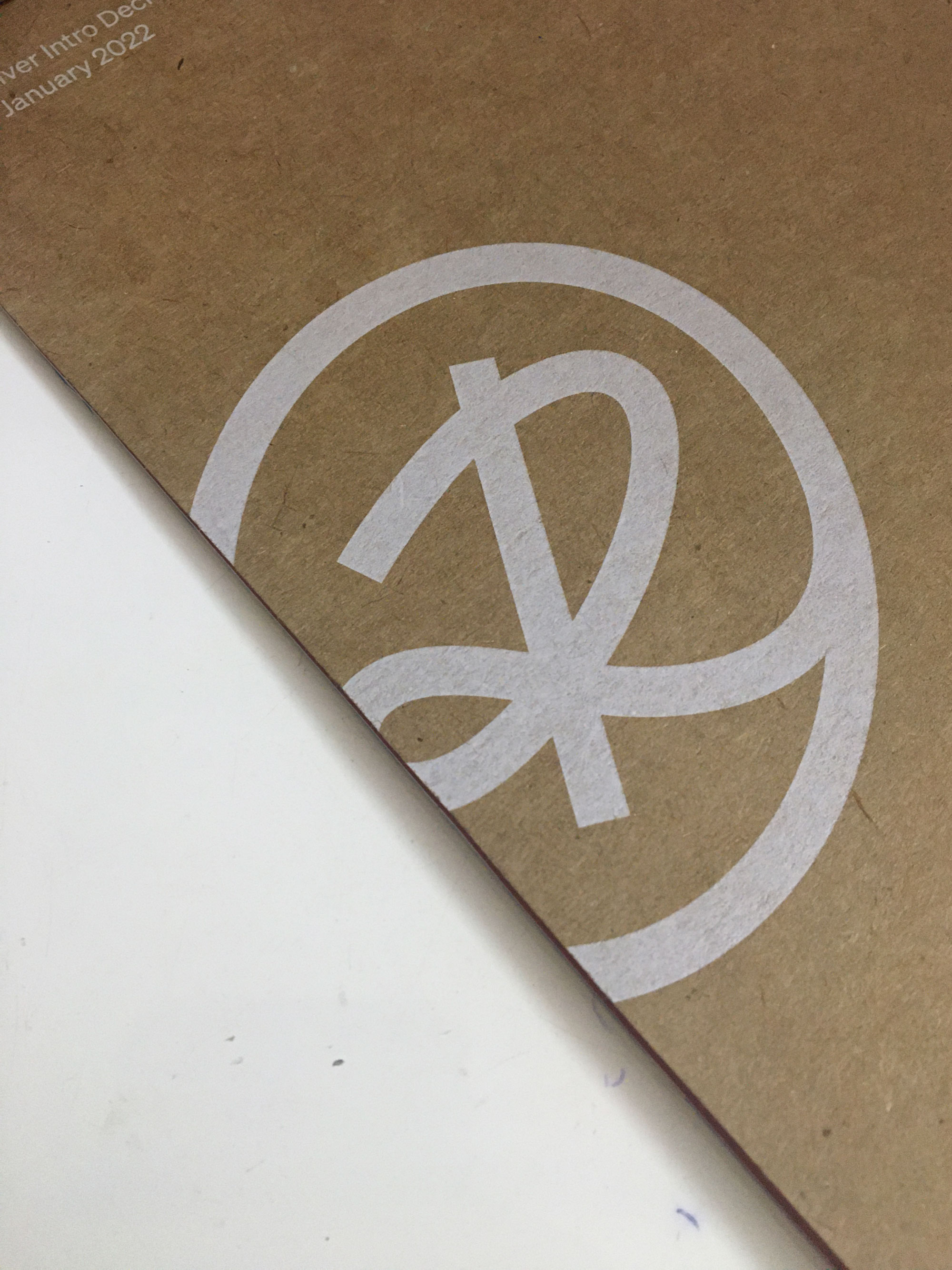
Trendz recently got a Xerox Iridesse press to Kozhikode and I had been waiting to print with speciality inks. We have been working with an EV startup that doesn’t call itself such, for the past year, and had the opportunity to make something that stood out in print for their up-coming presentation at CES. The covers (C1 through C4) are craft-paper and white and glorious, printed at T. I had to keep myself from ordering unnecessary test-prints after the first two. I’m looking forward to picking fifty copies up in the evening.
The white isn’t screen-print-thick (of course) but has that nicest of show-throughs when looked at from an angle. The paper feels great. And the whole affair smells great—kerosene-ey and paper-ey in equal measure while managing an essential earthy nuance. It screams ‘ecofriendly’ in subtler hues than green.
So, yes. We have a great print-shop in town and this is—as promised in UG-third-year—my love letter to the place. Please don’t crowd our little slice of ink-paper-heaven on weekday mornings; that’s when we get our kerosene-pulp-fix. If you choose to anyway, maybe we’ll let the shop-folks know how well-loved their work is.

