Only a lover notices the small things: the way the afternoon light catches the nape of a neck, or how a strand of hair slips out from behind an ear, or the way a finger curls around a cup. And no one scans a letter so closely as a lover, searching for its small print, straining to hear its nuances, its gasps, its sighs and hesitations, poring over the secret messages that lie in every cadence. The difference between “Jane (whom I adore)” and “Jane, whom I adore,” and the difference between them both and “Jane—whom I adore—” marks all the distance between ecstasy and heartache. “No iron can pierce the heart with such force as a period put at just the right place,” in Isaac Babel’s lovely words; a comma can let us hear a voice break, or a heart. Punctuation, in fact, is a labor of love. Which brings us back, in a way, to gods.
Rode to Kappad in the evening. If you can hear Gama in the background, it is either young bearded pony-tailed folks playing beach football in slow-mo or you might want to get your head (preferably with ears intact) checked.
Every time I am at the beach with the intent of catching the moment the sun sets, something significant distracts me seconds before that happens. This time it was a regular crab walking in sideways into its bunker like the thousand other regular crabs I’d been watching the whole evening. Yes, exciting evening. I was probably sat on some of their bunkers too; choosing to align myself to the smoothened parts of the shore rather than the rough-and-tumbled. Next time; always a next time. The ride back was significant in that I passed three (3) Lycra-clad gentlemen on hybrids wearing fluorescent helmets and pained bicyclist expressions appropriate for a late evening ride. Not really. It was significant because thanks to the elections, the traffic was standing still and I got to reenact select scenes from Premium Rush. Not really. It was just that night had fallen by the time I reached the plantain plantations and the LED headlight illuminates banana leaves in glorious FullHD ghostly pallor. Add to that the slow breeze and a surprising lack of freewheel noise (need to degrease that chain soon), and that is roughly twenty-something seconds of bliss.
Why go to all that trouble, to do all this? [Talking about typographic niceties; dashes, quotes and the like.] Aesthetics… is not such a compelling argument for this. Or for anything. Because it is highly subjective. Furthermore, it is a function of time and space. At a larger level. What we, Indians consider to be beautiful, Americans might not consider to be beautiful. Aesthetics is also very infectious. In some senses, you can be trained to like certain things. If I faff a lot about this font [points to a screen showing various kinds of quote marks, dashes and an ellipsis and their HTML character codes], you will suddenly start liking it. Because I faffed about it. … These are the kind of questions we dabble in… [in] academics. … Ha… matlab, for whatever reasons.
I had the browser open to Girish’s homepage on the quirky and sane IDC website and one hyperlink lead to another and in no-time (in real time, though, it was thirty seven seconds into the first video), I was grinning at that lecture-series (in four parts). Outside of the video, he dabbles in teaching typography, books, sharing obscure and critical information—processed, and presented with deliberate commentary after being asked six times, being nice to people, commenting on excel-sheet course plans and helping young kids (…) testing teaching-waters, etc., when not putting together an impressive (intimidating) number of multilingual fonts with folks at EkType.
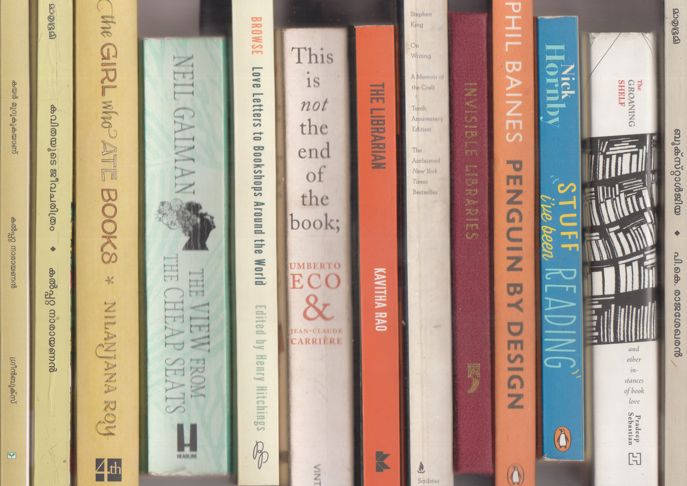
Some metabook-books I think are worth their weight in paper pulp laced with gold during the great Kerala wedding season: Kalpetta Narayanan Master’s Kayar Murukukayaanu (The Noose tightens) on books, people, places etc., and Kavithayute Jeevacharitram (The Biography of a Poem) on po-etry and -ets; Nilanjana Roy’s The Girl Who Ate Books; Neil Gaiman’s View from the Cheap Seats on people with books in them; Browse: Love Letters to bookshops Around the World edited by Henry Hitchings on places with books in them; Eco-and-Carriere’s This is Not the End of the Book where they talk about the book object; Kavitha Rao’s The Librarian with a girl who goes to work in a large library in Bombay; Stephen King’s On Writing; Yoda Press’s weird collection of imaginary libraries in Invisible Libraries; Phil Baines’s Penguin by Design, on book covers and the people and places that make them; Nick Hornby’s Stuff I Have Been Reading with a self explaining title; Pradeep Sebastian’s witty and relatable Groaning Shelf on book people and book places; P.K. Rajashekharan’s book memories in Bookstalgia (not as fun as Kalpetta; the title is what sells it). The list is defined by the length of my scan-bed; off-screen, working as props and caught in a Kindle are Seven Hundred Penguins, David Lodge’s Lives in Writing, Zafon’s Shadow of the Wind, etc.
Up-hoot #1: Found Love Among the Bookshelves today at the State Public Library (this, of the dust-jacketed—not the just-jacketed—kind.) Too many book-related coincidences this week.
Classes were held in the local elementary school. Because the students had the summer off, we were able to [make] use of the cafeteria as a classroom, two students sitting at each of eleven large tables. Paul would go from desk to desk carrying a collapsible garden stool with him so that he could sit and talk to each student about his or her work. Each tête-à-tête went on as long as was necessary to set the student on the right track and was laced with stories from Paul’s vast career as they were appropriate to the issue at hand. When he worked with students, he poured his heart and soul into it.
Paul remained part of the core faculty of the Brissago program until it ended in 1996. It didn’t take long for him to be convinced that this kind of concentrated and intense interaction with individual students was the best way to teach graphic design. He tried to transplant the one-project/one-week arrangement to the Yale program but because of the academic and extracurricular demands placed on the students, it never quite worked.
— Philip Burton on Paul Rand, Paul Rand: Conversations with Students
Part of the fun in teaching is all the -related literature and films and songs and anecdotes one reads oneself to sleep with. The other part of the fun is vacuously imitating the not-so-important parts and hoping things unfold well. There is a txti in there somewhere—of all the ‘material’ on teaching, waiting to be put into HTML. Point being that nothing can replace this extended bakchodi with individuals (on their work), showing them related work, showing them seemingly unrelated texts that make sense, showing off some of one’s own work, etc.
I started teaching typography and accoutrements (mostly accoutrements) in August 2018. This course has me really painted into a corner with the constant struggle with whether to preach the thin-stemmed crystal goblet or twirl a moustache a-la Victore. (Fuck your middle-path.)
It continues to be a process of getting paid for learning new stuff. And I think the learning equation is heavily tilted to the wrongright side. Here is the course-as-a-commentary HTML thingy. (Updated often; some useful links.)
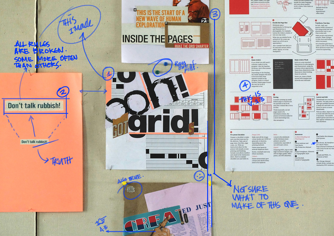
The one on top is Miss. SJ’s attempt at subtly commenting on the course. (I kid.) The bottom one (I need a New Cubicle) is from Miss. AS. She’s repurposed an otherwise dry exercise real well as a back/fore ground.)
* An up+coming Indianie band with its roots firmly in place in the underbelly of a forgotten surgical procedure.