Shoulders of Giants (1)
→
April 3, 2019 |
Reading time: 2 minutes | Permalink
Why go to all that trouble, to do all this? [Talking about typographic niceties; dashes, quotes and the like.] Aesthetics… is not such a compelling argument for this. Or for anything. Because it is highly subjective. Furthermore, it is a function of time and space. At a larger level. What we, Indians consider to be beautiful, Americans might not consider to be beautiful. Aesthetics is also very infectious. In some senses, you can be trained to like certain things. If I faff a lot about this font [points to a screen showing various kinds of quote marks, dashes and an ellipsis and their HTML character codes], you will suddenly start liking it. Because I faffed about it. … These are the kind of questions we dabble in… [in] academics. … Ha… matlab, for whatever reasons.
— Girish Dalvi, Practical Web typography (1) on D’Source
I had the browser open to Girish’s homepage on the quirky and sane IDC website and one hyperlink lead to another and in no-time (in real time, though, it was thirty seven seconds into the first video), I was grinning at that lecture-series (in four parts). Outside of the video, he dabbles in teaching typography, books, sharing obscure and critical information—processed, and presented with deliberate commentary after being asked six times, being nice to people, commenting on excel-sheet course plans and helping young kids (…) testing teaching-waters, etc., when not putting together an impressive (intimidating) number of multilingual fonts with folks at EkType.
MetaFriction
→
March 31, 2019 |
Reading time: 2 minutes | Permalink
Some meta book-books I think are worth their weight in paper pulp laced with gold during the great Kerala wedding season: Kalpetta Narayanan Master’s Kayar Murukukayaanu (The Noose tightens) on books, people, places etc., and Kavithayute Jeevacharitram (The Biography of a Poem) on po-etry and -ets; Nilanjana Roy’s The Girl Who Ate Books; Neil Gaiman’s View from the Cheap Seats on people with books in them; Browse: Love Letters to bookshops Around the World edited by Henry Hitchings on places with books in them; Eco-and-Carriere’s This is Not the End of the Book where they talk about the book object; Kavitha Rao’s The Librarian with a girl who goes to work in a large library in Bombay; Stephen King’s On Writing; Yoda Press’s weird collection of imaginary libraries in Invisible Libraries; Phil Baines’s Penguin by Design, on book covers and the people and places that make them; Nick Hornby’s Stuff I Have Been Reading with a self explaining title; Pradeep Sebastian’s witty and relatable Groaning Shelf on book people and book places; P.K. Rajashekharan’s book memories in Bookstalgia (not as fun as Kalpetta; the title is what sells it). The list is defined by the length of my scan-bed; off-screen, working as props and caught in a Kindle are Seven Hundred Penguins, David Lodge’s Lives in Writing, Zafon’s Shadow of the Wind, etc.
Up-hoot #1: Found Love Among the Bookshelves today at the State Public Library (this, of the dust-jacketed—not the just-jacketed—kind.) Too many book-related coincidences this week.
Outside of a library (and of a dog), a quiet place.
1234
→
March 26, 2019 |
Reading time: ~1 minute | Permalink

Paul Vikramadityan Rand
→
March 17, 2019 |
Reading time: 2 minutes | Permalink
Classes were held in the local elementary school. Because the students had the summer off, we were able to [make] use of the cafeteria as a classroom, two students sitting at each of eleven large tables. Paul would go from desk to desk carrying a collapsible garden stool with him so that he could sit and talk to each student about his or her work. Each tête-à-tête went on as long as was necessary to set the student on the right track and was laced with stories from Paul’s vast career as they were appropriate to the issue at hand. When he worked with students, he poured his heart and soul into it.
Paul remained part of the core faculty of the Brissago program until it ended in 1996. It didn’t take long for him to be convinced that this kind of concentrated and intense interaction with individual students was the best way to teach graphic design. He tried to transplant the one-project/one-week arrangement to the Yale program but because of the academic and extracurricular demands placed on the students, it never quite worked.
— Philip Burton on Paul Rand, Paul Rand: Conversations with Students
Part of the fun in teaching is all the -related literature and films and songs and anecdotes one reads oneself to sleep with. The other part of the fun is vacuously imitating the not-so-important parts and hoping things unfold well. There is a txti in there somewhere—of all the ‘material’ on teaching, waiting to be put into HTML. Point being that nothing can replace this extended bakchodi with individuals (on their work), showing them related work, showing them seemingly unrelated texts that make sense, showing off some of one’s own work, etc.
Patience (nts?) and Scissors*
→
March 16, 2019 |
Reading time: ~1 minute | Permalink
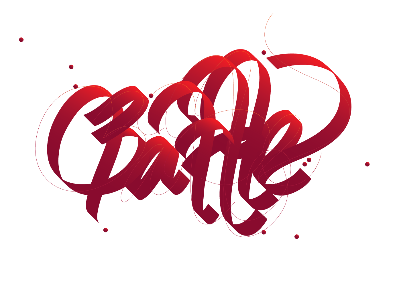
I started teaching typography and accoutrements (mostly accoutrements) in August 2018. This course has me really painted into a corner with the constant struggle with whether to preach the thin-stemmed crystal goblet or twirl a moustache a-la Victore. (Fuck your middle-path.)
It continues to be a process of getting paid for learning new stuff. And I think the learning equation is heavily tilted to the wrong right side. Here is the course-as-a-commentary HTML thingy. (Updated often; some useful links.)
The one on top is Miss. SJ’s attempt at subtly commenting on the course. (I kid.) The bottom one (I need a New Cubicle) is from Miss. AS. She’s repurposed an otherwise dry exercise real well as a back/fore ground.)
* An up+coming Indianie band with its roots firmly in place in the underbelly of a forgotten surgical procedure.
Gridnook
→
March 10, 2019 |
Reading time: ~1 minute | Permalink
It will take me justsixcolumns, I said. You can pay me by the column-width, I said. Ooh/meh.
On Giving a Shit
→
February 26, 2019 |
Reading time: ~1 minute | Permalink
On the other hand, cheap, rough paper with a beautifully set textblock hanging just so on the page makes those in the know, smile (and those who don’t, feel welcome). It says: We may not have had the money to print on better paper, but man, we give a shit. Giving a shit does not require capital, simply attention and humility and diligence. Giving a shit is the best feeling you can imbue craft with. Giving a shit in book design manifests in many ways, but it manifests perhaps most in the margins.
Craig Mod, Let’s Talk About Margins
Part of the trouble with setting the blog in monospaced type and letting the browser decide what is best (the CSS reads ‘font-family: “Courier New”, courier, monospace;’) is that there is no guarantee the em dashes will be distinct enough to not have them mistaken for their shorter, less fancy cousins. There is an advanced typography course I’m tutoring soon and I was rereading Bringhurst this time with intent. I realise it is odd and all kinds of unprofessional to have left it run this way—without distinction—for four years. There are spaces around the em dashes now (see last sentence) for making sense’s sake and I don’t recommend it used this way otherwise. (A little piece of javascript runs at the end of each page to replace all instances of the dash with a space-dash-space string. So the ‘actual’ text in its editable form stays the right way, for when the monospace phase passes.) Bringhurst recommends an en dash flanked by two spaces over the em dash without spaces around (which [the actual em] is what the Chicago Manual prefers). The Practical Typography website has this to say on the matter. There is a beautiful bit of prose on the absence of an ebook version of the site, elsewhere.
I shouldn’t have used the word “content” to describe what writers make. Writers make writing. So let’s call it that. Because “content” isn’t a neutral word. It’s anesthetizing jargon that encourages us to see the best (and worst) parts of the web as fungible commodities, like soybeans. Writers are not content farmers. Recognizing that fact is a prerequisite to improving the economics of writing.
— Matthew Butterick
While the fairgrounds are full of life and lights and odd juxtapositions of the well-thought-out (like the many muscle-powered rides that go round with one delirious kid in a random car tied [the car, of course] on to the rotating platform[1], lit up in a baaraat of zero-watt bulbs [or LEDs masquerading as those] with wonderful pieces of jugaad-ed electrical wiring wizardry[2]) and the fantastically random (the five Freudian dogs sniffing out politically incorrect definitions of people from a paying crowd, aptly named [the dogs] Raja, Rani and two other names I failed to commit to memory), the show is—without question—stolen many times over by the man with the mike (to the right of the image) drawing a sizable crowd to the well-of-death with his (almost) non-stop banter. It is as if he is enjoying himself tremendously. He isn’t[3]. But he makes it all sound so convincing in a non-annoyingly self-deprecating way (India’s largest such well-of-death, featuring three thousand three hundred and thirty three nuts and bolts and two hundred and seventy five light bulbs[4]). On my first visit to the fair, I had assumed the speech to be a well-rehearsed—and by now, standard—affair. I was wrong; today’s version is subtly politically charged (the pathos is almost palpable) with a long-drawn joke about the absurdity of it all and the flash-hartal. Then there is the manic laughter every once in a while, followed by a bout of Tamil with an accent so Sivaji Ganeshanesque it is hard to not cheer from the edge of the crowd that has by then gathered to just watch him pour out this heartfelt piece of hard-selling prose. Some people in groups wolf-whistle in approval. He weaves the absurdity of issuing a no-smoking warning at a show that promises frequent encounters with death and so on, into the narrative at some point. Peppy bollywood music peppers his pauses. The volume knob does its little dance. He takes reviews from the unsuspecting crowd on their way down from the ‘well’ after a show. Even the most inarticulate reviewer sounds like Gordon Ramsay on a particularly good hair day.
People expect in fairgrounds an encounter with the absurd. Or at least something off-kilter like a board shouting ‘BREAK DANCE’ in tall, outlined capitals over a ride where people are tied to their chairs and hold on to their lives and sentient dupattas. The well-of-death salesman mixes a deadly dose of self-awareness into the cocktail of the less than routine and serves it on the rocks. We are part of the joke-making mechanism so we laugh with the jokes and not at them. It is stand up comedy in first-person VR, if you will. His prose is the reason you make peace with the amplified cacophony of it all.
1: Kids have it the worst when it comes to peer pressure.
2: I am in awe of the one where the lights on the periphery of the rides take their juice from the axle. It is like an electric train, but wrapped around a crude cylinder.
3: He takes a short break from the banter once in a while and leaves people awkwardly staring at each other with no one to listen to, and their phones conspicuously not out. During the breaks, he is in serious conversation with a person who appears to be the show’s lead rider and probably the business partner.
4: Or something to the same effect; I was laughing through that part and failed to pay attention. The 3,333 bit is quoted right, though.