Work With KL11
→
September 3, 2022 |
Reading time: 3 minutes | Permalink
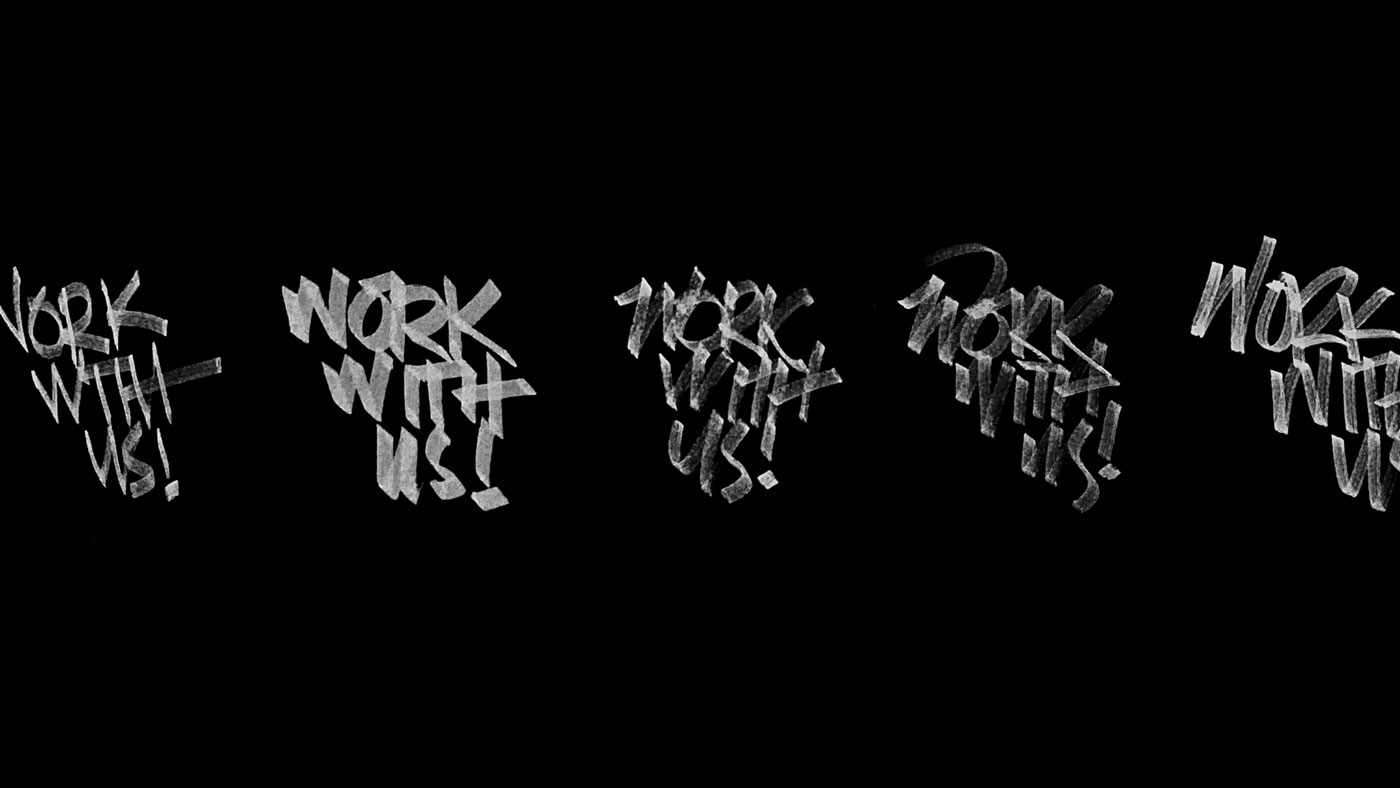
Here is the long version of our ‘looking-for-people’ document: bit.ly/WorkWithKL11. The short version is that we will be very happy to take care of graphic design graduates well. (As well as a two-three-four-person-run-studio out of Kozhikode honestly can; both in gold and adventure.) We have waited very many years to be able to afford the luxury of mentoring young graduates. As always, Codesign and Girish and Suresh and the many great mentors we have had, are the benchmark we’re chasing. And that bench is admittedly marked sky-high. Ha.

Gold and Adventure
On a dimly lit, chilly Gurgaon evening, Ghate (Abhishek) spoke to us about Gold and Adventure. Two things one seeks from a ‘job’ of any kind. Enough of a challenge so the milestones feel not like accidents but like discoveries and delight. Enough moolah so the whole thing doesn’t slide into a maggi-for-three-meals type situation. Most small (count us in) studios can’t afford to pay people what they truly deserve (compared to true corporates). People like Co did the best they could and we were happily in the top one-percent of studio-salaries. (No Maggi-days in three years.) Most often, it is basic maths winning over the urge to do (what to us is) honest work. When we started KL11 in 2014, we took out bus-money for salary. For many years. All our insurance payments lapsed, we stopped buying books and other luxury items, tea was limited to Swami’s and Bombay (who sold heart-melting stuff at pocket-friendly prices; and still do), walked to and from the bus-stop, etcetera. The adventure far outweighed the gold and that was alright. Long story later. The point is that we are trying to do the gold-adventure-mix right-ish for fresh-graduates. And it looks like we can, now.
Graphic Design with a Capital G
For these projects, we want to work with (and mentor) people who live and breathe forms, compositions and usable gestalt-principles. While we (mostly M) takes care of the business end of things, whoever steps up can stick to their roots, stick to what they explored in the classrooms. For that reason, we’re not necessarily looking at good-looking mockups and three-dimensional renders of not-so-resolved forms. Not that we have anything against such stuff per-se. Just that one can read way better from a well-made resume that respects readability and our intelligence. One typeface (maybe two), one or two sizes in the scale, supersorted groups and hierarchy. That is it. I’m looking forward to some exciting work. I hear it is hard to find people who stick to graphic design in the not-so-old-but-fairly-old-fashioned way of forms and blacks and whites and foundations. I want to believe otherwise. From under this rock. Yes.
Other Stuff
Logged in to Instagram on my phone after ten years-ish of deleting my own account. While I do hog R’s phone to look at cat pictures often, this is some other level of timesink doing that scroll on your own device. Not for me.
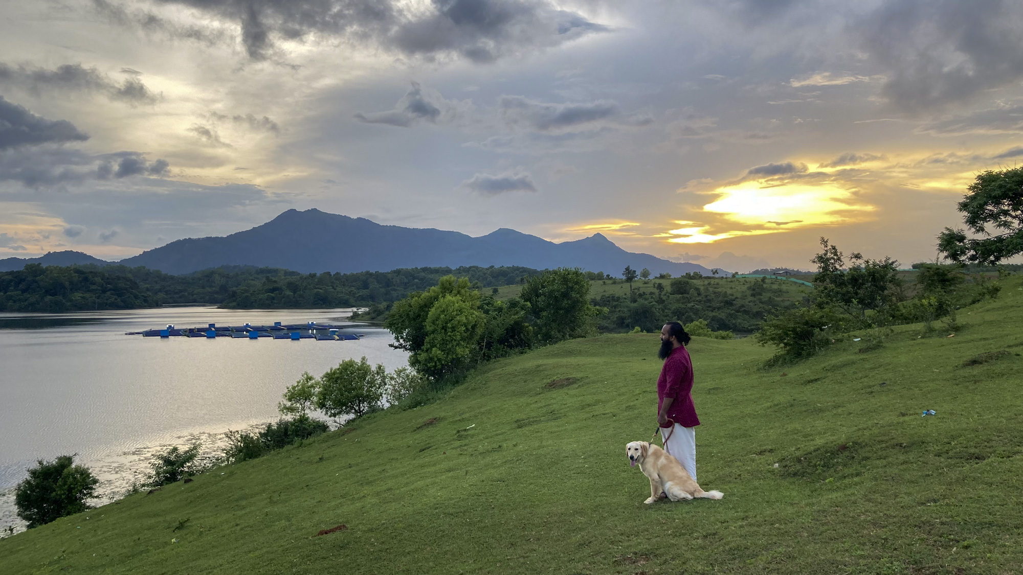
The evenings in Wayanad are bliss. Evenings with R and Chelgato sweeten the deal. Mathayi helps.
Pee Yes See
→
August 14, 2022 |
Reading time: ~1 minute | Permalink
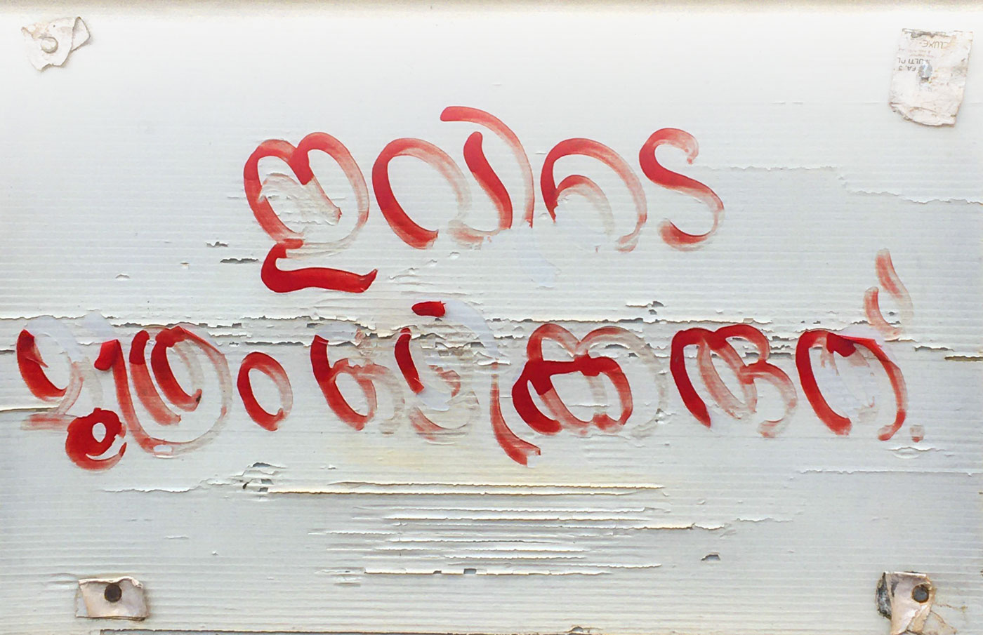
Iranics with a lovely fade. Somewhere on a wall near Malabar Hospital in Kozhikode.

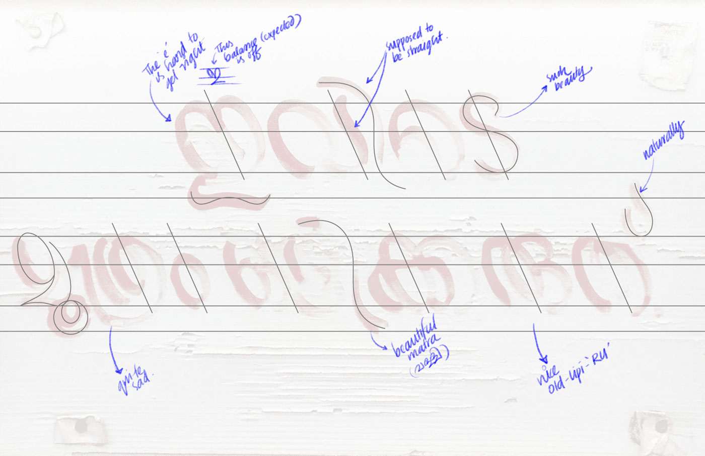
Says ‘do not pee here’ in superrefined calligraphy. That e-matra is lovely. One can see where the brush strokes start and end and start running out of paint. Funny (er) that the hospital most famously deals with urological anomalies.
Update. Just ’cause. I’m overthinking peesigns now.

On Ze Road
→
August 11, 2022 |
Reading time: 3 minutes | Permalink
We had a nice Vijayawada teaching-road-trip last month. It was the first post-Covid-lockdown offline course (abstract doc) for Communication Design so the benchmark for awesomeness/okayness was set quite ground-level and below. The bachchalog did well, with some well-written books in the last week. I was impressed (capital I) with the depth and breadth of work; kind of reminded me of the good old times as a student in Paldi. R cooked everyone dinner (like the good old times in Paldi). We had fun (capital F) and some spicy Andhra food. On the way back (Vij–Chennai–Coimbatore–Kozhikode) there were friends, Tamizh food, football-field-sized roads, shady hotel rooms, aeroplanes, Burmese food, near-miss Tollbooth stucknesses, etcetera. (More on all that later.)
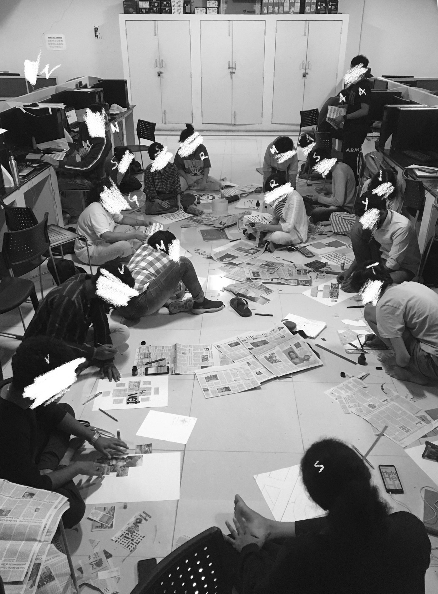
Here is everyone making posters out of thin air and newspaper at the makeshift CD-studio (IT Lab) at Vij. Capital F.

At home in Wayanad, Podimol is ‘in’ the Monsoon way more than we are. We just had her power-washed yesterday (because she was looking more terracotta-sculpture and less metal-sheet-stamped) and today, she looks like this (below). We—not so—accidentally drove into a green patch that turned out to be a Rasayanam-consistency patch underneath. Getting out was harder than getting in. The mud flew everywhere.
The Monsoon (coupled with rising prices for everything) is really hard for many people in many places in Kerala, but we are okay. Dealing with leaks in the kitchen and more-slash-bigger wasps-and-technicolour-bugs is not much of ‘dealing with’ really. We had some hard-ish times a couple of months back (delayed payments and some such logistical effups) and sailed slowly through them.

KL11 has resumed work on River and I’m looking at multiscript wordmarks. We are also looking for interns/project-associates to help us for three months (more on that too, later). Some expansive icon-sets, web-design, brand-guidelines and extending the product identity, etcetera, are in the works. Drop me a line (KL11 mail) if interested. I’m putting together a document on the what and the why and all that soon. We are kind of particular about some basics (like third-year-in-college-basics; not unreasonable basics) of type and form but are hoping to be able to mentor people as well. We shall put our semi-abandoned Instagram page to some use, maybe. And I have so many emails to catch up to.
Chelgato has put on good weight and has no hesitation anymore before jumping into bed before we do. That usually means we end up fighting her for realestate but are also kind of halfhearted about it thanks to the added warmth. (Our part of Wayanad gets cold like most other parts of Wayanad). She pretends to guard the house while secretly hoping for strangers to come and pet her.

SuBa
→
June 17, 2022 |
Reading time: 2 minutes | Permalink
Sulthan Bathery’s arguably-best print shop is called CopyCat. We moved here (not exactly SB but close/far enough) in March and sometime last week was the first time we needed to commit-control-pee anything into pulp. This (below) is from Nellarachaal, a buffaloe-grass-carpet showroom over a hill overlooking some water that seems to be going nowhere in particular. Chellam likes the place despite the three dogs who are a bit too jumpy, and because of the one who is a sweetheart. (R—obviously because everything is photographically appropriate—took the pictures.)

Chelgato loves taking naps in moving vehicles way better than any of us can ever hope to. (She’s halfheartedly sleeping off a vet visit to Aruma in this picture.) She finds nooks where there are none apparent.

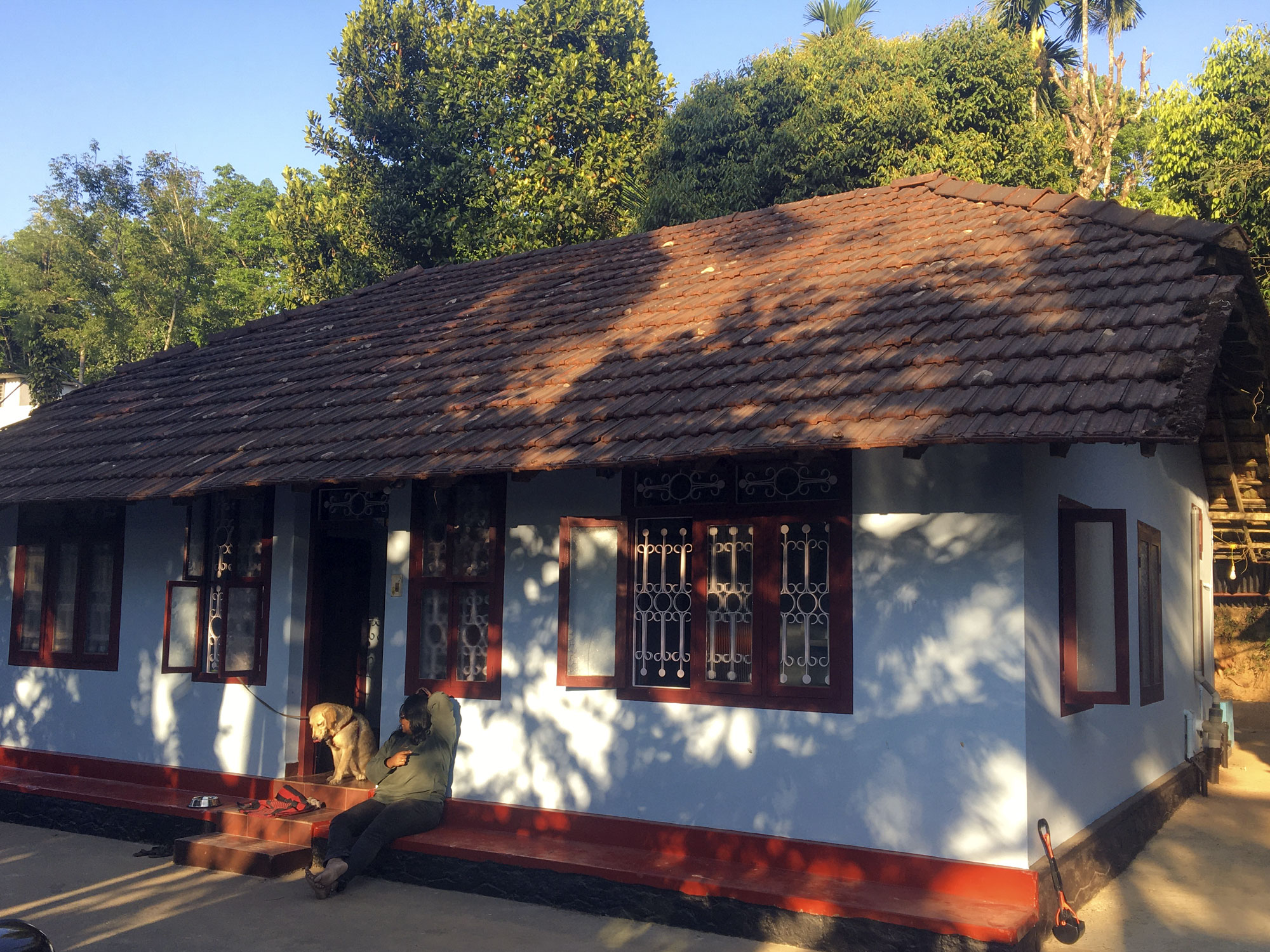
This is home. It is an old (60+ years) singlestory sloped-roof affair with flawed wooden ceilings and a kitchen that leaks in five places (so far) when the rain turns extrabold. Like many houses from that decade, ours is a simple square-plan divided into two big rooms, two small rooms, and the kitchen-cul-de-sac-combo next to a bathroom that stays consistently in winter-mode. It is a 3-column modular-ish grid with odd gutters. We lost the green cover in the backdrop to some seasonal clearance sale. On the plus side, the fore-noon sun warms the house up in time for night-chill. Out front, there are birds (bulbuls, kingfishers, tiny sparrows in a rainbow’s worth of hues) everywhere. Plus everyone’s chickens are everywhere all the time. Chelgato has kind of stopped barking at some of them regulars.

Photosynthesis
→
January 10, 2022 |
Reading time: ~1 minute | Permalink
In the auditorium, I felt the pleasure of competence and the warmth that only comes from sharing ideas. It always baffles me when my colleagues complain about teaching. Teaching is like photosynthesis: making food from air and light. It tilts the prospects for life a little. For me, the best class sessions are right up there with lying in the sun, listening to bluegrass, or swimming in a mountain stream.
— Richard Powers, Bewilderment
To the Print-shop, With Love
→
December 27, 2021 |
Reading time: 7 minutes | Permalink
Great print-shops don’t just print well; they reciprocate your love for print.
It isn’t often (more like never than ever) one looks forward to seeing a PDF that has gone to the printer come back all inked and kissing paper in ways nicer than what the screen approximates. It is rare for a printer to be consistently good at what they do at prices that aren’t approaching personal-scribe levels of indulgence. That brings us, conveniently, to this thinly disguised love-letter to our friendly neighbourhood print-shop in Kozhikode. Trendz (Flash? TrendzFlash? FlashPrint? I never get that right or anywhere near consistent; you will see.) is a big-ish floor of discerning (but mostly—for no fault of the shop’s—restless) people seeking print-outs (mostly Xeroxed copies of huge A1 sized architectural drawings, lanyards of pretty colours, large sheets of business cards that most definitely need to fit into A3-express-es and not just A3s, etcetera), unimaginable-otherwise-ly patient designer-DTP-professionals who know what they are doing and are in no hurry to let you know they know, the odd Errando person who is amused and restless in turn (thanks to how crowded and how on edge the rest of us leave the floor), etcetera. Trendz can print white (and silver, and gold) on all kinds of paper and not-paper. Trendz can print and frame photos on canvas. Trendz can print on off-the-menu-paper if you promise to bring it (the paper). I don’t think they can walk on water. I haven’t asked for a quotation for that, yet. The point is that printing at Trendz is much more exciting than it theoretically has any right to be.
Printing is meant to be hit-or-miss (hit-and-miss) in most small-ish towns. We were worried about finding passable quality printers in Kozhikode moving in, in 2014. Then we found Trendz and haven’t looked anywhere else yet. (I—regrettably in 20/20 hindsight—did, once, in 2018. I apologise for the Pantone promiscuity.) The flat swathes of colour don’t look like a second-year textile-design-student’s weekend (no-lines!). The flat-colours are flawless. The flat colours sing in that special voice only coloured-paper does, otherwise. The registration, while not perfect under bright light and some push-pins, is easily masked with 3mm bleed on all sides. The colour reproduction is great, considering how slightly off all the monitors at the home-studio-setup tend to be; the shades almost match their Pantone swatches more often than not. They’re great even with bad (RGB) sources. They’re good with scaling/cropping/flipping/rotating. You don’t have to ask them to ‘leave the artwork be, don’t fit it’ every time a PDF goes to get birthed again. Etcetera. You know what I mean. This is print the way print should be. With people-who-care manipulating the machines. Etcetera.
The people there are perhaps overworked but manage to find joy in helping when they hear you speak of spot colours and wait patiently behind their supposedly revolving chairs. I have had plenty of time watching people like B-chechy at work on CorelDraw and Photoshop (she admits she’s not good with Illustrator, fixing white spot-ink selection for my sorry CC-ed ass) and I am convinced she/they can race me to a corner, with their left index finger alone finishing alignment on some unnecessarily complex client-layout. I watch them deal with pressure and a need for making things right. I watch them deal with disillusioned customers after they realise source-quality matters. I watch them levelheadedly deal with bad contrast and esoteric typeface selection. I watch them deal—with grace—with fellow enthusiasts who are eager to teach them how to do their jobs. Often the younger ones would crane their collective necks to B-chechy and ask for expert advice on some obscure paper-sizes or print-processes. (I just go straight to her or to one of the print-engineers who come out and work the DTP-end once in a while. There was a DQSellman-haired youngster there who used to be a pro, too, but I think he found greener Pantones.) The work isn’t easy, with people whose mental-models of how print works is modelled after wide printer-margins and ant-sized type on everything, demanding multiple edits at once and ‘discerning’ eff-ers like yourstruly looking for a special-colour-on-craft-paper fix to deal with loneliness, and some misguided sense of purpose. Etcetera. The lady at the counter (simply, chechy), a lean, forty-plus-ish looking woman of impeccable dress-sense and solid work-habits (who reminds me of a Maths teacher that likes to moonlight as girlshostelwarden for kicks) is curt in a likeable way with impossible arguments and requests from customers. She’s all politeness and care the moment she spots my mug from across the counter; because I have learnt the superpower (the only one that makes sense at a print-shop) is patience. Patience and an ability to bend and support yourself on your knee-balls without weirding out the designers. So, counter-chechy (whom I assumed to be Christian—but isn’t; she worked the day before Christmas so some colleagues could take the day off—for the longest time because of her convent-like manners) is all efficiency and nothing much else, often. (She recognised me through the one-and-a-half inches of exposed specs and said ‘goodmorning’ as she walked in late today. It felt great. No. Scratch that. It felt effin fantastic and I smiled through all six layers of my mask.) Even the behind-the-scenes-but-actually-the-whole-scene-people, the print-engineers (including R and the chettan with many threads on his wrist) are fantastic beyond their job-title. Most would come out with your print and make sure things are okay before they commit acres of forest to torture.

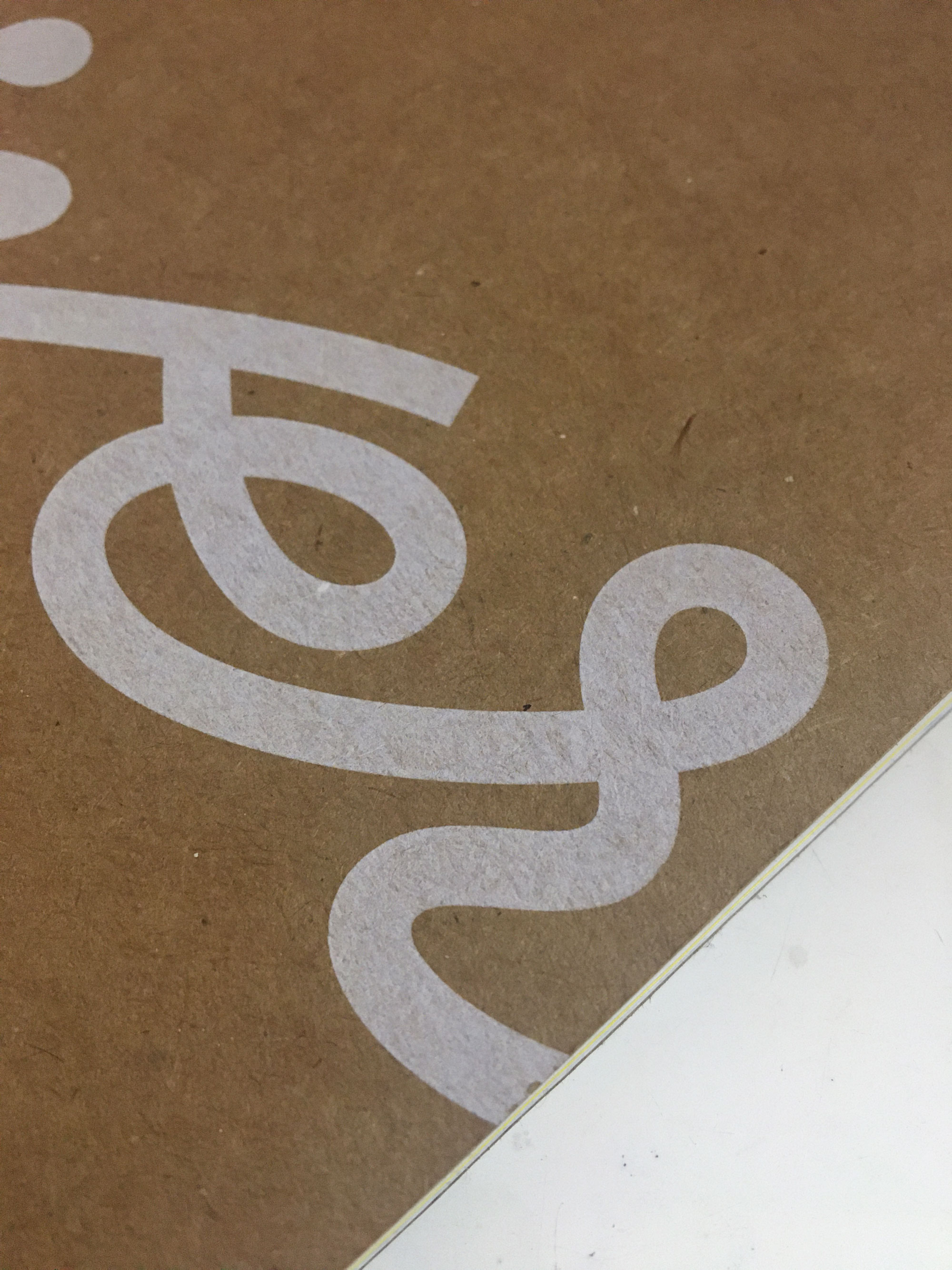
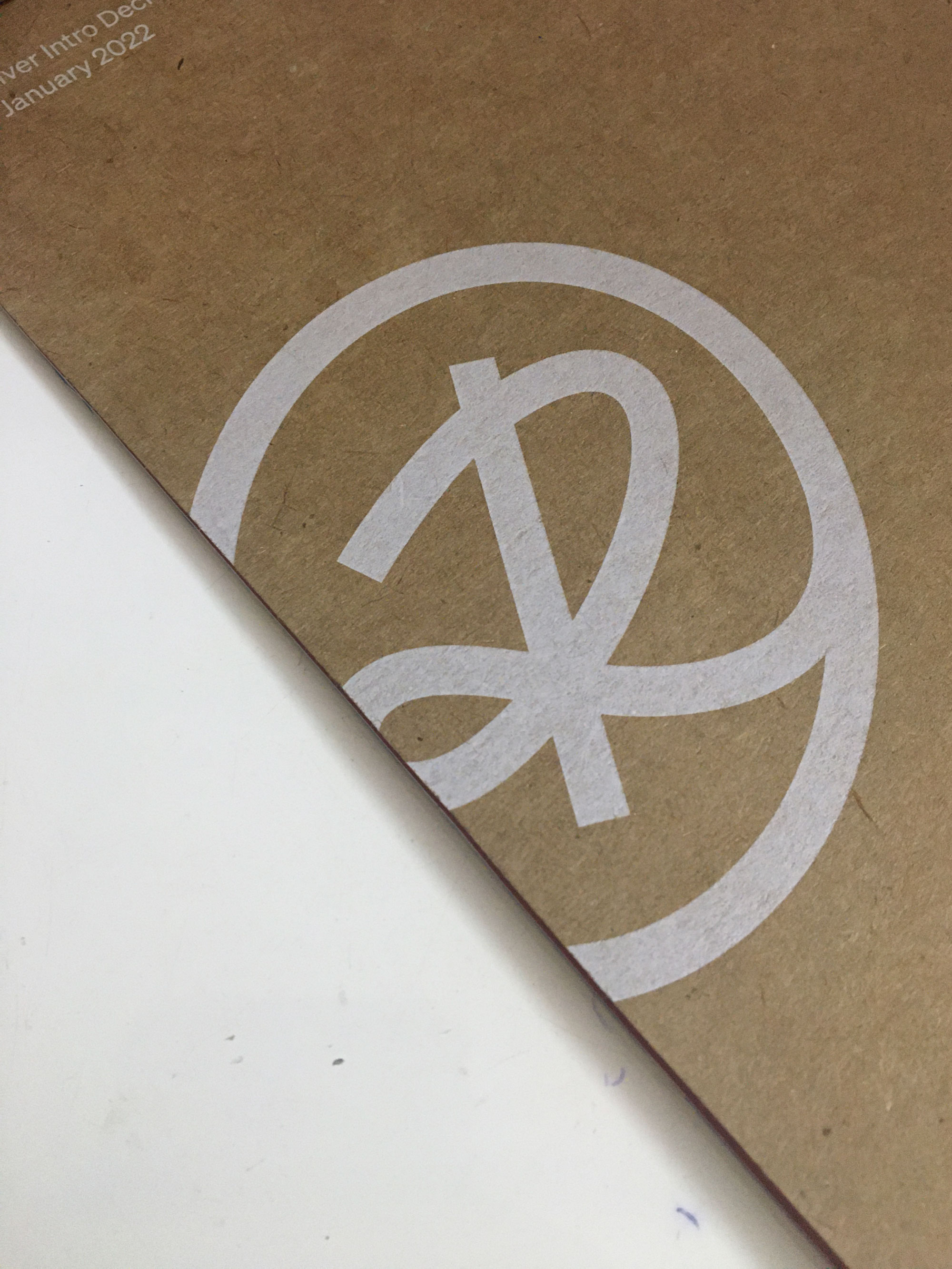
Trendz recently got a Xerox Iridesse press to Kozhikode and I had been waiting to print with speciality inks. We have been working with an EV startup that doesn’t call itself such, for the past year, and had the opportunity to make something that stood out in print for their up-coming presentation at CES. The covers (C1 through C4) are craft-paper and white and glorious, printed at T. I had to keep myself from ordering unnecessary test-prints after the first two. I’m looking forward to picking fifty copies up in the evening.
The white isn’t screen-print-thick (of course) but has that nicest of show-throughs when looked at from an angle. The paper feels great. And the whole affair smells great—kerosene-ey and paper-ey in equal measure while managing an essential earthy nuance. It screams ‘ecofriendly’ in subtler hues than green.

So, yes. We have a great print-shop in town and this is—as promised in UG-third-year—my love letter to the place. Please don’t crowd our little slice of ink-paper-heaven on weekday mornings; that’s when we get our kerosene-pulp-fix. If you choose to anyway, maybe we’ll let the shop-folks know how well-loved their work is.
GyanBhaskar-GyanBharti-GyanBhashaposhini
→
December 16, 2021 |
Reading time: ~1 minute | Permalink
Finished a distracted-as-hell-but-saved-by-the-penultimate-exercise Typography-1 course with second-year students at NID Bhopal (MadhyaPradesh). The students were hardworking multitaskers who managed to stay awake through really long (not!) history-presentations, and found much energy to laugh appropriately after so many sad jokes filtered through a three-layer-mask. The winter was cold, the food was cold often, the guest-house-hot-water-situation, still a mystery. The people’s warmth and the excellence of ShreeVinayak’s samosas made up for all that hostility with un-parallel-penn-able hospitality. I wish the course was longer (than a packed-to-the-brim two weeks). Apparently some students wish so too. Win-win-type situation, then.

The title is, as they say, an inside-joke on the only (excellent) stationery-shop in BhopalCity. They (the shop) use a Didone for the wordmark and we discussed that to the moon and back, over multiple lunar missions. And PS, you can open the 6000px wide image and read all the unfunny and informative annotations if you’re good at deciphering handwriting on weirdly contrasty backgrounds.
R came along and mentored an NID-H course from the NID-MP guesthouse. If that is not collaboration, I don’t know what is. We had copious (illegal, even) amounts of instant noodles with a smart TV running YouTube-food-shows as witnesses. What a life.
HighRes Dreams
→
October 20, 2021 |
Reading time: 2 minutes | Permalink
R—recently—won the Alkazi Foundation’s Theatre-Photography Grant. With the support, she gets to work on her project Akam for the next year and present her work at the end of term. She’d applied last year and had won a special mention so this is doubly sweet. Here is what the three-person-jury had to say.
…it speaks to her own anxieties and dreams and nightmares. But, especially in times of COVID, being able to see her work or the range of work she’s doing, where it feels like something deeper is being tapped into, which feels of the time—not only of the time, obviously. But the greater sort of anxieties that we are enveloped in, and how they seem to be bubbling onto the surface—that is a really really fascinating thing. — Monica Narula, Artist and Curator, Raqs Media Collective
In the way she was photographing her experience, there is a certain sense of horror, which is very evident in cinema but not really present in photography—at least in the context of South Asia. — Munem Wasif, Photographer and Film-maker
We thought that was an interesting space for development. Project Akam blurs the line between the personal and intimate, and what populates a shared imagination. — Marie-Nour Hechaime, Curator, Sursock Museum
Here is the foundation’s Instagram update announcing the winner. (Here is a direct link if you prefer the no-popup experience and prefer to focus on the video. Update: here is the foundation webpage with a convenient video-embed.) Thanks to COVID-related travel-restrictions and some hardware SNAFUs, R had to greatly reduce the scope of setting-up and shooting the images. The low-light-noise in the images is both a production-side-effect and is really effective.
R’s already put a lot of herself into the project and speaks excitedly about all the potential offshoots to it. She’s working on some of the background research and we will—fingers crossed—work on a publication, together, later. I think the project—eventually—deserves a treatment that can do justice to all the film-like-grains in the images and the general grain of the subject. Can’t wait to pick the stock for this one.
Chel-gato Tails
→
August 6, 2021 |
Reading time: 2 minutes | Permalink
We welcomed a puppy to the family and she’s prone to flying at us with ears flapping in the least aerodynamically efficient way possible. She’s also good at stealing everyone’s hearts while at it.
Arguably, I did not start out as a dog-person (or any kind of -person really). Only past meeting studio-dogs at NID, Ninja and Saboo at Co (third year of college, internship-driven) I grew comfortable enough to let them rest on me while working. Then Kalyani changed a lot of the ways I dealt with animals; she came to me—an intelligent, somewhat aloof like many cats—baby who needed a lot of time and very little space for herself. Now I can—with 62% success—tell a Lab-Retriever puppy from a Golden one.
The title is an inside joke with R on alternate, modular names for the puppy. (Inspired in parts from Elgato’s announcing a new camera. I was researching building a Pi-Zero web-camera for the computer; we share a webcam and on days with meeting-s it is awkward.) It was R who spent hours talking about canines, sending pictures of them in irresistible lighting, etcetera and made me warm up to the idea of befriending a puppy. The furball did the rest when she arrived.

Photo thanks to R. I am responsible for cropping the original (portrait) weirdly.
PS: I think it was essential that we got her. So much stress and anxiety and fatigue in our lives post COVID-uncertainties and general COVID-uncertainties. Work has been super-slow and mind-boggling at all times.
All Roads Lead to Roam
→
June 27, 2021 |
Reading time: ~1 minute | Permalink
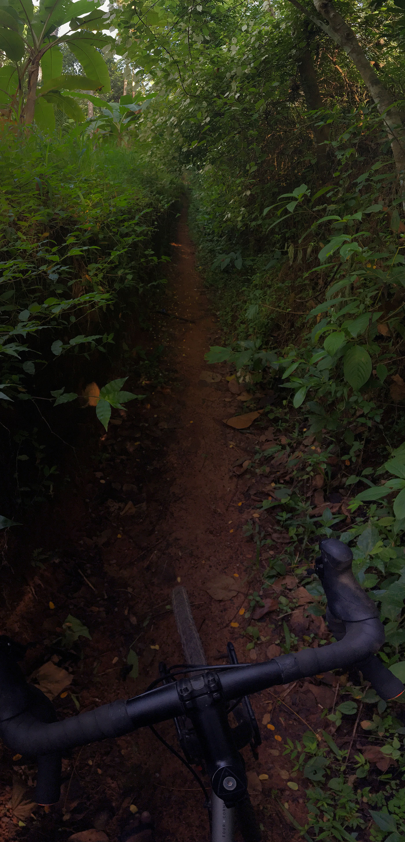
The side-road parallel to the one with fancier government offices is busy with undergrowth and vines nobody cared to watch. I haven’t been outside much since the testing-positive-and-then-negative ordeal. (It was hell and then it was okay.) These short morning rides are a good respite from sitting on a work-chair all-day. Things that were easy are hard again; climbing a short (tiny) hill steals all the energy and breath and replaces them with aches and a wheeze audible through the mask-layers.
I can smell the flowers again. (And there are many!)

This not-meant-to-be cycle path joins the main road beside the BSNL office (roam). The short detour is well-worth the scratches and true-random spider-web installations.
