Chel-gato Tails
→
August 6, 2021 |
Reading time: 2 minutes | Permalink
We welcomed a puppy to the family and she’s prone to flying at us with ears flapping in the least aerodynamically efficient way possible. She’s also good at stealing everyone’s hearts while at it.
Arguably, I did not start out as a dog-person (or any kind of -person really). Only past meeting studio-dogs at NID, Ninja and Saboo at Co (third year of college, internship-driven) I grew comfortable enough to let them rest on me while working. Then Kalyani changed a lot of the ways I dealt with animals; she came to me—an intelligent, somewhat aloof like many cats—baby who needed a lot of time and very little space for herself. Now I can—with 62% success—tell a Lab-Retriever puppy from a Golden one.
The title is an inside joke with R on alternate, modular names for the puppy. (Inspired in parts from Elgato’s announcing a new camera. I was researching building a Pi-Zero web-camera for the computer; we share a webcam and on days with meeting-s it is awkward.) It was R who spent hours talking about canines, sending pictures of them in irresistible lighting, etcetera and made me warm up to the idea of befriending a puppy. The furball did the rest when she arrived.
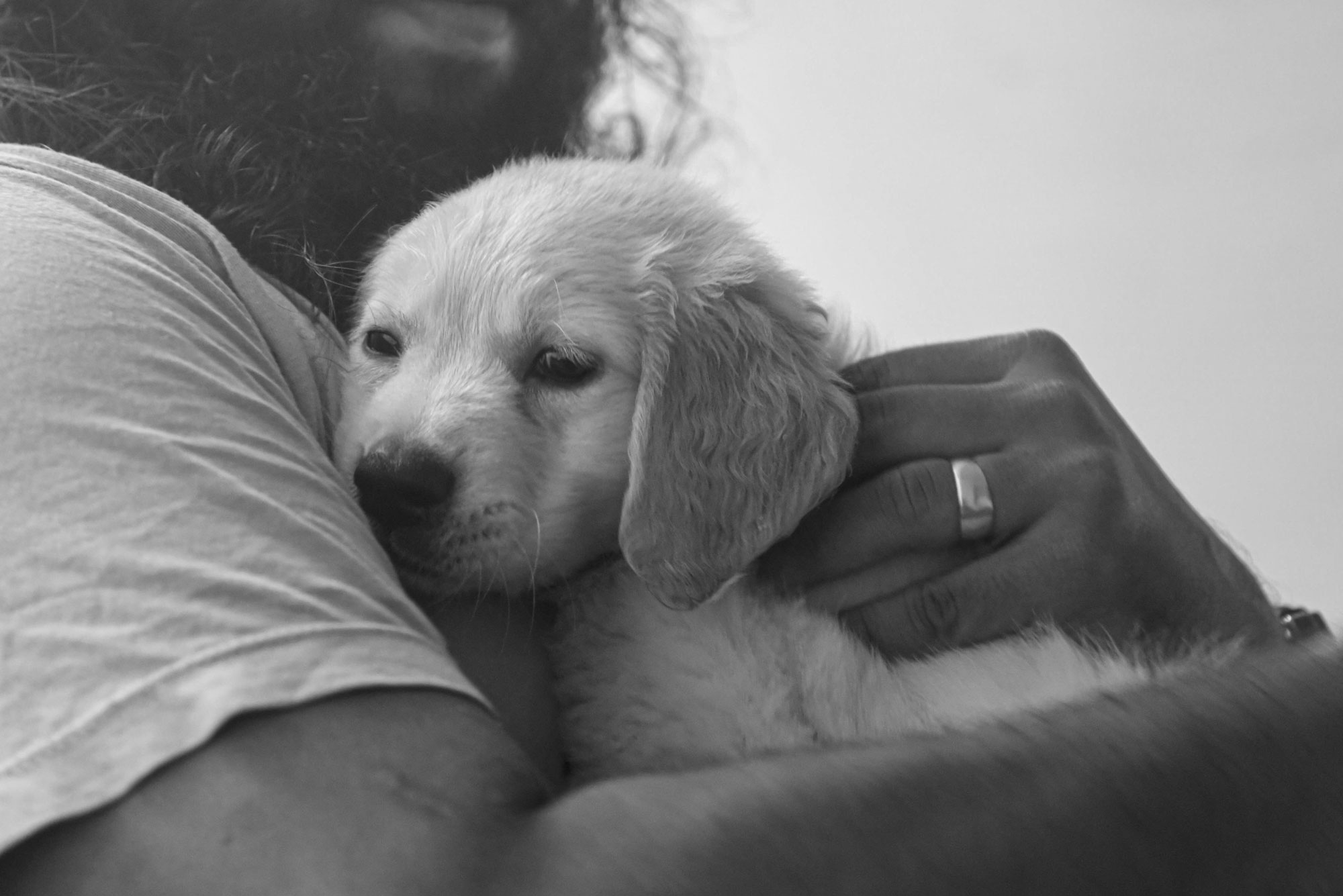
Photo thanks to R. I am responsible for cropping the original (portrait) weirdly.
PS: I think it was essential that we got her. So much stress and anxiety and fatigue in our lives post COVID-uncertainties and general COVID-uncertainties. Work has been super-slow and mind-boggling at all times.
All Roads Lead to Roam
→
June 27, 2021 |
Reading time: ~1 minute | Permalink
The side-road parallel to the one with fancier government offices is busy with undergrowth and vines nobody cared to watch. I haven’t been outside much since the testing-positive-and-then-negative ordeal. (It was hell and then it was okay.) These short morning rides are a good respite from sitting on a work-chair all-day. Things that were easy are hard again; climbing a short (tiny) hill steals all the energy and breath and replaces them with aches and a wheeze audible through the mask-layers.
I can smell the flowers again. (And there are many!)
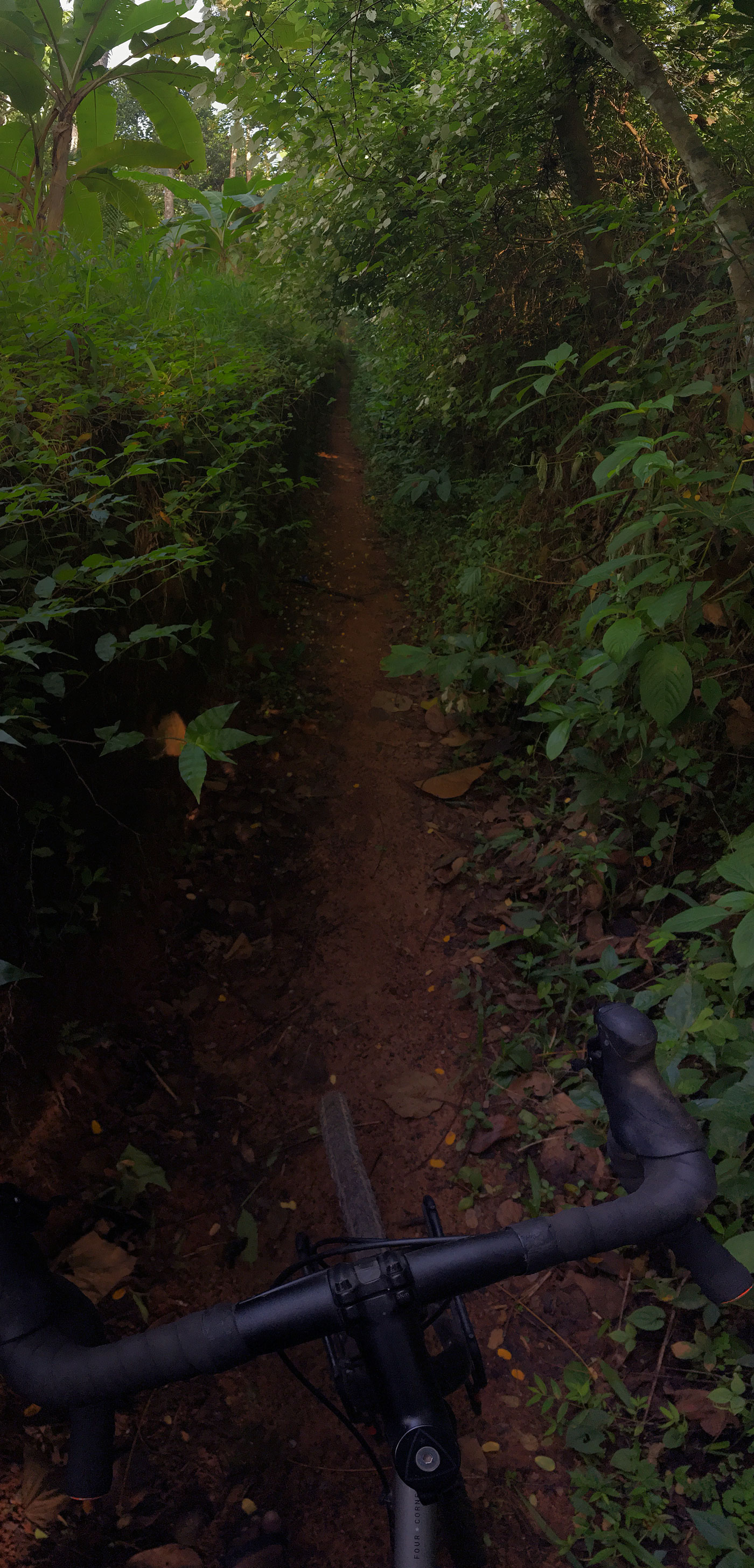
This not-meant-to-be cycle path joins the main road beside the BSNL office (roam). The short detour is well-worth the scratches and true-random spider-web installations.
This is much verse than a poem. Go forth. (Retrieved from the good-ol’ Tumblr from 2013. ‘Found’ poetry [mostly] from an old geyser at a temporary-accomodation-type-situation in Gurgaon.)
Do not operate this pressure-type geyser before connecting to a water source. Do not plug the top-vent ever. In the absence of a vent pipe at the place of installation, it is necessary to use modern safety valve on the top-vent. It is advisable to use a non-return valve on the inlet water line to prevent accidental damage to the inner water tank. Always use a three-pin plug with this water heater. Green is the universal symbol for earth. Never use the logo on a grey, ambiguous, white, rainbow, yellow, magenta, cyan—or the combinations of the above—background. Do not put a drop-shadow around the logo unless your branding agency tells you it is good for you. Never stretch, squeeze, mentally torment, humiliate or drop water on the logo.
Thank you. Ask for refunds at the exit gate.
Passages
→
May 26, 2021 |
Reading time: ~1 minute | Permalink
When I read, I withdraw from the phenomenal world. I turn my attention “inward.” Paradoxically, I turn outward toward the book I am holding, and, as if the book were a mirror, I feel as though I am looking inward. (This idea of a mirror is an analogy for the act of reading. And I can imagine other analogies as well: For instance, I can imagine reading is like withdrawing to a cloister behind my eyes—an open court, hemmed by a covered path; a fountain, a tree—a place of contemplation. But this is not what I see when I read. I don’t see a cloister, or a mirror. What I see when I’m reading is not the act of reading itself, nor do I see analogies for the act of reading.)
When I read, my retirement from the phenomenal world is undertaken too quickly to notice. The world in front of me and the world “inside” me are not merely adjacent, but overlapping; superimposed. A book feels like the intersection of these two domains—or like a conduit; a bridge; a passage between them.
— Peter Mendelsund, What We See When We Read
Tiny Atrocities
→
May 19, 2021 |
Reading time: ~1 minute | Permalink
Elisa Gabbert is immensely quotable (not the best thing to have read in the times of COVID though).
As the injustices pile up, and reserves run low, the question of where we should focus our moral attention becomes critical—when exposed to more evils than we can possibly attend to, most of us feel helpless. And what, more than helplessness, excuses apathy and inaction? Rather than confront global suffering, we may cull our feeds, or stop watching the news. Or, worse, we may make of the suffering other an enemy, turning apathy to antipathy. These unspoken algorithms by which we manage our empathy—they are almost innocent, almost “self-care.” (We’re not committing atrocities, just refusing to witness them.) But layered together, they have the shade of evil.
— Elisa Gabbert, The Unreality of Memory
Red Things, Green Things
→
May 14, 2021 |
Reading time: ~1 minute | Permalink
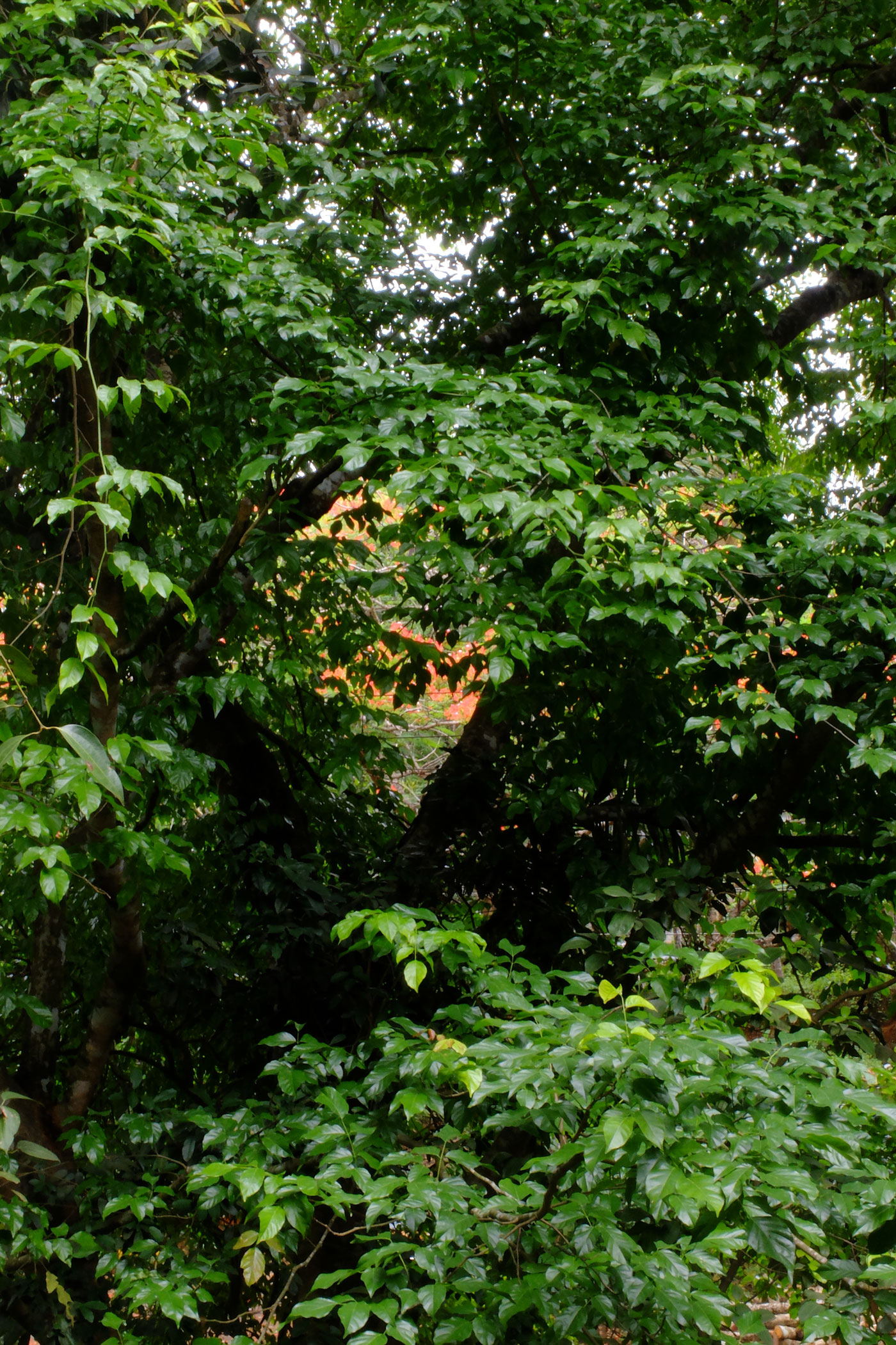
The Mayflower outside has may-flowered and the ungg-tree’s leaves are that shiny dark green again. Via the quarantine-window at home.
Relingos
→
May 12, 2021 |
Reading time: ~1 minute | Permalink
Guaranteed repairs
Restoration: plastering over the cracks left on any surface by the erosion of time.
Writing: an inverse process of restoration. A restorer fills the holes in a surface on which a more or less finished image already exists; a writer starts from the fissures and the holes. In this sense, an architect and a writer are alike. Writing: filling in relingos.
No, writing isn’t filling gaps—nor is it constructing a house, a building, just to fill up an empty space.
Perhaps Alejandro Zambra’s bonsai image might come closer: “A writer is a person who rubs out. . . . Cutting, lopping: finding a form that was already there.”
But words are not plants and, in any case, gardens are for the poets with orderly, landscaped hearts. Prose is for those with a builder’s spirit.
Writing: drilling walls, breaking windows, blowing up buildings. Deep excavations to find—to find what? To find nothing.
A writer is a person who distributes silences and empty spaces.
Writing: making relingos.
— Valeria Luiselli, Sidewalks
Liff, Positive
→
May 10, 2021 |
Reading time: 3 minutes | Permalink
I tested COVID positive on Tuesday (last week). Post the trans-Kerala train-trip (both ways), I was feeling slightly headache-ey, weak and generally uneasy for three-four days when we decided to go see a doctor. I was afraid the symptoms were COVID-related but convinced myself otherwise since we were supercareful with masks and sanitisers throughout the trip and hospital-stay (R’s papa had a stroke and we were looking after him). The hospital had COVID patients. We were far from the block where they were, away on the fifth floor of a separate building with ample ventilation and few people (mostly babies) across the floors.
Everyone except R had symptoms since then and are quarantining in separate rooms. Achchan and Ananthu tested positive so we haven’t bothered with testing Amma. R tested Negative, twice. We have video-meets at night and see that everyone is alright.
I have been cycling through (thankfully mild) symptoms all week, starting with a sore throat, blocked nostrils, head-heaviness, loss-of-balance and now a heaviness-to-the-chest. I haven’t lost my sense of taste; sweet stuff is sweet and salty stuff salty. Can’t smell a thing though; been burying my nose in the detergent-dabba after the sanitiser-bottle-test burnt its insides (of my nose, not the dabba).
For the first few days there were also the odd and persistent nightmares. The episodes would wake me up past twelve with a cold sweat, leaving some random scary detail lodged front-and-centre in my head for ten-fifteen minutes. These shorts are cinematic and detailed, with the details staying well past their regular welcome. To add more definition to the already high-d visuals, the neighbour has decided the best way to install high-intensity LED floodlights is to face them towards our house. There now is a whole (otherwise not scary) shadow-puppetry-bit on the bedroom walls as I stay awake trying to forget why the building is shaking, scenes involving chains apparently lifted from GhostRider, etcetera. The contrast there in the shadows is amazing and I catch myself admiring the shapes before remembering to go the eff back to sleep.
I am glad our symptoms are mild and manageable and that one of us is free to take care of the rest. R loves to be and excels in her caretaker-role, breaking character only to tell me how much she misses me. She’s been cooking and delivering food to everyone while managing papa’s hospital-related stuff over the phone. K is stuck in the balcony-room complaining all the time (R takes her for short walks but she misses running the house, perhaps).
I have been on Amoxycillin, Domperidon, Mondeslor and VitaminC-Zinc tablets and lots of vapour-inhalation. The vaporiser is a temperamental beast and will need to be opened up soon. I don’t know why we can’t get something as simple as sort-circuiting-with-water work reliably. The ‘Oximeter’ keeps things steady at 97–99 but nosedives to early eighties enough times to keep one wondering if all of this really is Maya-esque after all. I’ve also been reading through R’s reading list (thanks to getting stuck with her bookshelf) and looking for decent Malayalam movies. The classes are all post-postponed and I will have to effectively restart some of them given this gap.
All is well. Relatively.
Breath Becomes Air
→
April 30, 2021 |
Reading time: ~1 minute | Permalink
[Timothy] Morton calls global warming a “hyperobject,” something that is “massively distributed in time and space relative to humans.” Such objects are more giant than the giant objects of megalophobia; they can’t be captured in a photograph or even an abstraction. Time-lapse gifs of melting ice don’t help; their extreme compression only minimizes the impact of what’s happening at actual size. Global warming is happening everywhere all the time, which paradoxically makes it harder to see, compared to something with defined edges. This is part of the reason we have failed to stop it or even slow it down. How do you fight something you can’t comprehend?
— Elisa Gabbert, The Unreality of Memory
Reading this, looking at the aerial-photographs of pyres in Delhi, tense-traversing the length of Kerala in the middle of the pandemic. My prayers are with the very many families weathering private hells and the possibility of unfillable voids. Title.
WaterFountain: PDF Drift
→
February 11, 2021 |
Reading time: ~1 minute | Permalink
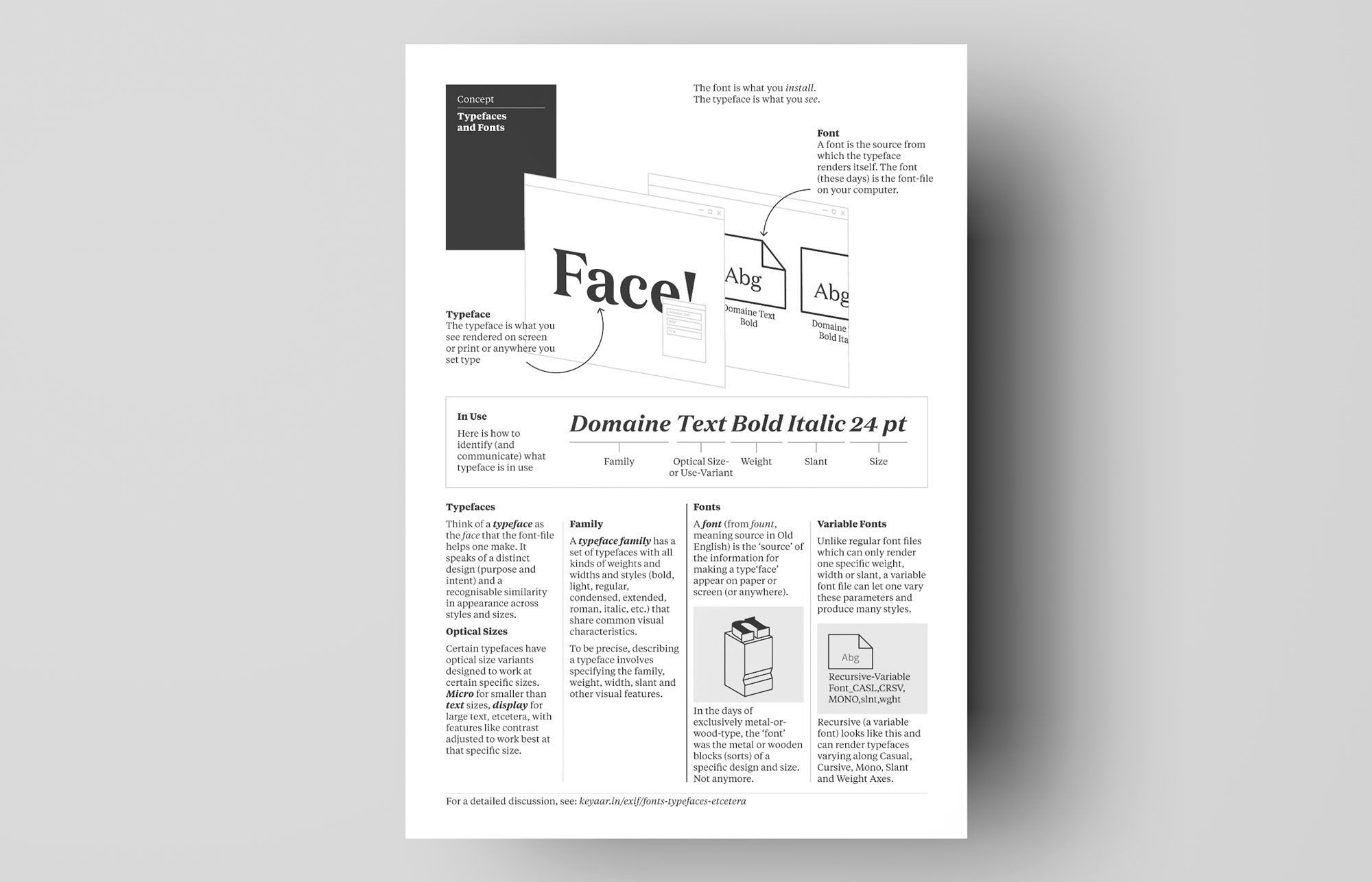
Here is a pixels-and-ink version of the ‘fonts vs typefaces’ discussion as a printable A4-sized PDF. Feel free to use in a classroom (thankses!), pinned on a board, printed and made a boat out of, wallpapered on a PC (why?), etcetera.
Download (PDF, 106 KB)